Ink Coverage Issues
Hi all,
OK, i finally got my hands on some wooden type. Not even a full fount, but enough to play around with at least. I have an Adana HS3 and am having trouble getting good ink coverage on my prints. I’ve attached a photo to show you the results i’m getting.
I’ve tried on a variety of papers, the best print so far was actually on a sheet of acetate, although even that was blotchy still.
I thought it could be the amount of ink, so I rolled a couple of layers of ink on directly on the type to see if that worked, but still blotchy.
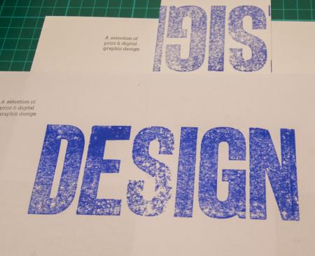
The top print is on Cranes Lettra 300gsm cotton, printed in the normal way with the Adanas ink rollers.
The bottom print is on regular printer paper, with the ink rolled directly onto the type itself.
I’ve also included a pic of the type in question in case that helps.
Also, the size of the area that is being printed is about 6.25 inches wide and 2.25 inches high. Is it just that the little adana can’t produce good results with a print area that large (because i’ve never had this issue with metal type)
It’s times like these I wish I had a seasoned pro looking over my shoulder to help me learn!! Any insight anyone can give would be much appreciated.
Thanks,
Ben
print.jpg

type.jpg
The ink coverage is limited to the rollers dia of the press.
These are large letters needing more ink coverage than your press was design to do.
And, if you run the press a few passes before the impression the coverage of ink might pull the paper back into the press.
Might want to try some packing? I had an issue like this, not as severe however, and added packing and it fixed the problem right away.
Aaron’s right. The press is too small to print type that big.
As a rough guide, imagine the combined surface area of the type vs. the size of the chase: you probably want about a quarter to produce a good print. Don’t expect to be able to smash into a soft stock and get any sort of impression, else you’ll sooner crack the machine in half.
Simon G.
londonbookarts.org
The comments about chase size VS form size seem correct to me.
But additionally…
In my experience, wood type needs a bit more inking pressure and also a bit of advanced care paid to it’s underlay to work really well.
You want the blocks to be planed to the same dimension- sometimes wood type swells and/or contracts, or was manufactured to standards not the same as metal type; thus characters are sometimes a different height.
Most people printing with thick papers might add a bit of impression/packing to compensate, smack it a bit harder, and I think that if you aren’t patient and just wanna whack’a’mole to solve the problem/your press will do it, you can go ahead and abuse the type/garner the produced results.
Or you can get a micrometer or plate gauge, measure the thickness of each individual sort/character of your family of type, carefully catalogue each piece, cut out tissue paper to bring them all to the same thickness (thickness of the highest/thickest piece being the target), and once you’ve evened out the underlay and then flattened the form in the chase (“planed”), you can lock it up and try printing again with a sharper degree of success. A bit of inking pressure goes a long way when the whole form is flattened out.
Usually, the results are superior to the ‘whack’a’mole’ strategy outlined above when I do this, FWIW.
If you want the underlay (tissue you used to build the type’s height up) to stay in place, FYI, a tiny touch of rice paste will serve to help adhere. Not too much at all. It’s easy to remove with a damp cloth once you want to remove the underlay after a few uses.
It looks to me like the S is a bit lower but the others look even to me, but you are asking a LOT of that little Adana. I would suggest two tacks (after you get the S shimmed up to the same height as the rest): clean the face of the letters carefully but thoroughly — there looks to be some residue of old ink on them — then a lot more ink and dampen the paper (not wet just damp, a plant mister works well for that or a steam kettle). The damp paper will conform better to the type and accept the ink better than dry stock.
Bob
I second Bob’s suggestion of dampening the stock, it should help. But as others are saying, even with careful makeready you are probably asking a bit much of your press.
-Kim
Wow, thanks for the great responses, such a wealth of knowledge in this place.
It is as i’d feared then, probably too much for the press to handle. As an exercise in experimentation I’m going to attempt to play around with different makeready techniques, and will definitely try dampening the paper to see if that helps.
I also wonder if I would get better results from maybe doing it in a couple of passes. This weekend will be spend playing around and seeing what I can get out of a few different techniques. I also have some 1” high letters that are arriving within the next day or two, so it will be interesting to see the difference in results with some smaller characters.
Now if only it would stop getting dark at 3:30pm, or I had a shed with actual power connected to it I could spend a bit more time out there. Bring on Summer I say!!!
Thanks again all, you’ve been a great help.
you could also try to use matte paper as it absorbs very little ink and therefore takes a while to dry, you should leave it over night to cut it
Yep, and Crane Lettra is not the easiest paper to print large solid areas on…