Schelter & Giesecke - ID Please?
Hi there,
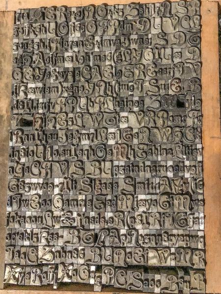
I got a couple of letters of this font in some pied type and it was quirky enough for me to drive 5 hours to get some more yesterday. Can anyone tell me what the name of the font is please? I know it’s from Schelter & Giesecke by the stamp on the side of the letters. Image reversed for clarity
SG.jpg
I finally got around to digging out my Schelter & Giesecke catalog that is c.1910. Your face is displayed on page 85 and is listed a Kunstler-Grotesk.
It was offered in sizes 8,10, 12, 16, 20, 28 and 36 punkte.
I also have a note on the inside front cover of this catalog that this foundry was taken over by D. Stemple in 1918. I have no clue were I would have culled that information from, but it is interesting if it is true.
I have always been great about making notations about typographic matters, but unfortunately I was never savvy enough to also record the sources of my gleanings. I have been doing this for decades, so many original sources have faded from my memory. Perhaps someone else could comment whether that is true or not. I would have simply assumed that S&G had disappeared in the Second World War.
Rick
Hi simontee, Foolproof546
Wikipedia has some interesting notes (inc sources) on the history of the S&G foundry:
https://en.wikipedia.org/wiki/Schelter_%26_Giesecke_Type_Foundry
Hope you find it helpful!
Geoff
Geoff,
Thanks for the reference. Nice to have.
Rick
Thanks very much for the info. Every little bit of info is great. 28pt isn’t what I’d call “standard” but I also have a couple of 36pt letters so I assume I’ll have another 5 hours driving to look through more pied type…
Final product with a bit of cleaning…
IMG_1466.JPG
Yes, the 28 pt. is not that common. The general rule for setting odd sizes like this, if you don’t have the matching spacing material, is to use your next smaller size of spacing material.
Your font looks beautiful.
Rick