Help Identifying metal typeface
I recently bought a lot of letterpress type. Some of the drawers were not labeled and I’ve been trying to accurately label them as best I can. Below is all the type I found in one of these unmarked drawers. There’s what looks like Uppercase Roman, uppercase condensed and lowercase roman
I’ve been pouring over the 20th century type book trying to identify this typeface, but to no avail. Any help would be greatly appreciated. thanks
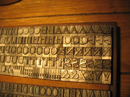
identifont-resize-UC.jpg
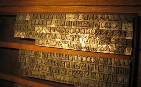
identifont-resize-UC-cond.jpg
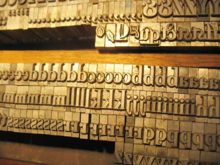
identifont-resize-lc.jpg
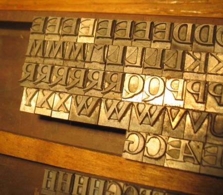
identifont-resize-R.jpg
Sweet. I’d like to say Bernhard Modern Bold (based on the lower case) but I’m sure I’m wrong, but just as sure that I have seen this face, likely even owned it, but can’t quite put my finger on it.
At any rate, this looks great. Some great variants in there. Congrats. Do something very nice with it.
Gerald
The caps in the first and third photos are DeVinne, p. 188, 189, 190, Barnhart Brothers & Spindler, Catalog 25 (1925). The alternate, variant, or wrong font (?) characters may be DeVinne Recut, p. 190. Or quite possibly a pirated version by the Empire State Type Foundry, p. 133, Type Foundries of America and Their Catalogs, by Maurice Annenberg. Empire often copied a foundry face and beat the copyright laws by changing the name and one character in the font, usually a cap “R”. Page 289 of DeVinne’s Practice of Typography, Plain Printing Types, 1914, has a description of, and a one line specimen of four-line pica DeVinne. More readily accessible references may include: ATF 1909 Desk Book, p. 294 through 306; ATF 1912 Catalog, p. 590 through 606; ATF 1923 Catalog, p. 330.
I’m going to have to say that I think its an Empire State Type Foundry pirate. I have 4 or 5 other trays with decayed stickers proclaiming that an “Empire State Type Foundry” typeface resides in that drawer. Most of them have “No. x” as names.
I’ll have to get my hands on a copy of the “Type Foundries of America and Their Catalogs” book.
I also came upon this seemingly sardonically worded letter about the superiority of Empire State’s Type at http://www.libby.org/~cowpower/
empire4.jpg
Hi,
Along with the DeVinne it appears that you also have a font of Bewick Roman (the caps on the bottom of the second picture and the lc in the third picture). The ligatures and font ornaments in the third picture are pretty distinctive. You can see a specimen in Mac McGrew’s “American Metal Typefaces of the Twentieth Century” or look online at skylinetype.com