Identifying a sixteenth century typeface?
Okay, please be patient with me; I am a newbie here.
I am trying to identify a typeface found within a Latin text from the mid-1500s. I know very little about the history of typography. Is my request ridiculous or impossible? Ultimately, I hope to find a contemporary typeface—digital or otherwise—that mimics as closely as possible that used in the photo.
Thanks in advance.
kevin
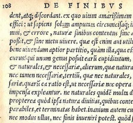
sample text for typeface identification on Briar Press.JPG
How about a Bembo Italic or a Centaur Italic from Monotype, exist in digital format as well.
here it is Bembo and Centaur
bembo.jpg
Or, Monotype Poliphilus and Blado italic, which has a heavier weight closer to your sample page. But none of the faces mentioned so far have the tiny bowl on the “a”, nor the long “s” used in your original. Not even Adobe Poetica has that, and it has a lot of variant characters. You may need to do some modification to the font if you need those archaic characteristics.
Bembo and Centaur look like they may be as good as I might get with what’s available to me. My crappy digital version of Centaur isn’t event close. And I will definitely check out those you listed, parallel_imp—and I’m okay with borrowing or modifying a character or two if I must.
Thanks!
Or have a look at the Dutch Type Library, they have a got several revivals.
Picture 1.jp2
Sorry about the quality of the image, the face is Van den Keere.
And it comes with all the ligatures, diphtongs and long s as well.
Sorry, thomas, but I can’t seem to view the recent image: Picture 1.jp2.
I tried testing it on the DTL site too, but I must not have the right installed because I can’t see it there either. Could you try re-posting it please, since I think you’ve sold me on it?
Okay, I think I found the pdf specimen on DTL. Wishing the lip on the ‘e’ was a little more truncated, as with the Blado. Hhhmm, tough call. I’ll give it some thought—which of these two to go with—both have a nice weight and look damn good.
Is there any way to orchestrate slight variances in the letters as happens in very old fonts? Does the only or easiest way involve digitally modifying each letter a few times in order to mimic this “imperfection”?
Thanks!
Your specimen looks very much like that of Francisco Griffo, the punch cutter and type designer for Aldus Manutius. According to a book I have, “The Art of Written Forms” by Donald Anderson, 1969, Poliphilus is Monotype’s imitation of Griffo’s italic which was cut in 1502. Arrighi designed his italic font shortly after Griffo in 1523. It is of course the basis for Frederic Warde’s Arrighi which is often used for italics to accompany Bruce Roger’s Centaur. Bembo was based on Griffo’s Roman letter design.
Given that you are trying to match a font cut by hand, you may have a difficult time since most contemporary fonts were draw and cut with modern tools. I admire your goal and hope it will further your study of typography.
Kevin
This is likely an Aldine, mainly because it is italic. Probably Griffo as foothillpress suggests.
You would not be able to get an exact match in regard to digital fonts, though there are folks who have developed such fonts on an experimental basis.
I did some work with the Aldine output
http://bielerpress.blogspot.com/2006/04/aldine-press.html
There is a type designer on the Typophile list working in this direction and I think he was offering some of his in-progress fonts as downloads. You might want to check there. Name escapes me (been a couple of years or so) but you could do a search there on Aldine.
Gerald
http://BielerPress.blogspot.com
Gerald, I agree that it is probably Aldine, but I’m not so sure if it’s Griffo’s italic. The ligatures, particularly the “mu” look a bit different than a piece I’ve got in my collection.
Kevin- are you sure about the mid-1500’s time frame? I’ve got a few pages that match this font almost perfectly, but they are from 100 years later…. 1654 to be exact. Unfotunately, the book does not have a colophon, so I have no idea what type face was used.
However, it is a very nice-looking font.
Kevin
I checked and cannot match this with any of the Aldine italics. Francesco Griffo only cut type for Manutius from 1495 to 1500 and only produced one italic (identified as I1=80) though for many of the subsequent Aldine 16th-century italics it was the model. The Griffo italic was used until 1559. Most italics by this time had lost their characteristic hand-written look.
Likely a page from one of the many competitors or counterfeiters in the early part of the century.
Gerald
http://BielerPress.blogspot.com
Wow, okay. Can I just first say that I am overwhelmed by the passion, generosity and knowledge of everyone who has responded to my post?
foothills: Thank you for the lead, and I suspect that a digital Poliphilus will be the most feasible for me.
winking cat: As for the period, I’ve been assured that this edition was produced in 1552. Further to that, I’m told that it was printed by Sebastien Gryphius in Lyons. From what I can discover, Gryphius or Gryphium “borrowed” Aldine design, and so it seems like a counterfeit typeface would be appropriate.
Gerald: I am interested to find out more about that Typophile lead, yet am content enough with the wealth of info above, which should prove more than adequate. (And thanks for including the link—the broadsides eventually came across at the other end of the link you sent are gorgeous.)
If anyone will indulge me one last time, I’m having a bit of trouble keeping these types straight. For modern purposes, Poliphilus comes in both roman and italics, or Blado, which was designed by Arrighi but differs from what we call Arrighi, is an italic often used with Poliphilus? (I’m embarrassed to cite my source here: Fonts.com.)
Thank you again, everyone, for sharing the wealth.
Kevin
Since italics did not exist as metal type before the Griffo cutting, and faces like Centaur are based on romans that predate them, certain early romans were fitted with later italics.
Centaur with Arrighi
Poliphilus with Blado
Later digital faces, like Adobe Jenson, were likely fitted. And you might see Centaur listed as roman and italic with no mention of Arrighi, etc.
Though I am not sure that Blado is attributed to Arrighi, could be, but for some reason I have never known that. The Poliphilus and Blado were both supposedly designed in situ, meaning, as is, ink spread and all, but later investigations would seem to disprove that. Tough faces though, much more durable, in metal, than Centaur or Bembo.
Gerald
http://BielerPress.blogspot.com
Kevin,
Thanks for posting this question. It has been one of the more informative discussion in a while.
One last comment. The site below
http://www.mwbixler.com/
of Michael Bixler attributes Arrighi as the creator of Blado as does the Anderson book I quoted originally. He designed it a few years after Arrighi. The fact that your sample was from France and was a “borrowed” Aldine design further verifies that it was from Griffo indirectly. The name Aldine was used to describe fonts the were copies of Griffo’s italic as used by Aldus in his books.
foothillpress
This probably should be noted:
Arrighi wasn’t a type designer, he was what we would call today a calligrapher. There are handwritten documents attributed to him that survive as well as a book where the letterforms were carved in wood. The typefaces Arrighi and Blado were designed in the early twentieth century and are based on his work.
The term Aldine encompasses the entirety of the work of Aldus Manutius and his heirs and is not restricted to the italics that were introduced. While the Griffo influence was strong, having cut the first punches for italics, Aldus and company used many different italics. After 1500 the stand alone type foundry came into existence and printers, including Aldus, no longer had to rely on proprietary typefaces.
Gerald
http://BielerPress.blogspot.com
Just a further note on this:
The years 1500 or 1501 arbitrarily mark the end of the Period of Incunabula. With the standardization of typefaces and other materials offered by the newly established foundries, further reliance on proprietary or in-house development of typefaces effectively ends.
Gerald
http://BielerPress.blogspot.com
Gerald,
Thanks for the explanation. Normally when I take part in one of these discussions, I try to be brief. Therefore my comments may be over-generalized. I added to this discussion because the page Kevin had posted looked familiar. I don’t have much of a book collection but I have a withdrawn copy of Stanley Morison’s “On Type Designs”. On page 34 is a reproduction of the Aldus italic as used in “Epistole di S. Caterina da Siena” in 1501. Possibly the same text as his sample but surely the same font. Cut by Francisco Griffo. To Kevin comments about the ligatures, Morison quotes that it had “no fewer than 68.”
72 pt Franklin Gothic “GRATITUDE” to everyone for the assistance!