Font and date ID of children’s book
I am trying to identify the date of what I think is a page from a children’s book with a very nice illustration of a printer using an iron hand press. Unfortunately it was pasted into an old scrap book. I have attached a sample of the printing on the back of the page. Any help identifying the type may give me a more precise clue to the age of the illustration.
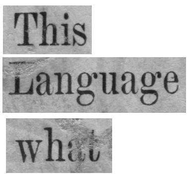
The second photo shows a larger image of some of the letters.

font.png
font2.png
It appears to be Century, cut in eight, nine, and ten point by L. B. Benton, at ATF, for the Century magazine. Quite likely it was cut later in larger sizes. It is shown p. 376 of DeVinne’s “Plain Printing Types” 1914. Also shown is Century Broadface which probably became Century Expanded. BB&S 1925, p. 20 and 38 show their Century Roman, but it seems to have shorter descenders than what we’re looking for.
Is the picture of the printer showing an Albion Press? If so it is from an English or Scottish foundry. It a modern rather than antique style face, with vertical stress rather than a diagonal stress. I would look for a Miller & Richards specimen or possibly Stephenson Blake or Caslon face from the 1870s or 80s.
Paul
This is not of the Century family. It is closer to a Baur Bodoni or Didot. One of the Modern transition fonts. It is however condensed and I can not find a condensed Bodoni that matches it exactly.
How about Monotype Modern Condensed in 1896 by the Monotype company in England. See Identifont.
I am making a guess here but is that not century schoolbook ? having looked it aint ,now i want to know as i have seen this very recently .
Paul - Thanks for your helpful suggestion. I do happen to have an old Miller & Richards catalog. It is not dated except for a revised price list dated 1910. The rest of the book looks older than that. I did find a font that shows only upper case samples and it is only labeled “24 point, no 4” and a “no 5” that is more condensed like the sample I posted below. I am not sure if it is the same font or if the difference is mainly in the fact that there is more bleed on the poster. I will look in my Stephenson Blake catalog too.
Have also posted the illustration on the other side.
(plug) The illustration is available on a card or poster in the Briar Press Zazzle shop. If you are interested, keep an eye out for one of their frequent 50% off sales.
printer.png
t.png
What about Barnhart Brothers & Spindler’s “Modern Roman Condensed”? The attached image shows a few letters extracted from the showing in the 1925 BBS specimen book.
Here’s a link to a scan of the entire (half-page) showing:
http://www.galleyrack.com/temp/bbs-1925-modern-roman-condensed.jpg
Note that this differs slightly from the (Lanston) Monotype face of the same name as shown in McGrew (and indeed it differs slightly within itself; the bracketing on the serifs of the ‘u’ differs between 24pt and 36pt).
Regards,
David M.
www.CircuitousRoot.com
bbs-1925-modern-roman-condensed-extract.jpg
The print is one I have, that is why the bit of doggerel seemed familiar. I suspect, without further info on the book itself, that it was an English children’s book. I doubt as to whether there were any Albions in this country until after the private press movement kicked into high gear in the 1890s.
Paul
Have been trying to follow this up without much success. As David points out, there are differences from the monotype face shown in the McGrew book and some differences in the BBS Modern Roman Condensed, but I am not adequately knowledgable in typography to distinguish enough of the differences to make a judgement, so I’ll have to be happy with Modern Roman Condensed or one of its earlier incarnations.
Thanks for the input.
Rather than searching on typefaces, I did a few minutes of looking around for text on Google, Google Books, the Hathi Trust, etc. Got it. It is:
Anon. _The Book of Trades_. London: Frederick Warne and Co., circa 1880.
Published as no. 6 in the series of Warne’s “Excelsior” Toy-Books. BTW, Frederick Warne is still around, now as a division of Penguin. They were famous, apparently, for publishing the Beatrix Potter books. Wikipedia has a page on them.
This book has been digitized by the State University System of Florida. This digitization is available at:
http://digitool.fcla.edu/R/QVLAMU1H62HFYYMR77K6MV2V9RP56QNQRJ8KG9ML2U9Q6...
Assuming that this link works for you, it should bring up a sort of a library catalog page with bibliographic information about the book and a thumbnail image of the cover of the book (which shows a blacksmith at work). Click on that to see the book itself. That (in Firefox, at least) brings up a new window with what appears to be a sort-of-proprietary online viewer for the digitization. This will have an expandable/collapsible index on the left. Click on the “+” sign in front of “Book of Trades” to expand to all of the pages.
The page with the text is page 2. Click on the ‘2’ and it should load up a PDF with an image of that page (shown however your browser is set up to show PDFs).
The page with the image of the printer is page 3. It is a decent digitization and a lovely image.
Regards,
David M.
www.CircuitousRoot.com
Great searching skills David. As I suspected, a British face must be the answer. Wish I had the type specimens to search through. I note that they did not reproduce the back of each picture page as the verse is printed on the reverse.
Any ideas from our cousins across the pond?
Paul
Ditto Paul’s remark. Due to time constraints, will put this on hold for now and hope that someone with the appropriate catalogs comes up with an ID.