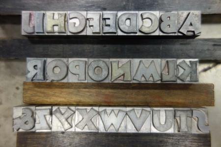
Can you help identify this typeface?
This is a typeface we have at SVC in Seattle and I’ve looked through McGrew several times and I’m stumped. Does anyone know what it is?
We have it in 36pt, 30pt, and 14pt. Upper case and #’s. No pinmark of any kind.
It has some interesting characteristics: the feet of the A don’t sit squarely on the baseline, and that S is very distinctive.
Any help appreciated!

mystery2_small.jpg

mystery4.jpg
This is called Ashley Crawford here in Britain. The original
Monotype design of c1930 has sharper ‘serifs’. Most founders produced variants and it was very popular in this country as a display face.
Hope that helps.
This version would be “Ashley Crawford Plain” according to Jaspert, Berry and Johnson.
Dave Greer
To perhaps explain why you couldn’t find this “Monotype” face in McGrew, it was issued by English Monotype, not Lanston Monotype (American).
It was designed by Ashley Havinden. A very cool font. I have Ashley Crawford Plain in my own collection.
Rick
Well done! Thank you, I’ve been curious about this one for awhile.
And to be specific… The name for the non-serifed metal version in this weight is “Ashley Crawford Plain.” Yes? As it looks like the digital version of this weight is referred to as “Bold.”
Thanks again!
I don’t know the name of the type… but I like it. If you decide to get rid of it, let me know. The 36pt would fit in well with my own work.
Don’t even get me started about the names of digital versions of faces. Often a complete cluster.
Ashley Crawford has very distinct and sharp serifs. Ashley Crawford Plain is essentially the same design without those serifs. Both versions are absolutely charming.
I probably should also mention that there was not a lowercase designed for this face. At least not by Ashley Havinden.
Rick
Rick
Sorry winking cat, it’s not leaving. It’s at the School of Visual Concepts in Seattle, and is regularly used in the letterpress classes. But now, I get to label the case properly and students will know what it is.
Thanks Rick. I know what you mean by the names of digital versions. Thanks for clarifying the details between the metal typefaces. I will label it correctly and then everyone who uses our shop will know what it is.
Cheers.