SB Verona Designer
Hi all!
I have acquired some Stephenson Blake Verona and am interested in learning more about the typeface.
Wikipedia and other online sources attribute it to Robert Wiebking. However, Wikipedia and other online sources on Wiebking do not list it amongst his designs.
I have found a single page ad for it, but that was of no help regarding the designer.
I’d be interested in any insights.
Thanks!
Greg
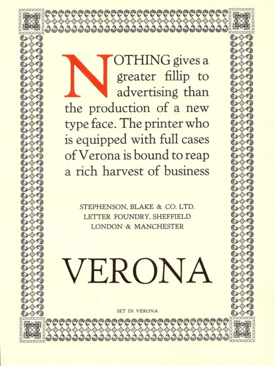
SBVeronaAdvert.jpg
The entry on page 232 of the book on SB by Millington is as follows.
Verona 1923
Acquired on advice of R.B.Fishenden from Leclede Type Foundry, St. Louis prior to its merger with Barnard Brothers and Spindler.
SB’s Verona is a direct copy of Wiebking’s Munder Venezian that was originally named Laclede Oldstyle issued by the Laclede Type Foundry in 1922. Laclede was absorbed into Barnhart Brothers & Spindler who sold the type until ATF closed the foundry. The mats survived until ATF’s auction in 1993, though I don’t think ATF ever offered the type for sale. I have the 18 pt mats as a gift from Theo Rehak, he also had the 12 pt mats at the Dale Guild. I believe some sizes are in the collection of the Smithsonian. There was a bold version as well along with the italic. I don’t think SB’s italic of the Verona was a direct copy. Nice type face, I have it in the full range of sizes of both Roman and Italic along with some of the bold.
Wiebking also cut the Engravers Roman mats and those are in my collection as well.
[Todays world has become so fast that in the time I was writing the note below there were two followup postings on this subject, one by Fritz Klinke (who has the ex-ATF mats). I’ll go ahead and post this, though, because while it now duplicates some of what Fritz and platenprinter said, it may supply some additional details of use.]
McGrew says that S-B copied the roman for their Verona from Munder Venezian (and drew their own italic). McGrew shows Verona in his appendix on imports, and Munder Venezian and its non-SB Munder Italic on pp. 226-227.
McGrew notes further that the italic, bold, and bold italic were designed (and one assumes cut) by Wiebking for BB&S and that the roman (“Munder Venezian”) was designed and cut by Wiebking for the Laclede Type Foundry as Laclede Old Style in 1922.
The Laclede Type Foundry has been treated rather poorly by history. It deserves a better reputation. It was the last type foundry started by Charles Schokmiller, who had a long history in typefounding and typecasting equipment. He did well enough to force ATF (via BB&S) to buy him out.
McGrew, though an excellent source, does not in turn cite his own sources. We have independent confirmation that Wiebking designed “Munder Venezian” from his obituary, written by Nicholas J. Werner. I’ve put this online at:
http://circuitousroot.com/artifice/letters/press/typemaking/history/punc...
McGrew says that BB&S “recut” Munder. That’s an odd term which implies extra work. They might have had to adapt the matrices for different casting machines. But we do not know what kind of machines Laclede was using (the Shokmiller type casters in Schokmiller’s earlier Western Type Foundry were pivotals) or what kind of machines BB&S was using. The matrices for Munder survive in the collection of Fritz Klinke, and he says that some of them were adapted by ATF for use on the Barth. [Or, more precisely, I have a distinct memory of him saying this in an e-mail or posting years ago. But he doesn’t mention this in his posting above, and his observation that ATF didn’t offer the type for sale suggests that they did not.]
Here are the Shokmiller casters that he built for the Western T.F. (not the Great Western T.F. of B.B.&S.) There’s a good chance that whatever machines the Laclede T.F. was using they looked something like this:
http://circuitousroot.com/artifice/letters/press/noncomptype/casters/sch...
Inline in this posting (somewhere) should be an ad by Laclede set in Laclede Oldstyle (it’s from a screengrab of a Google Books digitization of a page somewhere in vols. 27-28 of “The Pacific Printer.”
In any case, I hope this helps. Sorry about the duplication of material from Fritz’ posting. It’s a long path from Laclede Old Style to S-B Verona. [or perhaps it isn’t - the note by platenprinter suggests that the path was direct from Laclede to S-B] The attribution of the former (or at least the Munder version of it) is firm, though. Werner’s various essays are among the few truly accurate accounts we have of developments in typefounding in this period.
Regards,
David M.
www.CircuitousRoot.com
Trying again on the Laclede Old Style ad…
laclede-type-foundry.jpg
The amount of knowledge resident in the members of this forum never ceases to amaze me.
Thank you all for your help clearing up that mystery.
The degree to which typefounders just blithely ripped off each other’s designs also amazes me.
Greg
Theo came by the 12 and 18 pt Munder Venezian mats at the 1993 ATF auction. He took a break from the proceedings and sat down on a pile of matrix galleys already headed for the scrapper’s barrels and casually wondered what he was resting his elbow on and it turned out to be the 2 galleys of MV mats. He made an on the spot cash offer to one of the auctioneer’s people and a $20 bill bought both galleys. We have had several castings from the 12 pt mats and they were set up with the proper holes for use on the Barth caster. The 18 pt likewise is set up for Barth casting but Theo did not have the matching depth of drive mold for the mats, being about .007” off.
At one point some years back, I furnished sorts lines of the 12 pt to a fellow who had the SB Verona and the set width and alignment matched exactly between the two foundry products.
A sad note on the ATF auction is that so much of our accumulated type casting history was still sitting there in Elizabeth in ATF’s possession. Even with occasional purges of equipment and selling of obsolete mats for scrap to raise cash, ATF still hoarded an amazing amount of material. This has been well documented in various write ups on the subject. As a letterpress group, we were ill prepared with short notice to mount a serious effort to save ATF, and it was mired in debt and legal problems through the mismanagement of Kingsley. I entered the fray from long distance, asking Hal Sterne to bid on my list of faces and authorized him to spend up to the munificent sum of $500.00. It was a chaotic event, in extreme heat inside the building and an auctioneer from hell, and to Hal’s credit, he managed to buy for me the complete run of Bulmer Roman and Italic, and the complete run of Engravers Roman. The Bulmer cost $200 ( that figures out to $10 a font, 6 through 48 pt including 42 pt but no 16 pt), and the Engravers Roman came in at a staggering $20.00. I have often wondered what the balance of the $280 would have saved.
For the record, I have made a comparison of the three typefaces known as Laclede Old Style (designed by Wiebking for the Laclede Type foundry, St. Louis about 1922), Verona (Stephenson & Blake), and Munder Venezian (Barnhart Brothers & Spindler). Since I own a run of the original face, Laclede Old Style from 1922, I was able to compare it with published examples of the two later versions of it that were cast by S&B and BB&S.
First, none of the three typefaces are exactly the same, but all but a few of the letters appear to be exactly the same. A few variations, additions, and deletions were made by S&B and BB&S. Following are the differences I found from the original Laclede Old Style in my collection:
Verona: the lower case f has a shorter hook at the top; the lower case g has a slightly different hook at the top; the numeral 4 is closed rather than open; added the ae, oe, AE, OE ligatures, and the bracket [ , and parenthesis (.
Munder Venetian: Lower case g has a different hook on top; Upper case C has an added serif on the lower curve of the bowl; Upper case U has a hook or serif at the lower right side; question mark ? is different; the numeral 4 is closed rather than open; added alternate Upper case C, R, U—C and U are the same as the original Laclede letters, the R has a longer leg or tail.
Both the S&B version and the BB&S version seemed to have dropped the ff, fi, fl, ffi, ffl ligatures. There may be other subtle differences that better trained eyes than mine can find, but the three versions appear identical other than the differences noted here. In addition, the Bold versions of S&B and BB&S appear very close to each other, but the Italic versions are very different. The Laclede Type Foundry only made the original roman face, not the italic or bold. Sorry, I don’t have the ability to make scans right now.
—Bob
My run of BB&S Munder Venetian has all the fi ligatures 6 pt through 36 pt, and since I’ve been moving my collection recently, am not sure where the 48 pt is hiding.
Correct spelling is Munder Venezian for the BB&S face.
I’m learning a lot from this strand, thanks to all the contributors. SB Verona Roman did start off with a full-size hook on the f, which was kerned and necessitated the f-ligatures (visible in the sample from the OP above), but at some time the design of the f was changed to the ‘button-hook’ non-kerning variety and the f-ligatures disappeared. Looking at my SB catalogues and publicity material I’d guess that this change took place in the late 20s/early 30s, and certainly before WWr2. If I can I’ll try to attach an image of the different fs later, as I’ve got both types.
The SB Verona family is an curious assortment: the bold is not really like the Roman, the italic is new (it is not like the BB&S version I have seen in specimen books), and SB added a bold italic, a extra bold sometimes called ‘heavy’ and a bold condensed face, gradually throughout the mid-1920s (they did not all appear at once, I think). I’d love to know who designed all these additional faces.