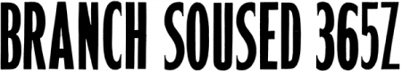
Erbar-style wood type ID
I’m trying to nail down, for documentation purposes, the original issue and original name (or number) of these wood-type fonts, which we have at the MInnesota Center for Book Arts. (Showings below.) There are showings of them in the American Wood Type Manufacturing Co. 1955-56 catalog, where they are labelled only as Gothic Nos. 733, 735, 737, 739, 741. (The catalog also shows unrelated series of “Gothics” with different numbers, so “Gothic”, in this catalog, is just a generic term.)
Some of the fonts have manufacturer stamps; these are all stamped “HAMILTON | TWO | RIVERS, WIS.”
No. 737 could be regarded as a cut of Erbar Bold, but the rest seem independent. The Erbar family appeared in the 1920s; this style of sans became popular only then (Futura, with its many knockoffs, being the best-known example).
I’m guessing therefore that the series was Hamilton’s answer to the demand for faces in the Erbar style, and that the fonts were re-sold by the American Wood Type company.
Does anyone know anything definite about the original issue of these fonts, or have a reference for what Hamilton may have called them if they were the originator?
Each weight in the series has, in addition to the normal solid face, a companion outline face, so the letters can be printed in two colors. The outline companion for each weight is designated by the same number as the solid face, with the word “outline” added.
I can find nothing closely resembling these faces in Kelly’s American Wood Type, or any exact matches for them (other than Erbar for the one weight) in McGrew or in Rookledge (1st ed.). There’s also nothing like it in Hamilton’s 17th ed. catalog (ca. 1907), Hamilton & Katz 1884, Heber Wells 1895, Page 1888—but these doubtless predate the font. (The series doesn’t appear in the AWT 1987-88 catalog.)
Showings (my first time uploading images here; hope it works)
No. 737
No. 739
No. 739 Outline
No. 741
No. 733

No. 735

No. 737

No. 739

No. 739Outline

No. 741
Hi Ken,
These were all cut by the Hamilton Manufacturing Company and first appear in their Catalog No. 38. The catalog is not dated, but I believe it is probably from around 1938 based on the design and layout and what is shown inside.
That being said this whole series of faces were named the Poster Gothic Series. They were all numbered. The odd number being the solid version and the next even number being the outline version of that face. Your No. 739Outline is actually No. 740.
In introducing this series at that time, Hamilton cautions that if you intend to use the solid and outline version for two color work, the fonts must be ordered at the same time. This is an extremely interesting tidbit, basically admitting that they could not guarantee an exact match between fonts cut at various times. They wanted to make sure that the operator cut both versions at the same to make sure the fit was right.
I never did think that the outline versions were cut with much precision. The width of the outline is a little shaky at times. The pantograph router is hand-guided which explains how this can occur.
It never ceases to amaze me that that people assume that one design can be regarded as a copy of another. No.737 is NOT a copy of Erbar Bold. And I might add that Futura is not even in the ballpark! This is the Poster Gothic series and was created by The Hamilton Manufacturing Co.
San serifs were in vogue at the time these were originated and they are unique unto themselves.
Rick von Holdt
Rick,
Many much-belated thanks for the information!
After a week or so without an answer, I figured my query had dropped off the radar, and stopped checking. I looked again just in time to incorporate the identification into the (semi-final for the moment) labelling and documentation for the wood type collection at Minnesota Center for Book Arts.
I see Hamilton Wood Type Museum issued a poster of the Poster Gothic face.