Any ideas?
It’s 12pt monotype type but no idea of the series/name?
any help would be great.
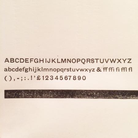
IMG_4572.jpg
ffi |
fl |
5m |
4m |
’ |
k |
e |
1 |
2 |
3 |
4 |
5 |
6 |
7 |
8 |
$ |
@ |
# |
Æ |
Π|
æ |
œ |
|||||
j |
b |
c |
d |
i |
s |
f |
g |
ff |
9 |
A |
B |
C |
D |
E |
F |
G |
||||||||||
? |
fi |
0 |
||||||||||||||||||||||||
H |
I |
K |
L |
M |
N |
O |
||||||||||||||||||||
It’s 12pt monotype type but no idea of the series/name?
any help would be great.
IMG_4572.jpg
I am not a sans serif enthusiast, but I can tell you it is an old design based on the crudness of the characters and most likely from English Monotype because of the pound sign and lack of a dollar sign. The Q’s awful design is also indicative of its age.
When folks are looking for i.d.s for foundry faces of this ilk, it is extremely helpful to also mention the point size. The punches for those faces were hand-cut and there can be an enormous difference in different sizes. Monotype, on the other hand, engraved all of their matrices with a pantograph so all sizes were generally derived from the same pattern.
Rick
Cheers Rick,
I think it’s Grotesque 51 but need to confirm it but it looks to be right and I don’t mind the Q myself haha but have certainly seen nicer!
It’s Gill Sans isn’t it?
I have it as Record Gothic, on Ludlow. I did think it was Tempo, but the cap M is the variant, for me. Its similar to some early non-letterpress strike-on fonts.
Ludlow’s Record Gothic is different.
The font shown appears to be Grotesque No. 2 - #51 English Monotype.
Michael
www.nickel-plate-press.com
If we’re going to be really pedantic (and I can’t think of a better place to do it), then Michael’s *nearly* correct - it is indeed Monotype Grotesque, series 51. It’s not “Grotesque No.2”, though - that’s series 33.
nick
Also being pedantic (and to get a bit of accurate information out into the world … )
Rick (@foolproof456), you’re nearly right: English Monotype don’t engrave matrices, they cut punches which are then used to strike matrices. Those punches were (and indeed are) cut on a pantograph, but different sizes aren’t cut from the same pattern. There are exceptions, but there tends to be one pattern for one sort at one size. I have no experience of US Monotype, so I can’t speak for them.
You *may* be getting it mixed up with engraving mats directly (as ATF did), where the same pattern *was* used for different sizes.
n
Thanks for the info on English Monotype practices. Definitely different than Lanston Monotype.
I have been studying and absorbing what I can for forty years (and I started when I was 30!!!!). The absolute truisim is that “The more you know, the more you realize that you don’t know.” I just LOVE this stuff. I am by no stretch of the imagination and expert on anything, but I do try to pass some of my limited knowledge on to others to try to keep the knowledge and the craft going.
Rick
Rick - you’re absolutely right. I’m a relative newcomer, and there’s a lot to learn. It’s places like this that are ideal for people to find stuff out; besides, who else is going to be interested in how Monotype mats are made?
Keep up the good work
n
Information in my post above (Monotype Grotesque No. 2, a.k.a. English Monotype #51) was taken from the Swamp Press type catalog.
See photo.
Michael
grotesque2.jpg
Michael: it does say that, doesn’t it? I’m afraid it’s not accurate though; mistakes do happen. Would you be interested in seeing the UK Monotype specimens? They’re currently in my sleeping daughter’s room though …