Ornamented Metal Type Identification
Hello, I have an ornamented face that I would greatly appreciate help in identifying. I’ve scoured through various digital and physical type catalogues and have not found what I am looking for.
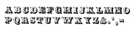
I found a match in Nicolete Gray’s “Nineteenth Century Ornamented Typefaces”. It is typeface 82 in the back of the book however the only identifying information attached is “Blake & Stephenson, c. 1841. German 1834”.
I am searching for a name, even if it is “Ornamented #XX”, and perhaps the source (such as which specific Blake & Stephenson catalogue the information is coming from).
I could not get a good picture of the metal type which I apologize for. I can try to get one however if it will help in the identification. The actual metal for this type looks fairly new so I am unsure if another foundry has acquired the matrices to make the type that we have.
OrnamentedTypeface.jpg
OrnamentedTypefaceCloseup.jpg
You didn’t say what size of type this is, but I’m willing to bet it is 18 point cast on 24 point bodies. In the late 1970s the Division of Graphic Arts, Smithsonian Institution offered a revival casting of this face, only calling it Two-Line Ornamented. It was cast by the Out of Sorts Type Foundery of Larchmont, NY and sold to interested printers for $15.00. I have the original flier for the offering. They offered a revival casting of an 1820s shaded face on the same flier. Here is some of the description:
Both of these faces are cast in matrices that pre-date the formation of the ATF [American Type Founders Co.] in 1892; we do not know which independent foundry they came from.
The Ornamented is cast in early electrotyped mats … with a drive of .081 inches. Presumably the electrotypes were made by one foundry on type acquired by another, with or without permission. This face was shown by several American foundries, the earliest we have found being the Cincinnati Type Foundry (1853). A similar face was shown by the English Blake and Stephenson in about 1841, and an even closer but still not identical letter is in Hass’ specimen in the 1834 Journal fur Buchdruckerkunst.
-Bob
Thank you so much for your assistance Bob! You are correct that they are 24 point bodies with letters that seem to be closer to 18 point.
Thank you for the extra information as well. It is great to learn more about how and why the typefaces was made. I am currently working with local rare book collections to obtain a copy of the flyer you mentioned. If I am not able to obtain a copy would you be willing to take a scan of the specimen samples at your earlier convenience?
Just as a follow up, I was able to obtain a copy of the flyer from a local library. Thank you so much for your help and assistance Bob!
Of course Nicolete Gray did her primary research at St Bride Library in London - and the specimen books she used in the 1930s still bear testament to that. For the first edition she traced all of the specimens in pencil, using tracing paper and a SHARP pencil. The pressure lines can still be clearly seen on some of the pages of the original specimen books.
I checked the Stephenson Blake 1842 specimen (St Bride does not have an 1841 edition, so I suspect that this is the one used by Gray). As you can see from the attached image, SB&Co gave the face the rather unimaginative name of “Tuscan” - a title used for many other faces. It seems to have been available in just two sizes, equivalent to today’s 18-19pt and 24pt respectively.
BOB RICHARDSON, ST. BRIDE LIBRARY
SB1842.JPG
Thank you to Tom Colson for pointing me to this discussion. I have a font of the typeface in my collection and was trying to identify its source as well.
I would very much like a copy of the flier about it. Would either of you be able to provide one?
-TH Groves
Here is a quick proof of my type.
IMG_20220920_170841_947.jpg