Font Identification
I’m fortunate enough to have some of the leftover stationery from my great-great-grandfather’s machine shop, and was wondering if anyone could identify the font used for it? If I understand correctly, the stationery would be from the early 1910s or 20s. I’d love to get my hands on a similar typeface to print with! Thank you.
P.S. I do have a higher quality image if need be—I just couldn’t get it to post to BriarPress!
584229632.196232.jpg
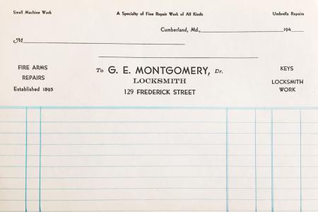
Looks like the Intertype face Vogue to me, which is set on a line-casting machine rather than by hand. There is a modern digital interpretation:
https://www.myfonts.com/fonts/millertype/intervogue/
The cap “E” and “R” in “Montgomery” look closer to Bernhard Gothic (maybe?) - not sure about the rest though.
The main typeface is Bernhard Gothic and that dates the printing to the 1930s or later, not the 1910 or 1920 era. And that was a hand set face.
Also notice the date line in the upper right corner reads: “194___.” I would guess that gives you a definitive clue to the decade this piece was printed.
Thanks all for your keen insight into this—I appreciate it! Looking forward to doing some more exploring into Bernhard Gothic…
I have so much material from the business during the 1910s period, and hadn’t looked at the stationery closely in quite some time other than quickly posting it. Next time, I’ll make sure to double check before I make a poor dating estimate. :)
The G,E and R are good matches for Bernhard Gothic, but the M is not.
It could be upside down cap W used in place of cap M. It appears those are slightly below the base line and perhaps the cap M’s were already in use in other forms. Since it is a 1940s form, the printer may have been up against war time restrictions on ATF type since new type production was restricted. I saw the actual production records for the late 1930s for ATF and their production was in excess of 2 million pounds of type yearly going in to the war. Those records are now at RIT. Apparently this printer didn’t get his share in time.
Fritz, as always you are likely right - look at the “M” in the word locksmith: a capital letter, but with straight sides and not slanted sides.
lad
Sorry to burst everyone’s bubble, but here is a scan of Bernhard Gothic Medium (which I believe the sample above is printed in) from the 1955 ATF specimen book. Notice the M matches the form shown above and the W turned upside down cannot create the proper M. Only the Bernhard Gothic Light has the center strokes on the M meeting higher up. The Medium and Bold versions have the strokes meeting at the base line.
BernardGothicMed.jpg
Parallel_imp had it right with the first posting.
The sample shown uses Intertype Vogue. Look in MacMcGrew’s book to see the amazing versatility of this face!!!!!!!!
They tried to cover ALL THE BASES by providing a myriade of alternate characters so that it could mimic Futura, Bernhard Gothic, Kabel and Tempo. A brilliant ploy actually.
This was offered in the early 1930s. This fits right in with your sample which is set-up to have dates in the 1940s filled-in.
Rick