A “Little” help, please
Recently I acquired some cases of type, including at least one small font. The case is labeled 8 pt. Craw. But the individual letters within vary in size of body they are on. Some are clearly 10 bodies , others appear to be on 8 bodies.
In reading prior posts here and checking the M & H site, I understand sometimes smaller fonts are cast on larger bodies. I wonder if that is what I have here?
I’ve hit a roadblock finding out information about the Craw font, or pictures to compare it to for a positive ID, one complication is the material I acquired included complete sets of Spartan in 12 and 24. These little letters look a lot like those Spartan ones to me. Maybe I’ve just been staring too long through the magnifying glass!
Since beginning to research pin marks, I’ve become more interested in the years various fonts were developed and where they are from. I have some spacing/ quads with pin marks from foundries prior to ATF: B B & S Chicago and Central Foundry. So I’m curious about if I do have Craw and if so could that be an older font or a more pedestrian one?
Thank you for your thoughts,
Adrienne
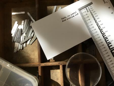
B2923D02-5863-4C67-960E-E8A1FECDEBBC.jpeg
Craw is in the Clarendon family of typefaces, so rather than being sans-serif as in the shown proof, it has bracketed slab serifs.
M&H does sell type on larger bodies: either because it is an odd size on an even body (9 point on 10) or because it is an imported Didot point-size face on an American point-size body. British Monotype book faces often are cast this way at M&H.
I have seen instances where say 8 and 10 were mixed to get a cap and small cap style where true small caps were not at hand. I’ve also seen cases that were mislabeled.
Freeman Craw was a designer for ATF near the end of their existence, and he designed a couple of faces that ATF cast for a while. One is Craw Modern, another is the Craw Clarendon series, and I think he had some other less popular faces as well.
Bob
To my knowledge, Freeman Craw never designed a geometric sans and your instinct is right that it’s very similar to Spartan, but that Futura knockoff did not have the tell-tale question mark of the original. (See the image below from the first Futura specimen held at Letterform Archive.)
So I think you’ve got Futura (or a different knockoff) there!
Futura-alternates-web.jpg
33960426965_86a14fd8ce_o.png