ID Help Serif Typeface w/ Lots of fractions!
Hi,
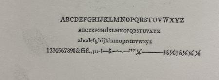
Any insights. The q tail is a defining feature as well as the double story G esp how the bottom seems to sit “flat” at the bottom. Did Identifont and it came up as Gazette, but the Q is different Gazette than as proofed.
Thank you for your help!
IMG_0546.jpg
typeface.jpg
Could you post a bigger picture? It is hard to see. What size is it? It looks like you might have two fonts mixed together because the upper case J, L, N and W are bigger than the rest and don’t seem to align well.
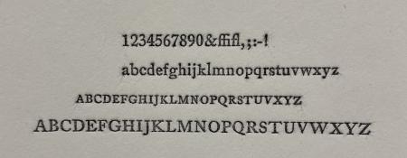
attached is an updated proof, this typeface is so small 8pt and all the letters are correct (took out the fractions because the nicks don’t align)
typeface.jpg