Interesting mystery type
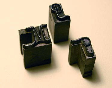
Can anyone identify the attached typefaces? I have a full-sized California job case that has three typefaces in it. The largest (36 point) is very interesting as shown by the photo of the three sorts (M, P, T). The capitals are set up in such a way so you can set the lowercase INSIDE of the capital in several instances. The M has the protrusions at the top and bottom. The P & T have one at the top or bottom.
My question is “Do you know what the typeface is from the photo of all capitals?” That is the 36 point.
Then is the second typeface part of the same font. As an 18-point font it will fit into the larger type, but also has its own capitals which don’t match the 36 point.
There is also about a 10 point type which I didn’t get proofed today.
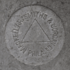
The font was from MacKellar, Smiths, & Jordan as you can see from the pin mark.
An interesting element about the 18 point type is that it is all kerned at the top so there is an overhang along the entire top of all letters. This appears, as best I can tell, in the original production of the type and isn’t something done later.
mystery-type-sorts.jpg
mystery-type-2a.gif
mystery-type-2.gif
mystery-type-1.gif
Here are two more photos showing the lowercase of the second typeface shown above.
The first image shows how the type fits into the uppercase M.
The second image shows the overhang at the top of all of the sorts.
MacKellar-type-top-kern.jpg
MacKellar-type-inset.jpg
I wonder if the triangle was common to more than one Philadelphia typefoundry. MacKellar, Smiths & Jordan (obviously) used the triangle, but Practical Typecasting (Rehak) also has a triangle noted as just ‘Philadelphia.’
It isn’t one of the digitized faces from that foundry…It doesn’t seem to exist online.
It shows some stylistic similarities to Stationers Semi-Script (McGrew 290), but I’m not finding it in that book. Perhaps I took too quick of a look through.
You have introduced a more serious mystery than usual. The face, I suppose, could antedate the purview of McGrew’s book. It appears that the face was cast on a pivotal caster and hand-dressed, rather than a later Barth-style machine, though I have never operated either, so could be making poor observations…
If it turns out this is a mystery to others on Briarpress, I would be willing to do a little digging…It might also be interesting to do a proof sheet for scanning and digitize the font with Fontlab.
Oh, and a possible answer might reside within a book by Doug Clouse:
http://oakknoll.com/detail.php?d_booknr=96669
UPDATE:
Download this:
http://www.archive.org/details/specimensofprint00mackrich
The PDF is of OK quality, though OCR on specimen books is not a good idea…
That should have your answer.
So it’s 18 pt Pencraft - 3 line nonpareil on page 56 of the specimen book, right? It’s gorgeous, lucky Lead Graffiti.
According to Annenberg’s Type Foundries of America and Their Catalogues, MacKellar, Smiths & Jordan only operated from 1867-1892 (and then became part of ATF), so that would explain why this font doesn’t appear in McGrew.
Of course there is a BB&S face of the same name in McGrew, so that’s nice and confusing.
Thanks so much for the “TSI” (Type Scene Investigation) work. Might make a good TV spin-off. After looking through a lot of the “Compact Book of Specimens” they had some really nice faces that would be fun to digitize.
I’ve put up the photos and collected some information on our blog.
http://blog.leadgraffiti.com/?p=106
Anyone else out there have any of these type of mortised typefaces to share with us?
Pencraft was designed by Herman Ihlenberg for McKS&J and was patented on September 29, 1885.