please help identify strange typeface
I have recently embarked on my first letterpress project, using a 10pt font which was donated to me, covered in cobwebs and mouse droppings, from the basement of my local printer. This is an attractive, rather quirky font, distinguished by a tight, pointed scroll in some of the characters, especially a, c, f, r, j and y. I would love to be able to say, in my small publication, exactly what typeface I used, so would be very grateful if anyone out there could put a name to it. I have attached an image of some of the characters.
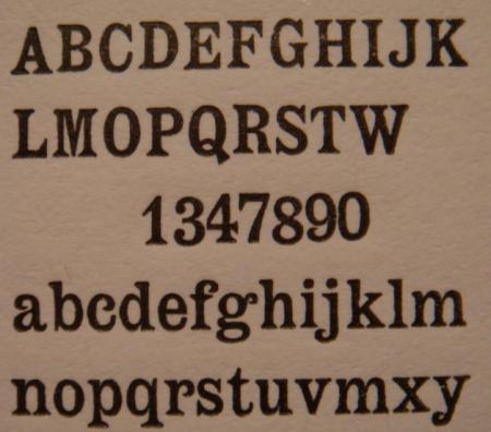
quaint font.JPG
Could it be PT Etienne?
http://new.myfonts.com/fonts/paratype/etienne/pt-etienne/
Looks to be Modern Antique. That is what the face is called in my 1898 American Type Founders catalog. I suspect that more than one foundry may have offered this design, as they also did with the somewhat similar Latin series of faces.
Can you tell me what the pinmark looks like or says???? That would be extremely helpful in absolutely nailing this down for you.
I should have looked at the first response before I answered. Indeed “Etienne” could be your face, but I believe that what is being shown is a digital version of the original metal typeface. For authenticity I would prefer the original name.
I never cease to be amazed at the hutzpah of some of our modern day type designers to basically digitally copy some of these antique marvels and claim them as their own by renaming them.
I have both 24 and 30 pt. foundry fonts of Modern Antique in my shop as well as two all-cap fonts cast in brass that were used for hot-stamping book covers. This was a very popular and much-used design a century ago.
Thank you very much for these comments. My font is indeed virtually identical to the PT Etienne font, but, as it has been mouldering in the basement of an Edinburgh print shop for many a decade, I would say it is pretty old.
I will certainly try to determine the pinmark later today, and post it on the website.
Many thanks.
Hi, If its from Edinburgh its quite likely a Miller and Richard typeface as they were founding in Edinburgh. I have it in my 1887 specimen as Old Style Antique No. 8. But this style in the UK is also referred to as Latin and is available as this condensed and wide latin which were Stephenson, Blake faces. The type may well have the name Richard on the shoulder especially on the bigger sizes. (Why not Miller and Richard I don’t know!). Jeremy.
I have now checked numerous bits of this type and have been able to find no pinmark or any other kind of identifying mark at all (I have it only in 10 point).
I would like to thank everyone who has contributed to the identification of the type. Your help has been immensely useful to me. And your knowledge is astounding!
Out of curiosity, I went through several old foundry catalogs in my library last night just to see how often, and under what names, this face appeared.
Albion confirmed that the face appears as Old Style Antique in the 1887 Miller & Richard catalog. I have a marvelous type specimen book from the Edinburgh printer Neill & Company, Ltd. dated 1905 that confirms the face was from M&R, but their specimen was simply named Antique No. 8 by that time.
In the U.S., there were several foundries offering this design as well, and under different names!
It is shown as Modern Antique in my 1898 American Type Founders catalog, my 1899 Barnhart Bros. & Spindler (Chicago) catalog, and my 1900 A.D. Farmer & Son (Boston) catalog.
It is also shown as Latin Series in my 1907 Inland (St. Louis) catalog, and finally it is listed as Lining Modern Antique No. 3 in my 1909 H.C. Hansen (Boston) catalog.
It seems to have been a very popular design!!!!
I will tell you that when I first found my two fonts, I had assumed that I was purchasing Latin. It was only later that I found my fonts listed as Modern Antique from ATF.
So you have your choice of names to choose from!!!!
The one name I would NOT give it is Etienne. The PT Etienne face was ‘created’ by ParaType font foundry as a digital version of an existing font. Why they chose the name Etienne is beyond me. Of course Modern Antique does not really describe it well either, but I use that name simply because that was the moniker that ATF originally gave to it, and I like to stay historically accurate. If I had never found a reference to it, I would have automatically called it a Latin.
It may well have been offered by even more foundries, but those are the ones I found last night.
Foolproof546 - thanks for that wonderfully detailed reply. I was left somewhat puzzled by the earlier discussion, but you have now clarified matters by confirming that they are inherently hazy anyway, and that I will have a choice of what to call the font when I come to that part of my publication.
I haven’t quite yet settled on which of the aliases I will identify it by, but it will not, as you suggest, be Etienne, as that seems to be a more modern realisation of the design.
Thank you very much for the attention you have given to my query - much appreciated.