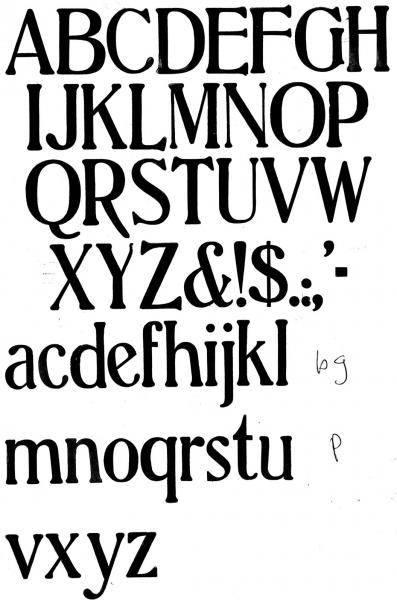
Identify Hamilton Wood Font
I am trying to identify this Hamilton wood typeface. This is a 7 line example. I am trying to replace the missing “b, g, p” using photopolymer.
Any help would be appreciated.
I am proofing the wood type collection at the Genesee Center for the Arts and I want to be as complete as possible
UnidentifiedWoodFont150.jpg
Hi Bill,
Your face is Schoeffer Old Style and is shown in Hamilton’s 1906 catalog. Unfortunately the b, g and p are not displayed there. This face was designed by Herman Ihlenberg for the foundry of McKellar, Smiths and Jordan in 1897.
I am hoping that with this information someone who watches this site might have a font of it in wood that they might be able to pull a proof of the missing characters for you. If that does not materialize soon, I do have a font of 36pt. Schoeffer Oldstyle that I could pull the proofs for you from. Obviously it would be much better to have a larger size to start with.
A condensed version of this face was later cut in 1902 in both metal and wood and curiously, instead of being named Schoeffer Old Style Condensed, it is named Adver Condensed. Go figure!
Update: Before sending this, I just went into my library and have discovered a better alternative. My 1912 ATF catalog has a nice showing of Schoeffer Oldstyle (they did not split Old Style) and it displays a 60pt. b and p and a 48pt. g. They would be a much better staring point for you.
Unfortunately I do not have the capability of scanning that page (page 490) for you, but perhaps someone else can help you on that.
Good luck,
Rick
Thanks Rick.
I have the 1912 ATF Book and its binding is broken into several sections so I am easily able to get to page 490 and scan it.
I have looked for this font off and on for a few weeks.
Bill
Instead of getting the missing sorts made in photo-polymer, consider getting them cut in thin plywood or perspex and mount them on thicker plywood to get close to type height. I did that a few years ago, a P was missing and I used the R as a model to work from. A small company doing name plates and engraving used my retouched print as a base to work and cut them perfectly clear (and strong).
Bill,
Greg Ruffa shows the caps of Schoeffer Old Style on pg. 290 in his book, The Art of Wood Type, along with both styles of the cap. R. His face is mis-named and is listed under, Poster Clarendon. You might want to contact him to see if he has the lower case and any of the characters that you are missing. Wood-Type specimen books are notorious for not showing descending letters in their specimen lines. Greg’s web-site is: www.theartofwoodtype.com and his contact address is there.
Dave Greer
When we were reviewing the type faces in “The Art of Wood Type” book, no one that checked the faces apparently knew the name. As luck would have it, Rick gave me the name, after the printing. Aside from the apology for the misnomer, the style is notable. My font has very few of the l/c if any, but I can suggest a guide to the characters b, and p can be close to using the existing d and q and flip them to the b and p positions. The g is usually treated differently. Sorry, I can’t help with the “g”.
Greg Ruffa
Wait a minute! Rick (foolproof546) was nice enough to ID this font for me in my collection. The ‘g’ is particularly cool, and can be seen here:
http://www.flickr.com/photos/pearcetrip/4677320542/
Let me know what I can do to help :)
Leslie