Shaded Font Identification please Chicago Type Foundry.
If I just had a clue I might have been able to find this without the help of you fine folks on BriarPress. I always feel you must have better things to do than to have me bothering you.
That said, here is a font that has Chicago Type Foundry pin mark - Also appears to have 2 styles of letters on the lower case ‘a’ (on bottom of pic 1) & ‘s’ (mixed in with font). Not sure if this is correct or if the extra letters were put in the type drawer in error and belong with a different font.. - Thanks for any and all help. - Paul - prying1 -
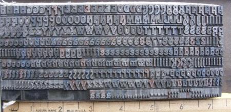
shaded font 01.jpg
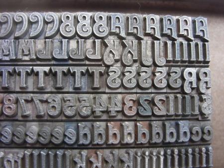
shaded font 03.jpg
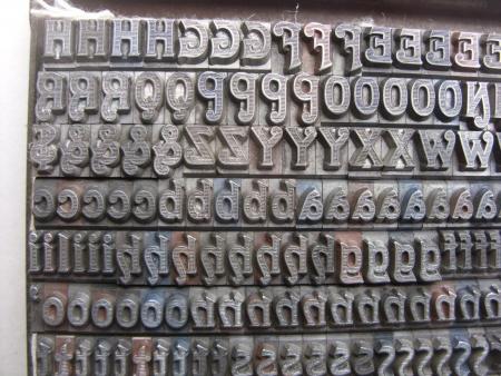
shaded font 04.jpg
Paul,
What you have here is a face called, “Halftone”. I don’t have any other information on it. It is shown in ATF’s combined specimen book of 1896, on page 475, but I did not find it in Marder, Luse’s 1890 specimen book, so the period 1890—1896 is as close as I can make it.
Dave Greer
Paul,
I might add, that the a’s, at the bottom of photo 1, may belong to a face called Lithotint, cast by the same company, but they are difficult to see. They might be better identified if you had shown a close-up. There did not seem to be an alternate a, shown on the specimen book’s page, but there was the alternate s. There were three sizes of both Halftone and Lithotint shown; 18, 24 & 36 pt.
Dave
Thanks T.J. That helps a lot.
I found a web page that has down-loadable charts of font names and ATF/BB&S catalog years/ID numbers/page numbers that I’ve found to be handy. Hope others can find this handy too. it runs from 1897 to 1971 and includes McGrew’s
- http://www.aapainfo.org/atf/ -
Don’t know how accurate it is but I’m trusting it is.
The charts shown do not go back to 1896 but do handle 1897 on and it shows ‘Halftone’ as also being in the 1899 catalog page 321 . - The Lithotint is listed as being in the ATF catalog 1897 page 192.
I’ve attached a better shot of the lc alternate (Lithotint?) ‘a’s which also shows the ‘s’ alternates a bit better.
Also I’ve noticed that some of the periods shown in this shot are a bit different. I’m wondering if I have another type drawer with the Lithotint buried in my piles of stuff. Guess I’ll have to keep on digging to find out.
Thanks again - Paul - prying1
Halftone 06.jpg
Paul,
Thanks for the improved view of the lower case a’s, at the bottom of photo 1. They do appear to belong to Lithotint. What size is the font, 18 pt.? I did not see any punctuation in the specimen book, but a shop that had two similar shaded fonts often mixed them. I bet a couple of those periods belong to Lithotint, as well. Thanks for that reference!
Dave