Anzeigen Grotesque/Aurora Bold Condensed
I have another good-size font that I’m hoping to sell at the Los Angeles Printers Fair. It was labeled Aurora Bold Condensed, which is in the “Popular Imports” section of McGrew with the notation, “AURORA (Weber) Condensed (or Inserat), Bold Condensed (or Anzeigen Grotesque), many others.”
I don’t understand McGrew’s note, and I would like to find out who designed and cast my particular font. It’s 42 point and appears to be foundry type milled down from a European height. It has a single nick and no pin mark.
The Linotype digital foundry offers an Anzeigen Grotesk, which looks very similar, and says that it was designed in 1943 by the Haas Type Foundry (Haas’sche Schriftgiesserei), which was a Swiss manufacturer of foundry type, located first in Basel then relocated in the 1920s to Münchenstein. Is this where my type came from, or is there no way to tell since McGrew’s note includes that expansive phrase, “many others.”
Here’s a higher resolution photo:
http://www.flickr.com/photos/lunadabayletterpress/8018080504/in/photostr...
Barbara
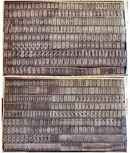
Anzeigen Grotesque 42 point, small file.jpg
Having completely messed up the discussion of the previous font Barbara posted about, I’ll enter this one with some trepidation.
Aurora Bold Condensed is listed (and very briefly shown) as an imported face in a specimen of Amsterdam Continental Types, Inc. (an importer):
http://www.circuitousroot.com/artifice/letters/press/noncomptype/typogra...
Note that it is listed there as “Didot body only.” It wouldn’t hurt to take a micrometer to your type to check whether it’s American or Didot.
Jaspert/Berry/Johnson isn’t really that helpful here. On p. 13 they distinguish the Aurora of Mergenthaler Linotype (1960) from the “quite different” Aurora of the Weber foundry. But they don’t show Weber’s “Aurora” - they just say that it is the same as Normal Grotesque.
However, the Normal Grotesque the show (p. 314, Haas and Linotype (Frankfurt)) is not the same as yours - e.g., the bowls of the ‘B’ and the “tightness” of the ‘S’ differ - but there is no condensed version, which could explain these differences.
They do, p. 310, show a “New Aurora Grotesque” (Weber, 1966) based on these which has bold condensed and extra bold condensed versions which are very similar to yours.
Here are links to temporary, low-res snippets of the relevant bits from JBJ:
http://www.galleyrack.com/temp/jbj-314-aurora.jpg
http://www.galleyrack.com/temp/jbj-310-new-aurora-grotesque.jpg
Jaspert, Berry and Johnson’s “Encyclopedia of Typefaces” is still in print, and quite inexpensive ($22.93 on Amazon). It’s worth getting.
Regards,
David M.
www.CircuitousRoot.com
Thanks so much, David. (And really, your comments are always appreciated, whether or not they are superseded by additional information. This is a discussion forum, not an exam.)
Thanks for asking me to mic a sort. It’s not 42 points (labels lie!). It’s 0.5295 inches (13.45 mm). According to my online converter, that’s 38.4266 American/British points or 35.6745 Didot points. My micrometer might be off, though it’s a pretty good one (a Mitutoyo Digimatic). I wonder what point size it’s supposed to be???
And thanks for posting the pages from the Amsterdam catalog and JBJ. What I have seems to match the “Aurora Bold Condensed” in the Amsterdam catalog, and indeed that’s how it was labeled when I bought it. Further evidence is that it’s not a British/American point size. But that still doesn’t tell me which foundry cast it or anything about the designer.
So, unless I find out more, I guess I’ll just tell interested parties that (1) it was cast by a European foundry and milled down to 0.918 inches (that checks out), (2) it was probably imported by Amsterdam Continental Types, Inc., and (3) it measures 38.4 points and can be used with 36-point spacing.
Barbara
I think your types are the new version, Aurora Bold Condensed from approx. 1966, of Weber’s Aurora-Grotesk Garnitur IX http://www.flickr.com/photos/bogtrykkeren/8022640423/in/photostream . There are some major differences in the design of especially the upper case in the two versions, but that could be explained with an attempt to get the old design to fit the new trends in the mid of the 60 - New Aurora Grotesque regarding to Jaspert. If you take a look of your lower case t you can see the original Aurora version from Weber.
If you compare with Fette Anzeigen-Grotesk from Haas http://www.flickr.com/photos/bogtrykkeren/8022642726/in/photostream/ you will see the same upper case as in your version, but not the correct t. Haas and Weber worked together with Stempel and their types was sold by Amsterdam Continental Types in the US.
BTW, the original version of Aurora-Grotesk Garnitur IX is probably cut by Wagner & Schmidt in Leipzig.
Gott grüß die Kunst
Jens
Thanks, Jens, for the additional insight and for posting those two specimens. Yes, my uppercase letters do not have that Hobo-like swell of the Aurora-Grotesk, though my lowercase t’s do have the slanted top and shorter extension above the crossbar. My uppercase is definitely more aligned with the Haas design, though my lowercase is not as elongated as the Fette Anzeigen-Grotesque. I think I will just have to refer interested parties to this discussion!
The biggest problem I have with selling type is that the more I find out about it, the less inclined I am to sell it. :-)
Barbara