My parents 50th
Hi all,
I’m looking for general feedback. Any advice will be appreciated. Not necessarily heeded, but absolutely appreciated.
I’ve been a lurker here since a little over a year ago when, out of the blue, I gained a acute interest in letterpress. Since then I’ve managed to acquire a C&P 8x12 Old style from two centuries ago. It was mostly disassembled and had missing and broken pieces, but last spring was able to get her to the point where I could print using the seven or eight trays of type that came with it. I’ve had several projects since then. The main goal, however, was to print the invitations for my parents upcoming 50th wedding anniversary. I wanted to print them from photopolymer and use a variable speed motor, which the press didn’t come with. Although it did have the motor mount and the right side .drive pulley. It turned out the biggest hurdle was getting and using some DTP software. Once I got past that hurdle (I use the Adobe CS2 suite) it’s all come together and I’ve been able to finish printing the invitations. The only thing I didn’t get done was the drive (which is all ready, but I accidentally bought the 220 input drive instead of the 115. oops. But my motor, pulley and drive belt are ready to go when it shows ups in a day or so.
Anyway, there’s absolutely no way whatsoever I would have been able to get to this point without the people on the other end of these webs. Thank you.
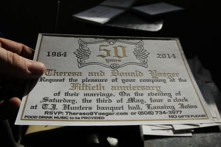
The invites are on #220 Lettra fluorescent white and printed in two color. Metallic Gold (thanks ink in tubes guy) and black. The typefaces are free downloaded copies of Wedding text and a little copperplate. The swirly thingamajig around the “50” is a character in a font of calligraphy frames. I’m using a 6x9 boxcar deep relief base and KF152 Plates. Before putting the metallic gold on the fluffy Lettra, I first made a kiss (or the best I can do) impression of a Varnish and put the gold, and the punch, on a second run through after a day to dry. For the black, I used the: tape the plate where you want it and close the press on it. It worked.
I also video recorded it and spent the last two days learning the basics of video editing and have uploaded a (not all inclusive) video to YouTube. Please check it out and let me know what you think. Or better, ask any questions. The link is http://youtu.be/NE32Eh8Ya0M This is my first post so I’m not sure how to get links in here. Sorry.
Rich
IMG_0030.jpg
Well done and masterfully executed.
The one part that really stands out and weakens the work, is the RSVP stuff in the bottom. It fits awkwardly, and feels like a late afterthought.
Just look at how much better the card breathes without it.
There’s an old design rule that can improve almost any work: If it doesn’t strengthen the design - take it out. If you can’t take it out (the information is essential) change the design so that it would no longer benefit from the removal of that part.
cip.jpg
Just a quick observation. Anniversary is missing the v! yours reads anniersary!
You have double the word space you need.
You can upper case the “A” in “anniversary”.
An ampersand would draw
Theresa & Donald closer together.
Otherwise, nice job.
Calvert
Kansas City
Good eye. It took me a while to see it too. Let’s hope nobody else notices. Please don’t call or email my mom. :)
Thanks for sharing!