Strange Type
Or is it me? This is the oldest type I have, and I’ve noticed much of it is worn. There were also some random letters from other type families in the case, which I’ve had to pick through.But it may be something I’m doing. So, from the photo below, is this an inking problem or could it be that some type is thicker/thinner than others? (The “g” in blessings and the word “be” are wider than the rest) I’ve tried several different things, but I’m not pleased with the end result. Can anyone tell what’s wrong from the photo? Thanks for any help. Susan
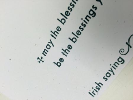
IMG_2106.JPG
Looks like Futura medium, with some bold mixed in (the lc ‘e’ in blessing (1st line) the word be, and the ssings of blessings in the second line.
The nicks of the two faces should be different (well possibly). Unless you made ready under the heavier letters (that they are smashed) there would be no reason why type of a common face would do this, ergo: there are two faces involved.
Thanks, Mike. I was wondering about that. I looked closely at the locked up form, and sure enough— some looked bold. I guess I need to go through the case and clean it up. No make ready, so it was either ink or the type itself. Thanks again.
You don’t find this too often, but if the type case had been in a school at some point in its former life, it is highly likely that the students distributed close-but-not-right type into that case simply because they weren’t paying attention or more likely didn’t care.
When you set a line. make sure that the nicks are perfectly lined up. Those that don’t perfectly align are your first clue as to wrong fonts.
Rick
Thanks, Rick. I’ll check tomorrow. Now I’m curious…