Delittle not 0.918
Do any of the clever and much more experienced letterpress people know why a ‘Delittle’ font would be well over 0.918??? The ‘A’ is pretty close but I think that’s due to wear, the rest of the letters are between 0.929 and 0.921 (as demonstrated by the ‘M’ in the picture. Didn’t think Delittle made continental-type-high type, or am I wrong? Any suggestions/ideas welcome. Thanks.
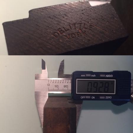
image.jpeg
Unfortunately from entries some considerable time ago and earlier still even, on B.P. it appears that Your .929, figure is Continental Type Height (probably French)….. Maybe Your Delittle, were forward thinking and manufactured Wood Letter for overseas.!
If hopefully, our well informed Colleague, Thomas Gravemaker looks in He will probably Re-post extensive Resume,s on this very subject. … i.e. Continental Type Height variations.!
If your font be seen as very usable, and would ideally need to be used in conjunction with other image material of standard .918 height, as posted before, (the author) has, via the use of an Engineering/Milling M/c.locked up whole Fonts face down, of course, and Back Planed the entire font down to .918”.
It has been done with conventional Lead Type (over-height continental) up to 72-Pt. (or Didot variations) but unfortunately with a limited success rate, i.e. occasionally as many as 10% of the Larger Characters, (M), (W), not cast perfectly for weight, with inclusions etc, broke through at the foot when planed down.
Not applicable to Wood Letter/Poster type, being (generally) end grain Hardwood.
Has been posted before, if the Wood Letter can be used as *Stand Alone* with a little (hopefully acquired) expertise, born of hard earned practice/learning, make ready in the conventional sense, per dodgy letter(s) can prove successful, even >without< a parallel approach Machine.??? …… Good Luck.