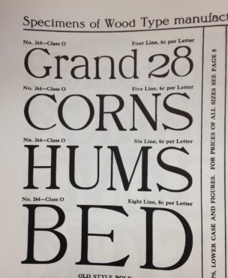
Hamilton wood type No. 264
Has anyone seen this type? It is listed in Hamilton’s 17th edition catalog. Was it based on a hot metal typeface? Did it have a name?
The relative size of the lower case letters is interesting.
No 264.jpg
ffi |
fl |
5m |
4m |
’ |
k |
e |
1 |
2 |
3 |
4 |
5 |
6 |
7 |
8 |
$ |
@ |
# |
Æ |
Π|
æ |
œ |
|||||
j |
b |
c |
d |
i |
s |
f |
g |
ff |
9 |
A |
B |
C |
D |
E |
F |
G |
||||||||||
? |
fi |
0 |
||||||||||||||||||||||||
H |
I |
K |
L |
M |
N |
O |
||||||||||||||||||||
Has anyone seen this type? It is listed in Hamilton’s 17th edition catalog. Was it based on a hot metal typeface? Did it have a name?
The relative size of the lower case letters is interesting.
No 264.jpg
Not a classic by any stretch of the imagination. Quite awkward in fact. The character widths are pretty goofy. Look at the width of the E as compared to the H for instance.
I can tell you that this was a former Page face, but do not find it shown in Page’s 1888 catalog, so it probably originated sometime between that date and when Page was sold to Hamilton in 1901.
How did I determine it was a Page face???
The following information was obtained from Dave Greer several years ago.
Hamilton applied different series of numbers to typefaces that they acquired from different competitors and they are:
200, 600 and 4,000 - Page
2,000 - Tubbs
3,000 - Morgans & Wilcox
5,000 - Wells
This is a fantastic piece of information!!!!!! Thanks Dave.
Rick
Rick,
It is strange that I found a note in my 17th-Hamilton catalogue-reprint, saying that information was from you. I’m thinking that it might have been another David, possibly David Shields?
Any way, I agree that the face, in question, looks awkward, and may not have been copied from a metal face.
Dave Greer
Rick, thanks for sharing the numbering scheme. That is a very useful bit of information!
Thanks again,
Jon
Well thanks Dave, I’ll have to ask Dave Shields if it was him. I’ll see Dave at the Hamilton Wood Type Wayzgoose in November if I don’t run across him before then.
Rick
Well thanks Dave, I’ll have to ask Dave Shields if it was him. I’ll see Dave at the Hamilton Wood Type Wayzgoose in November if I don’t run across him before then.
Rick
Reviewing this earlier post. Can anyone recommend a typeface with x height as tall as in the first line of type in the attached photo? Thanks
ATF foundry type Americana series has a large lower case x height.
Michael
ATFamericana.jpg
Thanks, Michael. I looked it up and it was the last typeface cut by ATF.