Font identification
Hi all.
I bought this wooden beauty some time ago but I am unable to identify it.
Could you help?
Photo atrached.
Thank you.
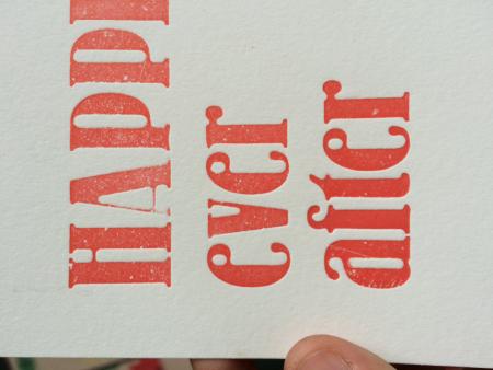
image.jpeg
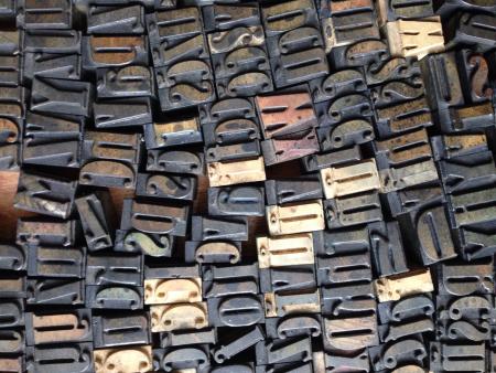
IMG_7659.jpg
ffi |
fl |
5m |
4m |
’ |
k |
e |
1 |
2 |
3 |
4 |
5 |
6 |
7 |
8 |
$ |
@ |
# |
Æ |
Π|
æ |
œ |
|||||
j |
b |
c |
d |
i |
s |
f |
g |
ff |
9 |
A |
B |
C |
D |
E |
F |
G |
||||||||||
? |
fi |
0 |
||||||||||||||||||||||||
H |
I |
K |
L |
M |
N |
O |
||||||||||||||||||||
Hi all.
I bought this wooden beauty some time ago but I am unable to identify it.
Could you help?
Photo atrached.
Thank you.
image.jpeg
IMG_7659.jpg
Didn’t find it in any of my American wood type manufacturers catalogs. I suspect it is of English or German origin and early 20th century.
Rick
We have a German (Bauer?) foundry type that looks similar.
Bernhard Bold Condensed.
Michael Vickey
www.nickel-plate-press.com
bernhardbldcond.jpg
Looks similar to Lo-Type Condensed from Berthold. See:
https://www.myfonts.com/fonts/berthold/lo-type-bq/med-cnd/glyphs.html
Matt
Arrgh! I kept thinking that “I should know this face” but just couldn’t place it. As soon as Matt said Lo-Type I immediately knew that I had first admired it a year or so ago when seeing it for the first time in Erik Spiekermann’s book “Hello I am Erik”. The book has been out for a few years but I acquired mine at the Hamilton Wood Type Museum’s Annual Wayzgoose a year or so ago.
An absolutely fantastic face.
Rick
To give you more information on your font. Lo-Type was originally a metal typeface and was designed by Louis Oppenheim between 1911 and 1914 for the Berthold foundry in Germany. The name was derived from the designer’s initials LO. Erik Spiekermann started to redesign this face in 1977.
Rick
As far as I can see, it’s neither LO-Schrift nor Bernhard-Antiqua Schmalfett. It resembles both faces, but hasn’t got the boldness of the above mentioned. I attach some images here, two were scanned from the 1926 version of Handbuch der Schriftarten, also known in Germany a the ‘Seemann’ (the name of the publisher) as well as a scan from the version that Erik Spiekermann redrew for Berthold in Berlin. The author was Emil Wetzig. Updates were published until 1939. This is one of the best sources on German type developments available. The Klingspor Museum in Offenbach am Main has digitalized the book, as well as the individual updates. here is a link to the PDFs: http://www.klingspor-museum.de/Handbuch-der-Schriftarten.html
And, if my memory doesn’t fail me, LoType is the first typeface that Erik Spiekermann did for Berthold under the direction of Gerhard Gunter Lange, the artistic director.
LoType Berthold.jpeg
Bernhard Antiqua schmalfett.jpeg
LO-Schrift fett.jpeg
Our Bernhard Bold Condensed is not as heavy (bold) as those scanned pages show.
In the above photo of the proof of the wood type, it looks like it is a facsimile of the Bauer Bernhard Bold Cond. face. There are even variations in the “e” and “r” between the 2 wood type sizes shown.
Michael
Something that shouldn’t be forgotten, is that every type foundry looked at each others catalogues and issued something in the same style that the competitor had. In my ‘Seemann’ and it the seven supplements (that were published until 1939), I can find at least 30 faces in the same fashion.
Thomas,
That sounds like a wonderful archive you have. 30 faces in the same fashion … so which one most resembles the original post’s wood type?
Michael
Hi all,
Very sorry for late replay.
Thank you all for the suggestions and thanks for helping me identify the font finally. We bought this beauty in Slovakia and we have extended collection with all diacritics - rare I would say. Its very hard to source something in Czech and Slovak - been lucky with this one.
Kristína
Kristina.
Glad to be of help. That’s a nice typestyle.
How many sizes of this wood type do you have?
In my collection I have several wood type fonts with the special characters for Polish, but not Czech.
Michael
www.nickel-plate-press.com