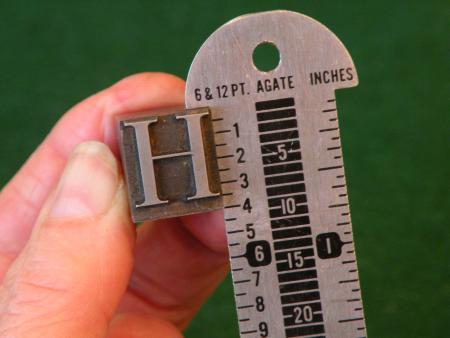
Is this what is ment by a “pica stick” and how do you read it?
I would like to learn how to determine the point size of a sort. I included a picture so that perhaps someone would be able to explain how to read it and am I using a “pica stick”?
Thank you for your help,
Gail
011.JPG
sorry about that, I can spell and I meant to say meant…..always in a hurry.
Gail, the inch is 6 picas, each pica is 12 points (72 points to the inch) what you have is 4 picas which is 48 point type. Hope this helps, good luck Dick G. ps some call it a pica stick
Thank you! I appreciate your fast response and I am glad to know it is that easy. I have several cases without names or sizes, this helps a lot!
CGB, actually it is 36 point on a 48 point body.
best james
most type has a little space on the bottom incase you have a lower case j or g that hangs down, its 48 pt., although the face of this type measures 42 pts. not 36 pt. Dick G.
The type face you have is 48 point. Type is measured from the ascender to the descender. I have attached a photo.
type size.jpg
type size.jpg
CGB, I stand corrected. Nelson Hawks is the father of the American point system. Richard Hopkins wrote a great book with the very same title, and I will qoute him ” It is noted that the standard line established only common base
line for all letters.Today more than ever before, there is great discussion over the fact that point sizes primarily refer to the sizes of the metal bodies; they have no direct relationship to the height of the letters on those metal bodies as measured from the tallest ascender to thedeepest descender.” In thirty years of printing I have seen 16 point type on 18 point body as well as 5 point on an 8 body. best james
We call it a line gauge. Not only essential to accurately measure type, but they make darn good back scratchers as well. You can always tell if someone knows what they are doing, by the way they put a line gauge in their pocket.
I’ve also heard it called a pica pole
Line gauges can be used to get into your car, don’t it look like what police use. Dick G.
The line guage shown also shows agate lines down the middle. This was a measurement used mainly by newspapers and is pretty much obsolete now.
Rick
Well thank you all for your responses. I hope I can get it right when I list my type. I will include a picture that way printers can see for themselves as I don’t want to lead anyone astray. Foolproof546, thanks for the info about the agate lines, it makes sense. My dad set type for the Bisbee Daily Review in the early 1900’s and I have several of these line guages, wondered why he had so many.
Thanks again everyone!
Yes, agates were used mainly in newspapers; they are the only printer’s measurement (at least before the desktop point of 72 to the inch) that translates exactly to the inch. Ads were sold by the column-inch of 14 agate lines, without confusing the buyer with points and picas.
I was a linotype operator that used to set a lot of agate at the newspaper, the agate is five and a half points, someone figured out they could get a lot more lines on a page, do the math, the paper made a lot of money on each page of classified by selling agate lines. Dick G.
One point (no pun intended) to clarify. 72 points DO NOT equal one inch. Damn close, but not quite an inch.
Rick
No, traditional points are not 72 to the inch, but on the computer they are, unless you change the preferences in graphic programs (to something like 72.27 pts per inch, can’t remember exactly). Schaedler sells rulers with traditional points found on a line gauge, and others with DTP or desktop points where 6 picas = 1” exactly. People printing digital type by letterpress should be aware of the difference: not much on a 3” form, noticeable on a 20” form.
I would like to add some further clarifications:
While ascender line and descender line are part of a font’s “metrics”, type size is NOT generally defined this way. Not with letterpress fonts, nor with digital fonts. In both cases, type size by default refers to the body, which still exists with digital type. So in general, one can just measure the body and that’s the type size.
But there are also exceptions and this can easily cause confusion.
A) Smaller font on a larger body.
This is sometimes used for uncommon or “in-between” type sizes. A 9 point design for example might not be put on a 9 point body, but instead be cast on a 10 point body. If you only had that single font without the original packaging, you probably wouldn’t be able to tell this and label it a 10 point font. But if you also had the original 8 point and the 10 point, you would see while printing, that the 9 point design is right between the 8 point and the 10 point in visual size.
Not sure about the standard practice around the world, but I would label this font “9 on 10” or 9/10 for short.
B) Larger font on a smaller body.
This often happens with larger fonts. Let’s say you have 3 display sizes of one typeface: 48p, 60p, 72p. If you print them, you clearly see that they all have a different visual size. But if you measure the body, the two larger sizes might both have a 60p body, because this significantly reduces the size and weight of the 72p letters!
So I would label these fonts: 48p, 60p, 72/60p.
The double notation (like 9/10, 72/60) really helps to avoid confusion. If you only use the second value, you end up having different cases with apparently the same font, but they are actually not the same. If you only use the first value, your measurements won’t work and you will pick the wrong spacing material and wonder what is going on.
… and then there’s a situation common in Momotype-based foundries, where a Didot face is cast on an American body. M&H has British Monotype book faces that are Didot sizes, but M&H casts them on the closest American body size. So, 12D/14, but also two sizes fitted on 30 point bodies, 30 large and 30 small.
In Monotype or back in the Day eg at Stempel Ag, you wanted to set type 8 pt with 2 pt Leading, on Monotype you can cast the 8 pt on a 10 pt Body, the Typefoundry would do the same, eg if you had straight matter and didn’t wanted to fuss around with Leading.
Ludwig
Stephenson Blake the founders here in the UK chose at some point in their history to place the characters of their display faces on their rspective bodies, on one of three alignments. Point Art Line, Point Script Line and Point Title line. All three were one point apart, at 3, 2, and 1 point exactly. This allowed comps to set different characters in the stick and make them align at foot with suitable bits of leading. It sounds horrible and often was, but the fact remains they did indeed do this. As for other foundries or in the US .. I’m sorry I’ve no idea.
Yendalls, Risca-type, Star-type, Mould-type, Monotype, ???
Hi, Mick, I think that all those ‘foundries’ you mention used
Monotype Corporation kit, and had a quite different approach.
I think I recall that the Corporation was fond of the lower case x- height being centred on the depth of the body, and their early alignment system (the cast ‘cross’ character) seems to reflect that. Other early methods, (turning three em rules) also felt like that. tho, a few faces didn’t fit. The Final Definitive System using the ground alignment slips to given reference number of thous (using the special gauge) for each and every face and size was excellent and
still seems to refer back to that original centred approach.
One might ask Monotype Hot Metal Ltd if thats correct.
I also refer to the alignment issues with Gill Sans 262
as cast by Adana down the years!!!
Harrild, Thank You for the acknowledgement of my humble offerings above, the object was to (hopefully) corroborate Your post(s) and to give the New devotees a little more to look into and learn.
If possible key into the *Web* under the heading, >Leading and Slugs< re Monotype and under the Briar Press, banner, should find my entry from 1st. August 2013.
To recap and maybe elaborate and clarify, (as You imply above) the original and basic Alignment system was, in most cases the reversed out * Maltese cross* which exactly sat atop the body and when alignment was achieved, via the Knurled adjusters on the Bridge of the Casting machine, AFTER the Quad had been sized to 18 Units of set, for the particular face in use.
Eventually the Cross gave way to (as You imply) the Alignment slip system, which to some of us was not foolproof. because even with the Monotype issue Alignment tool and the appropriate slip(s)including the watchmakers style Eye glass, the Slip and 2/3 Cap characters, cap (H) cap (M) with good serifs would be set in the tool, and via many minute adjustments the serif would be brought into line with the Alignment slip which has a well defined/polished surface to view and match.
Way back we did encounter alignment problems, basically because in several cases when We only had the even sizes of Moulds, 6 pt. 8 pt. 10 pt. and 12 Pt. and the *didot* sizes dictated the odd sizes of moulds, 7/9/11/13 Pt. our only option was to cast the face on an off body size, (wrong body) for which there was/is no recognised Slip available.
******* There is a very specific formula, published By Monotype for working out the EXACT figure for every alignment, in standard form.? ******
We overcame this by resorting to the 3 Em rules method, i.e. casting 3 em rules, using the gauge as normal by turning the centre rule upside down and bringing all 3 into perfect alignment, thought by some to be more accurate than the conventional method, because any error was/is magnified considerably.!
One more little trick/gimmick which we occasionally resorted to, in the absence of any genuine Monotype >slip< but having access to Monotype,s extensive alignment charts, we just cast up, in 12 Pt. on a Composition Machine, OR 24 Pt. on the Super Caster a }High Space{, MIKED up to exactly the size recommended, polished up on the shirt pocket usually.!!!
This system was also found to be very valuable, when in the final demise of Hot Metal, firms would save the expense of acquiring new Ex Monotype moulds for a once only use, and Lend/Borrow Matrix case(s) and Wedge(s) to cast up Fonts of Type, hence we automatically cast up and aligned with 3 em rules.
Harrild, still have a collection of *Slips* from way back, and more than one Monotype issue alignment Gauge, one of which You would be welcome to Borrow, if ever needed, against a small deposit and the postage covered in one direction at least, have a few slips that You would be welcome to, Gratis of course.
Regards & Good Luck. Mick.
Hi, Mick,
Thats very kind of you, bit I dont have anything Mono these days. I do have a friend who does and runs his caster very frequently, but is on a learning curve. Matt McKenzie at his Paekakariki Press in Walthamstow. He is using the alignment slips and the guage, with such slips as he has, that is. His product gets better all the time, and with a Heidleberg cylinder his books get better and better all the time. His caster is computer controlled, and that set up runs discs that he has created by scanning manuscript copy!!! Which leads me to ask do you know anyone still running a keyboard in the UK - assuming they can get the paper rolls. I tthink I was one of the rather few folk that had C & G in both caster and Key. Loved the amazing system.
Harrild, Thank You also, Yes I have corresponded with Matt in the past. Pretty sure His Caster was acquired from Harry McIntosh in Edinburgh (Speedspools) already equipped with Harry,s own design and manufactured Computor.
Seem to remember in a face to face meeting calling Him a *Snake in the Grass and a traitor* up to the point where he threatened to have me escorted to the English side of >Hadrians Wall< ?? He also threatened me with *Robert the Bruce,s* later day heavy mob, but I think that was poetic license.
I do have more than One Keyboard 2, (both extended scale 90 ems) and still in touch with a colleague from Ditchling Press (formally St. Dominics - Eric Gill and H.D.C. Pepler) who was the Keyboard operator. !
I have a fair supply of Keyboard Spools (virgin of course) all original Monotype issue and well stored, possibly available but not for sale - barter or trade for specific Diecases (matrix cases) 12 Point Rockwell, for example.
Also have a limited supply of *Plastic* spool paper = virtually indestructible and could well produce keyed up spools for specific purposes, (in plastic) step and repeat Chapter Headings, Folios, etc., was standard practice to set folios left and right alternating, with 2 zero,s up to 99, the comp picked precast line and inserted appropriate figures. !
I have also a limited supply of slightly thicker Spool paper which was bordering on a failure, mainly because with constant use the sprocket holes tore out, could be available for a worthy cause.
Apparently reproduced Spool Paper is available from Portugal or similar.
There Is or Was literature and references to an In House, Sprocket Hole, perforating machine, Monotype issue and manufacture, a long time ago, I did enquire of one or two of the Paper companies and G. F. Smith (London) did appear to suggest that Blank spools could be available, but would need a sample etc., and of course a substantial order.
Although the *Plastic* 31 channel tape is, as stated above, virtually indestructible, it is not too kind to the Punches on the Keyboard, but have a few spare sets on hand. !
Harrild, could always Key Up, small spools for book work, from standard paper,
OR,
Sorts spools, Standing spools (repetitive) with Plastic tape - 31 channel - Monotype !
A third party C. V. on my behalf ! can be found by Keying In to the Web,
“The Counter Press, Type foundry, sort of“
and I count myself as extremely lucky and fortunate in that during National Service, was stationed at R.A.F. Uxbridge,
for the last 6 months, of the 2 Yrs, the RAF allowed, one day per week attendance at the Monotype School in London, paid the fees, paid the fares (underground tube etc.).and provided a pass for a late meal in the mess.
Part of the reason for. A. being grateful for the journey, so far, and B. still trying to pass on what I may.
Mick.
That’s been great reading your reactions this morning, Mick! It puts a smile on my face. Have a good day!
i ground a “V” into other end of my 18” “Pica stick” Now, with some cars i can Pull the lock with the hook end, or Push the lock with the other. Most cars today though, hard to do.
Some of us diemakers have been making “Slim Jims” for years with 2pt creasing rule
Thomas, Thank You for Your greeting also.!
As Abraham Lincoln implied (score) as part of His >Gettysburgh address< speech I have just passed the 4 SCORE milestone on this journey, hence every day is a *Good Day*
My next burning question is, IS the Forum ready for a later-day Verhalenverteller .? (from the Flemish I hope, no disrespect, Mick)
After all THE forum is an international platform, is it not.?
Regards Mick - With the Mast-head as the Union Jack.
+
If You are ever happen to meet the beautiful,
*Maxima Zorreguieta Cerruti* ??? offer the humble greetings from U.K. chapter of the Letterpress community, affiliated to B.P. of course.