Please help with identifying this type.
Howdy!
The type below was included in my equipment purchase and the case is labeled as 36pt Valiant. I am wondering if anyone can confirm if this is indeed 36pt Valiant and equally importantly, does anyone know potentially where I can purchase more?
Also, there is no pinmark on these sorts so I do not have that information to offer.
From what I can see it is Valiant but I just would like a confirmation.
Thanks!
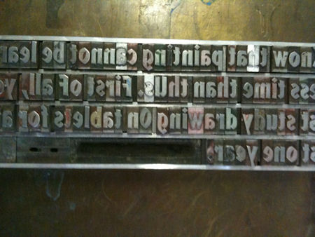
set type.JPG
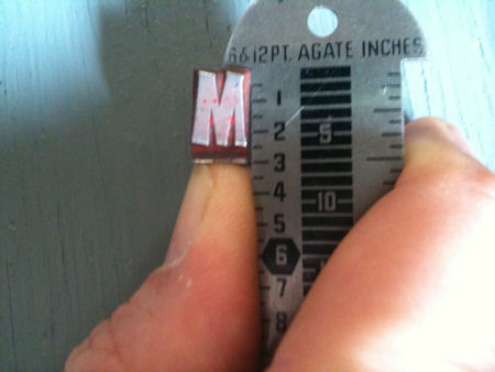
IMG_0354.JPG
Hi,
It is Valiant (AKA Valiant Bold) which is monotype pattern 412 for casting on the Thompson Caster.
M&H Type in San Francisco still sells it. http://www.arionpress.com/mandh/
It also appears that Skyline Type has matrices for it in several sizes if you want to order castings there. http://skylinetype.com
Best,
Alan
Here’s a scan of the Lanston specimen for Valiant, series 412:
http://www.galleyrack.com/temp/valiant-412.pdf
In addition to M&H, Swamp Press (www.swamppress.com) lists Valiant for sale (in 30 and 36 point).
Regards,
David M.
www.CircuitousRoot.com
Awesome! Thanks for the confirmation and links! I fear M&H may end up with more of my money than I want to part with, they seem to carry most of the faces I like!
It is an interesting face. When I first saw it I thought of the “Prince Valiant” comic books from when I was a kid. Must have been the name.
I can see this being associated with Spanish/Moroccan/Persian advertising in the way that Neuland is associated with Africa/Native American advertising despite the name basically meaning “Norway”… It also has a simplified blackletter element to it, a modern take on a lettre de forme.
A fun jobbing/decorative face that could have a lot of uses.
I was considering using it for a quote by Cerrino Cerrini about what it takes to become a master (in regards to painting) and the time it takes and commitment. However the issue being I do not have enough to do the full quote!
When I can I may purchase a 1/4 strength and that ought to bring me to a 1/2 total with what I have.
BD:
Prince Valiant? How ‘bout Samson, Ludlow #47-H, in sizes 24, 36, 48 and 72 pt. sizes. Possibly other sizes were added later, as I don’t have a newer book. It has the same feeling as Valiant but bolder and wider. I wonder if there’s any Samson in captivity anywhere yet?
I’ve been in the situation you’re in with an antique face that I could not get anywhere. (Learned this as a kid in WWII when money couln’t buy a font of type!) I set the full quote, turning letters or spaces for what I didn’t have. In a five line quote, I printed lines one, three and five first in one impression. Followed by the second time through the press with lines two and four. I’d advise doing a test run with all the actual lines spaced out to avoid working yourself in a corner; not having enough type and having to go a third impression!
This method can also be used to print (for example) 60 point type on 48 pt body.
First time I did this I was concerned with the ink coverage being the same on both forms. Solved that by printing in black ink, running each of these forms through the press twice, as two, three, four impressions of black can only be so black.
Valiant is indeed modelled after the drawn title lettering for the Prince Valiant comic series. Very similar to Lydian Bold Condensed.
Neuland = Norway?????? Never heard that one before. Neuland (pronounced Noy-land) means “new land.” I did a piece once about Neuland and had I guessed that perhaps Koch came up with name because new land equates with breaking new ground and Koch certainly broke new ground when he hand cut the punches for each size of Neuland without any guide in front of him. He was going for the hand-done look and really nailed it.
To appreciate this you will need a specimen page showing different sizes of Koch’s Neuland (not Monotype’s - a single design enlarged and reduced) to appreciate the subtle changes in each character in each size. Absolutely gorgeous.
Rick
I would really love to see a specimen page as you described. Looks like I will have to use my web-fu for this!
Neuland does definitely not mean Norway, in any language.
Norway in German is Norwegen.
-Kim (Norwegian)
Regrettably, Koch himself did not state the reason for the name nor the origin of the type design.
There are two competing theories as to the design:
1. Neuland is a simplified blackletter as posited by printer John Gambell. Gambell printed text set close in blackletter style using Koch’s Neuland types to prove his concept. Regrettably, however, those who understand blackletter typefaces well know that blackletter types are designed to economize paper, modeled on the the original blackletter letterforms which were designed to allow for extremely narrow writing to economize on expensive vellum. A cursory glance of Neuland shows that it was not particularly close set and lacks a lower case as originally designed, further compounding the problem of supporting this view. A lower case was designed in 16pt in 1929 (some 6 years after Neuland was issued in 1923) but was never issued.
2. Neuland is based on the type of lettering found in German and Nordic expressionist woodcuts from the period of the 1920s. Printer John Henry Nash subscribed to the second view and published a book pairing woodcuts with the typeface.
Further support for idea #2 is in three parts:
First, Koch himself did a number of woodcuts, and the typography in those woodcuts is not too far from Neuland.
Second, the ornaments cut for Neuland were a number of simplified woodcut ornaments (the cross, etc…)
Third, Koch designed a number of extremely beautiful blackletter forms, (Jessen Schrift, Wallau, Deutche Schrift, Maximilian, Freuling, Klingspor-Schrift) all with mixed case and a narrow letterform. Klingspor is particularly narrow, Wallau less so, but still traditional. To compare them visually, and then to compare Neuland to the lettering in woodcuts, it would appear rational to conclude that view #2 is the more likely.
Gerald Cinamon in his bio of Koch on page 92 (pp 90-95 inclusive talk of the Neuland design) gives nod to this theory as well.
As to the norwegian reference above, a friend who attended design school in Koln (Cologne) Germany in the early 90’s saw the type in my cases and commented on it, sayings that he was told by his instructor that the woodcut theory was the correct one and the name was designed to be reminiscent of the rustic look of nordic woodcuts.
The german word for the Nordic countries generically is nordland or “Northern Lands”. How he got neuland from nordland is unclear to me. The etymology of the word Norway means “north way” a reference to the saxon invaders who came into german from the north.
The useage of Neuland historically has been towards the more rustic and rough, thus its association with Africa and Native American advertising as well as it’s more famous use in the movie Jurassic Park.
FWIW,
Alan
I would definitely subscribe to the theory of an expressionist influence in Neuland. When I read that theory I immediately envisioned it paired with Käthe Kollwitz’ woodcuts.
-Kim
Fun with Neuland. Just to give it an even more handlettered look, I discovered that because the O is cast on a square body, it can be rotated left or right or even upside-down to create three additional variations of that character. This really works well for me because I can set “Foolproof Press” with all the Os looking different (and amazingly staying aligned). This works for all my fonts, which are foundry and not Monotype.
Rick
Valiant (Monotype) and Sampson (Ludlow) both came out in 1940, and both capture the feel of Blackletter types without losing readability. Both, I think, must have been designed with one eye to Bradley which is almost completely a Fraktur styled face, and was phenomenally popular in its day, and the other eye directly on Lydian. Lydian was designed by Warren Chappel and released by ATF in 1938. Chappel had spent a year (1931) at the Offenbacher Werkstatt under the watchful eye of Rudolf Koch, and dedicated his 1935 book ‘The Anatomy of Lettering’ to Koch (in Neuland on the dedication page).
I wouldn’t call Neuland a Blackletter type even though it came from the hand of probably the most important proponent of German nationalist type-styles in his day. Rudolf Koch developed it at a time when there were attempts to break away from typographic stereotypes that had become a disconnect between Germany and the rest of Europe. It is a Roman variant based in his deep understanding of letterforms, coupled with his first attempt to cut punches (Koch cut all sizes of Neuland himself, which in its original form is marvelous for the variations). Klingspor did not like the type, but, for its strength of character and sheer novelty, sales and popularity proved him wrong. The Castcraft catalogue of typefaces called it Neuland followed by Norway in parenthesis, which may account for the misnaming, although the poetic license my go back further. I would posit that “Neuland”, with all of its hand-made, woodcut qualities my actually have represented “new ground” which Rudolf Koch would break again and again in his all too short yet prolific life.
Paul
Rick said recently,
“I did a piece once about Neuland and had I guessed that perhaps Koch came up with name because new land equates with breaking new ground and Koch certainly broke new ground when he hand cut the punches for each size of Neuland without any guide in front of him. He was going for the hand-done look and really nailed it.”
Rick, I still have a copy of that piece you did a while back (years ago) and it was hanging in my old shop for a long time. I’m trying to locate it. Marvelous.
An old friend, the late Cliff Leonard also had a very nice run of Neuland.
Interesting that you can twist the (foundry) O’s around like that.
Valiant is a rather handsome face and seemingly useful and I don’t own a single character of it or Neuland for that matter, but like you BD, if I had one font of it, I would surely want another (in other sizes).
Dave
Hi Dave,
If you are coming to the APA Wayzgoose in June I’ll bring you another copy of that piece.
Cliff Leonard was also a friend of mine. I have a print of my favorite Cliff Leonard quote hanging in my shop. Without even going down there I can probably quote it verbatum -
“There are but two classes of type. The type you have, and the type you don’t have. The type you don’t have is always better.”
Rest in peace Cliff,
Rick
I do so love the wealth of knowledge on this site!
Thank you to everyone who has contributed to this thread, I have really enjoyed the information.