Wood Type Identification
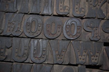
I recently acquired this font which has no makers mark. It looks like the Doric from William Page & Co., but there are subtle differences.
Any idea of the maker?
Sorry for the poor photography… cell phone image from my scouting trip.
Here is a link to the full image. Click on the image to enlarge.
http://elationpress.com/doric-circa-1850-1870/
Doric
Looks like this one from my old Hamilton Type Catalogue . Doesn’t say a name… Class T? Number 212-6 Line
hamilton14-102.jpg
Wow! That’s a great one!
If you compare the outer contours of letters that are the same there seem to be slight differences that would make me think this was from before the era of the pantograph router. Does it look hand-carved beyond the obvious detailing?
Your H, I and K are shown upside down so it’s hard to tell, but does the K have the double dots at the bottom like the Hamilton specimen? It doesn’t appear so.
I’d guess that the Hamilton font is based on the one you’ve got there!
Dan
@dan I am starting to lean toward hand carved. If you look at the high res version on the website, you will see what I mean. The font is in transit with the rest if the shop I purchased, but look closely at the two o’s - the inner circle is clearly different.
I’m pretty sure I know what you’ve got there, but I really need to see (print) it to be sure. Please contact me so you can send the font over ;-)
@ Dan sorry I responded too quickly as I am excited about the find. I do not think this is the Hamilton font. I think this is a very early cut and hand carved the more I study the photos.
I was looking at that same detail.
I hope you’ll share some more pictures when that haul arrives!
I will defiantly do that. What is unbelievable is that it is complete!
I was finally able to clean up the type and examine it closer.
I do believe it is hand carved at this point. I have added some new photos with some close ups that show the inconsistent removal of wood around the outer edges of the font. It was also clear very early on that the inner portions, particularly the dots, were hand carved due to the inconsistency.
At first I thought this may have been a “solid” Doric with the inner patterns added, but it seems to me now that the entire font was hand carved.
In the photos, the inconsistencies at the base are not grime (dirt, ink, etc.), but wood that was not removed consistently.
http://elationpress.com/doric-circa-mid-1800s/
Hi Res Photos’s
http://cdn.elationpress.com/wp-content/gallery/upload/IMG_1381.JPG
http://cdn.elationpress.com/wp-content/gallery/upload/IMG_1384.JPG
http://cdn.elationpress.com/wp-content/gallery/upload/IMG_1393.JPG
http://cdn.elationpress.com/wp-content/uploads/2013/07/Doric.jpeg
I have nearly the very same thing! And mine is a full set also. The only difference I can see is that yours has those small vertical triangles at the mid-point. I’ve been told it’s some sort of Doric but that’s all I know. I hadn’t thought about the possibility of it being hand-carved, but that makes sense. Mine is just slightly larger than 10 Line but definitely closer to 10 than 11 so perhaps hand carving would explain the non-standard size.
WoodType.jpg
Details like the small verticle triangles were added by hand with a steel punch, so maybe whoever ordered your font did not want to pay for the extra time involved to add them.
Rick
superb … gee, think type like that ever made it to Texas?
emthree, when you are done, send the font here for further testing.
you can never have enough type, ever.
Tony
dafodads -
I have a little sign in my shop that reads “The Man who dies with the most TYPE is The Winner.” Sorry ladies, the late John Hern printed that years and years ago.
I also have one that says “The pursuit and aquisition of new type faces is never a matter of life and death. It is far more important matter than just that.”
Rick