Rising type
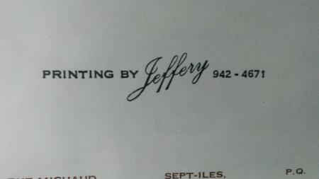
I just recently inherited my grandfathers old Adana Five-Three. It’s been collecting dust for many years but otherwise appears to be in great condition. And in keeping with my grandfather’s personality, everything is meticulously labeled so I’ve been slowly working my way through all of his gear and starting to learn about printing. What I was hoping to do was recreate some of my grandfather’s designs and I came across this business card posted below. I have two questions about how this might have been accomplished.
First, he has set 10pt type next to 18pt type. Is there a trick for doing this? Or perhaps he did it in two separate passes.
Second, I’m unsure how he managed to get the script font to ascend like that. If I just set them side by side then it comes out level. Does anyone know who that might have been done?
IMAG0036.jpg
the easiest way to do this would be to run it in 2 passes. after you get some practice in typesetting you might be able to run it in 1 pass. There are special spacing that allows you to angle a line like this, but they would take up some room and you might have to run it in two passes.
Okay, so let’s say I run it in two passes, how would I angle the type on the second pass? Because to me it looks like it wasn’t just printed on an angle but rather that the type was actually set in an ascending way.
Thanks for the quick reply btw.
The oblique line “Jeffery” could easiest be run by setting your gauge pins at different heights on your platen, 1@ 1” up 1 @1.125” up. These #s are inserted for demo purposes only, I have no idea what the actual spread would be. Stuart
@Village Press Inc: I think I see what you’re saying. So if I set them at different heights than the page will sit on an angle? Now, would that not just in essence be printing on an angle? Whereas to me the print looks as if the type actually ascends rather than being printed on an angle. Please correct me if I’m wrong because I’m very new to this. In any case I appreciate all the feedback.
Printing 18 pt type and 10 pt type in a single pass is fairly easy, though you need a lead/slug cutter and some spare leads/slugs you can cut up. Putting two 2 pt leads both above and below the 10 pt text would give you 18 pts.
Getting type to run up at an angle can be done a number of ways. Putting the paper in the press at an angle is the easiest.
Angular quads (matching triangular spacing) can be used to lock up type at an angle. You set it normally and then lock it up at an angle; the angular quads makes it into a rectangular block. Both of these techniques alter the slant of the type.
If you want the type at a normal slant, but stairstepping up, then you need to cut up bits of leads (a selection of 1 and 2 pt leads and 6 and 12 pt slugs comes in handy here; if you want smaller increments improvisation is called for) above and beneath each letter, being careful to keep the width of the spacing slightly less than the width of the letter(s). For the example shown, assuming a 1 pt step up for each letter, set the text normally in a stick then cut a bit of 1 pt lead the length of “Jeffery” minus the “y” and place it above the line, then a bit the length minus “ry” and place it between the first lead and the type. Repeat until the entire line is done. Cut another set of leads for under the line, similarly. You should end up with a rectangle that can be locked up normally.
I think the example was printed in two passes. The J in Jeffery goes well beneath the “printing by” in a way that would be hard to do with either angular quads or stairstepping as described above.
If this type configuration was used often, it would have been easy to print it once as a proof and have a cut made.
The type at an angle is a script that is slanted when set in a straight line in the stick. When printed at an angle as on the card it appears to be “rising up” but is actually angled. On this card I am sure the effect was achieved by setting the gauge pins at an angle on the platen, printing the word “Jeffrey” centered on the card, then spacing the words on either side to allow the needed gap, re-setting the gauge pins to be square with the platen again, and printing the second run. There would be no need to change the ink if the two runs were made on the same day, or unless you wanted the name in a different color.
Bob
It’s either a block for the whole thing, or type for the line and Jeffrey is a block.
If script letters had been slipped they would not have joined.
It’s not a line of script printed at an angle.
Great, thanks all for the input. I’ll spend some time experimenting to see if I can recreate this based on your advice. I really do appreciate the help.
Jeffrey hangs to the Left and is not on center, anybody who has set type by hand (I mean as a Trade, not a Hobby) can tell you this is run from 2 forms. The Jeffrey type is set, put a reglet top and bottom and and than placing it in the chase, we angle it and lock it up, if no angled furniture is at hands, spit wads or plaster is used to hold the type in place and achieve a square lock up.
A Merry Christmas to all
How about a cut set the type pull some reproof proofs paste up a simple piece of mechanical art (making angle of Jeffery what ever was desired) send it to the local photoengraving shop and done.
When hearing hoofbeats think horses not zebras.
Ted Lavin
Maybe I’m missing something, but wasn’t the original question how his Grandfather had printed this and how he can replicated it with what he has now in the Printshop.?
Sorry If I’m a Dunz and missed the question.
Typenut, it was a suggestion. Something of this sort may be buried still.An example being a 3x5 Kelsey I picked up a fee years ago had a: lot of nifty cuts in various boxes.
Don’t forget the poured plaster lockup. It could have been used to make this form in one piece without angle quads, saw or any special items.
I don’t understand why all these so-called experienced and professional printers insist on angling the type with spitwads and plaster when it is so simple to lock the type squarely and angle the card on the platen, print it, then square up everything and make a second run with the same color. I bet the whole job could be finished that way in less time and with less grief than any of all the other suggestions. Simple is best!
The point is that are many different ways to accomplish a single thing. The way you choose may be different from mine.
This may well have been a two-pass job, but printers have long used spitwads and plaster as well. These methods are well-documented in professional, vocational, and hobbyist sources. I have sometimes taken the more complicated method just to see how well it works.
This should not be a foreign idea to a handpress printer!
I’ve worked in several letterpress shops in comp rooms, have seen spitwads and plaster used in a few of the older shops, myself I have used canning wax, place type on a galley in the position you want, make a square around it with slugs then pour the hot wax, after the job is printed just drop in boiling water and the wax floats to the top and your type will look brand new.
My foreman presented me with this type of design some 40yrs ago. With the ability to see the mechanics behind the design, I made up the form in about 10-12 minutes as a one-pass job using the most basic pieces of equipment in the Jobbing/Commercial composing room. According to the very precious machinists, it was technically sound and safe.
At that time letterpress printing was being hit hard by offset printing, photocomposing, and other innovations. The idea of 2 passes would have got me demoted back to apprentice from Head Comp/apprentice. The facts were that 2 passes means double everything, makeup, lockup, proofing, 2 makereadies, double the machine time, opportunity lost [meaning there could have been another job on the press instead of a second run]. Working at angles is fine for hand-fed machines, but automatics ran supreme. The costs would have lost the job if all the cost were considered. Many of the suggestions above are sensible. I didn’t appreciate AdLibPress’ attitude towards those of us who have the knowledge, its one of the reasons I don’t correspond that much on Briar Press. Arie Koelewyn’s being the best, but mine is even simpler. This technical problem is why I teach letterpress at Rockley, near Bathurst, NSW. See my website www.willamer.com.au or see the adverts on this website for schools and instruction. Printing for Profit and Satisfaction.
I support this posting in full, and being one of the so called experts or long time Printers (I hold a SWISS MASTERDEGREE AS A SCHWEIZERDEGEN (Which means I can set type and Print, )) this is therefore my last post ever, as I’m tired of having to explain the basics of our Trade over and over to People who think they know it better.
TYPENUT
I’m sorry if I offended anyone. It is my perception that by the nature of script types it would be very difficult to create a one-pass run because of the interference between the script and the other types. In addition I thought the grandfather was more likely to have been a small operator with a limited range of equipment and work, and his grandson, who posted the inquiry, appears to me to be starting out in letterpress and wants to create the same effect as his grandfather, without any of us knowing how it was done originally. While I agree that the suggested techniques would work, I still think that for this purpose the split run approach seems simplest and easiest, though certainly not fastest for a long run that the current printer is probably not planning. My apologies.
Bob
I have found Typenut’s (and other) contributions to be invaluable. As a serious hobbyist, all contributions are appreciated and differences in opinion are always welcome. For what it is worth, I have learned a huge amount from BP and I hope that disagreements over major or minor issues are not taken personally and that those who have contributed in the past, continue to do such. I don’t think the experts realize how much others benefit. Neil
Neil
I give that a hearty Second.
Typenut
Please reconsider. You bring good information to this forum. Don’t stop just because others may disagree with you, or you may disagree with them. There is probably not one only right way. The proof is in the printing.
I am reminded of an old phrase:
There is more than one way to kill a pussy cat than kissing him to death.
Inky is right, Typenut posts good info, hate to see it stop, there are so many ways to achieve the same result, its good to get different opinions. These new kids need to hear different ways to do things, a lot of what I post gets chewed up but I don’t get offended, I post what works for me, I still remember my first foreman after I graduated from graphic arts at the vocational school where I learned about printing, he said “so you took printing at the voke, forget everything you learned, now we’re going to teach you how to print” I thought that I knew a lot but I soon learned differently. Good to see a post from Inky.
If I was presented the job, I would do my darndest to run it in one pass. Not only do you have to double all the elements of the job (press time, make-ready, etc) you also have to use additional stock to overcome any failures in registration or set off.
I would think any decent shop in the day would have a stock of wedges, either angle quad starts and terminations, or just matched wedges for any kind of slant work.
The first rule of work is to do the least amount possible to achieve the goal. Anything else is just working against yourself.
Michael Seitz
Missoula MT
Let’s not be hasty, Typenut; consider that many on this site, having completed an arduous two or three day letterpress seminar, have upwards of one, perhaps two years squeezin’ type to paper. Of course all that time is on weekends and such, but it does fit them in the ‘know-everything’ aisle. Just ask them. :o) I browse this site just to read the wonderous tales of the ‘Smash&Artsy’ crowd. And it doesn’t take much to twist their panties. :o)
As to the original poster’s query, well, I’d look to the card’s origin. Accepting the card was produced on the hand-operated press suggests the operator was not a printer producing for profit, and thus would not have the urgent need to speed his card throughput Too, such a card would have small demand and therefore quick turnaround would not be a consideration. Thus I would opt for the two-pass theory.
However, locking that type for a single pass is dead simple. Wedges (either home-made or otherwise) would see the angled scriptface easily accomplished. The close-set copperplate face is equally easy to explain: the script is obviously kerned, and when angled would allow such fitting. That’s the seeming ‘overlap’ of the cap ‘J’. Too, a simple pass with either saw or file on the type body could also explain the close setting.
Overthinking the card can make one lose sight of the piece’s purpose, and the conditions under which it was printed.
My take on the card is that had it been produced in today’s Quebec climate, we would be discussing the fact it is printed only in English - contrary to PQ laws. :o)
To Typenut:
AMEN!
I also am an infrequent contributor to Briar Press.
Having started in the trade during the war (World War II). I try to share my experiences with the newbies. After seeking help at Briar Press, they ignore it and go one with their ignorance as before.
The question frequently arises as to “what is all this stuff used for?”
Spend a few bucks on some old school texts. Forget about “embossing, debossing, smashing antique type, etc.” Learn to do it the basic way, then get artsy. Our suggestion is to read, and read, and make sure you’re reading the basic letterpress books, like Polk’s Practice of Printing, Cleeton’s General Printing, and Mills’ Platen Press Operation. Mills taught letterpress press work at Carnegie Tech, Cleeton was the dean of the School of Printing Management at Carnegie Tech, and Polk was a life-long graphic arts teacher in the Detroit public schools.
Nobody runs in the Indy 500, without learning the basics in a basic way. Learn to backup, park with an old red wagon, then go on to the real thing.
We can’t lump all new printers together as ignorant and careless any more than we can lump those with vast experience together as grumpy, stubborn and insane …can we?
May I appeal to all longtime contributors to refrain from quitting the forum? …over such small issues as how to set a few lines of type or how to build a home letterpress? Personally speaking, I read everything here …I have for a long time and I see all contributions offered by those more experienced as very valuable. And there must be many others here, of all experience levels, who feel the same way.
More and more people want instant gratification …not just with letterpress printing, but in every aspect of life; it’s just the nature of the world we live in today. But it’s not everyone and I know several younger printers who find great romance in the art of fine letterpress printing and are MOSTLY interested in the information that only you, the veteran, can offer. Your exiting is their loss.
Well, sometimes there’s instant gratification and sometimes there’s a complete failure to communicate.
A lot of the old timers have probably quit this forum (and many others) because people don’t seem to learn and are unwilling to do research.
A classic is the “why does my impression look crummy” from a person trying to print a 4 x 6 solid photopolymer plate on a 5 x 8 Kelsey. It’s a case of where there should be a “Top Ten FAQ’s” on Briar Press to help people running into basic issues.
Of course the other problem is that there is a serious division in the community between the shrinking number of those using metal/loose type composition and the polymer crowd. The gulf of layout and technical knowledge between the two is immense and no doubt when suggestions are proffered from one side, they are not understood (or received as insults) by the other. It doesn’t help that metal composition requires MUCH more than just a font and some spacing material/leading. You can get by with less, but it’s all that much harder.
That gulf also shows up in experience. Anybody who worked in the trade “back in the day” is going to have a completely different approach to a problem than a hobby printer. To the hobby printer, the professional approach looks alien and unworkable (possibly due to the lack of certain equipment) and gets discarded out of hand.
While the weekend workshop is a great way to get people interested in this avocation, it represents just the tip of the iceberg of knowledge that this craft contains. I’ve been doing this for 10 year (not full time mind you) and I still find myself in the shallow end of the pool, but not afraid to learn more.
If you old guys (pardon my young whippersnapperish comment) think there are newbs on here blundering, you should really go check out the screenprint channel on the gigposters forum. There’s a wealth of hazing that goes on over there, with the ‘old guys’ getting quite cheeky- maybe screen printers are just a bit more humorous.
I looked at the original post by Sanborn and thought, no big deal, and if I could access any of my in-storage script faces, was willing to give it a try to see how difficult it might be. But then I have a complete shop at my disposal with saws, spacing material, etc. When I read Stanislaus’ post about my old printing instructors Mills and Cleeton at Carnegie Tech I realized I’m one of those ancient, know-it-all letterpress geezers. I’m even printing with a Miehle V-50 I purchased from George Mills a while back, plus I have type from his shop that I worked with back in the early 60s when I worked part-time for George (to earn beer money).
Knowledge and experience are critical, but then too is attitude. There seems to be an abundance of attitude with little or no humility these days. I’m still learning as I start year 61 of being an active letterpress printer. That’s why my bedtime reading material leans towards old issues of the Inland Printer, just in case there’s another tid-bit I’ve missed.
The landscape has changed and the gulf has widened but my point was this: Just because it may appear to the seasoned printer that no one is listening or learning doesn’t make it so. Throughout history there have always been hacks in every trade you can name, and today is no different. This is a big group with many members and it’s a big mix of all types: Some skilled, some earnestly seeking such. Some smart, some not so much. Some with fine social skills, some coarse. etc., etc. And for those still wishing to make it from one side to the other, the beacon should stay as bright as possible.
If the going gets rough and people are getting unreasonable, by all means, leave the thread but not the forum. …because by doing so, those who crossed you are not the ones being punished; it’s the ones who were listening quietly.
Just to make this clear,
Any of whom I have given advise on and off the Forum know that I have no issue with any question or subject, but than you get personally attacked and called names ( shithead for advising that one doesn’t print with excessive Jewellery on ones hands, a Forger and Faker as nobody can have that much knowledge etc.) I take issue.
Attitude—the wrong attitude or inappropriate attitude can be a real put off to many of us who have served our time. I took a quick look at the gigposters forum—27,000 posts on the screen printing part alone. And the one posting that Google brought up started with, “Dude, … ” and that’s it for me.
I recall when the first poster the Jefferson Airplane printed back about 1967 was brought into our shop for an estimate—and I was an estimator there and George Bacon, the head estimator grabbed that one to do. It was for 50,000 4-color posters and the original artwork sat in our office for a couple of days—neat work. George came up with a price, and he had heard about the goings on at the Fillmore Auditorium and he stipulated cash up front—“who are these people” was a comment I recall. We ended up printing maybe a half million of that first poster, and of course, I didn’t grab one. The company was Carlisle Co., at 645 Harrison St in San Francisco (full letterpress, offset, steel die engraving) and George was an honest-to-God geezer. George had a definite attitude, but the dollar sign could easily sway his opinion, as could a well founded, logical argument.
Fritz,
You should have definitely grabbed a few of those!
To be fair to those who find personal attacks soul crushing, I understand. That does not make for a fun environment. I’m new here as a contributor and I was immediately the recipient of remarks which totally discarded my inventive expression (which is very personal), but everyone has a bad day or two and ultimately, I really don’t care; I know who I am and no matter what any one says, I’m unchanged.
Edit: I live very close to 645 Harrison Street!
Since placing my stick on the retirment shelf, I have encouraged the truly interested to take up the Black Art. Note I say: ‘truly interested’. And that group is small. What I do observe is the smashers of type; the poly-artsies; the dilettantes seeing braille impression as representing good typography. There are more categories of course, but why labor the point? :o) The comment of ‘instant satisfaction’ is spot on; as is the lack of these tyros to actually read a book about the craft. Even Kelsey’s rudimentary primer would be an excellent starting point for most - if not all; Wikipedia not so much. :o) The dabblers somehow cannot appreciate the true craftsmanship required to produce a printed piece. I am puzzled as to why they really don’t stick with the plastic and toner of modern ‘printing’ if all they want is an image.
Anyway. This is not the only site to have such shallow members. And that places me at a crossroads. My age compels a winnowing of things letterpress and I am seriously considering an offer by a local black powder society for my type and metal. Better to have a clean melt and purposeful use than have it crushed beyond recognition by ignorant users then discarded to an environazi government disposal station. The two little Kelseys will remain as flower pots. :o) As to the books and manuals, well, how many people actually use an Intertype, Ludlow or Elrod machine these days? Or are even interested in other facets of the letterpress field? Book speculators would salivate at my collection of course, but I’d rather the book’s pages be used as wadding (see” black powder, above) than have that the case. :o)
Thus I am toying with ‘taking them with me.’ Should make an interesting pile of ashes. :o) Now, please excuse me while I put the finishing touches on a lino eagle. - 30-
Any forum large enough will have fools wading in too deep before testing the waters. Some of those, upon realizing their feet can no longer touch the bottom will panic and lash out at anyone trying to fish them back up.
It is interesting to see GigPosters mentioned. Back when I started screen printing ten years ago, I quickly realized that their regulars didn’t take lightly to newbies with “dumb” questions.
If you wonder why it has ended up like that, consider the relative cost-of-entry for screenprinting compared to letterpress (you can get “everything you need” for 50 bucks at any Dick Blick) and you might get a sense of how committed to learning their average newbie is.
I lurked around that forum for 6 months before making my first post. I also registered early to show that I had been lurking for a while, and bought a premium membership to support the site. When making my first post, I had spent time learning all the basics without asking the stupidest questions, and in reading through old threads I had quickly figured out whose advise was worth taking.
I still got a bit of flack, but it was mostly good-humored and constructive at that point.