Nicks on Stephenson Blake 24pt Consort Light
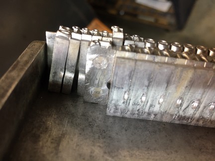
I have this font Consort Light having the small nicks across only a few mm of the type body, but the ‘f’ and ‘j’ characters have a nick all the way across the body. I was just curious about this different nick, were these types cast differently perhaps due to the kern? The pin marks show it’s definitely the same font. Also, it came out of the same sealed package from SB&Co.
Thank you
Mike Moore
LetterKraft Press
Independence KY
IMG_2694.JPG
The short answer to your question is that the type came out of two different moulds. This does not affect the type or your use of it, if it came out of the same font. A mould with a shorter, or incomplete nick, was built that way for a reason. Especially common in early American foundry type, it can be seen the nick did not extend across the full face of the type body to reduce the time and money to build a mould. Foundry moulds are very precise, and are built out of steel. So expense was probably the issue. This limited the mould set width but lowered the cost.Type could not be cast narrower than the nick allowed so a second mould did the narrow widths. It may have also reduced mould maintenance costs, but that is just a guess.
Dan Jones
Pygment Press
Ontario, Canada
Thank you, that answered my question.
Best
Mike Moore