New to typesetting
I’m getting a chapbook of poetry together and wonder if I’m making any silly mistakes without knowing it. If you could look at a page or two and comment on if it looks ok or not, I’d appreciate it. I’ll attach one page as an example. Also when you put a Colophon at the end, what’s the best way to structure that. Thanks
552A8147-2297-46D9-9079-1D4224156883.jpeg
I uploaded a medium size picture. I hope it’s clear enough.
Ok. No comment might mean it’s ok. How about this Colophon? Thanks
71658704-0BFF-4E00-A623-85C8963F12D1.jpeg
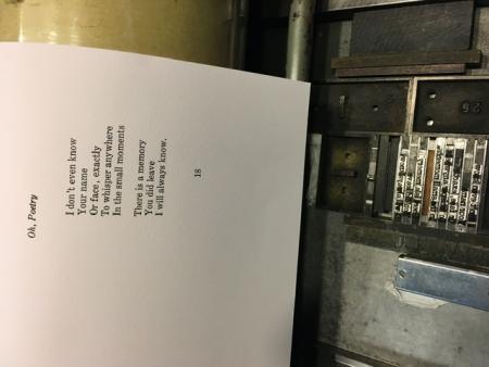
You appear to have a space before the comma and before the full-point. You need one after (which you have) but not before. Close up the gap!
Otherwise, it looks OK.
Thanks for the comment. I was told once a small space is needed between a letter and punctuation. I don’t have brass or copper so maybe the effect is too great. Maybe that isn’t a common practice too.
I’m not wild about the space between the apostrophe and “n” in don’t. That’s just the type though.
Thanks again for the comment. I’ll monkey around to see what seems best.
I like it better tightened up. I also brought the title in more. Seems lining up the P with the left margin was better. Just noticing the capital Ys that start lines seem a bit indented. Such details… oy
52931E94-99D6-4B8B-9666-1E4669119211.jpeg
I agree with you regarding the cap “Y” looking like it is indented, but I don’t think it would look correct hanging in the margin, and that would also mean you would have to indent everything else.
You don’t show the final page size in your illustrations, but that might bear on how much you would wish to leave the poem titles hanging out on the left.
The one item I would change is the spacing within the “VALENTINES” of your colophon (which seems well worded, by the way). When setting all caps, it is common to add spaces between the letters which do not have built-in space. The distance between the “V” and “A” would set the distance for all the rest. You mention that you don’t have any very thin spaces, but you could easily cut some of cardstock for use in a pinch.
There is a nice book “Printing Poetry” by Clifford Burke which is specific to the design and typesetting of Poetry. It is available, but pricey, on used book lists, but you might check libraries in your area as it might be available on library loan from a university library in your state. Beyond a specific source book, just take a look at poetry books on your own or a bookstore’s shelves to see what is being done and what appeals to you. There are very few “rules” which “must” be followed. I try to go for the most readable setting which does not make itself obvious.
John Henry
Cedar Creek Press
Oh. I forgot about the spacing on all caps. I’ll do that. Thanks too for the book suggestion. I’ll look into that as well. Thanks much!
FYI I have all types of spacing available…quads and spaces in all sizes both new and used as well as copper, brass, and steel thins in all sizes. Leading too!
We’ll get your poetry looking perfect!! Give us a call!
Larry Lionetti
516-633-5107
Everything Letterpress
The cap “Y” looks OK to me, but the I’s on the first & last lines look out of place. When I lay a ruler on the “I” on the first line and the “I” on the last line, it does not go through the “I” in the middle. Either your spacing before the line is not the same, or there is something different about the type.
Are all the nicks pointing in the same direction?
Have you checked for wrong font letters?