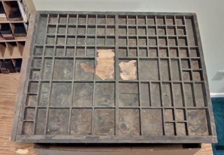
Odd 2/3 typecase
This 2/3 typecase enhances the usual California layout with an extra row of boxes at the top and large upper corner boxes. I wonder what was intended for these areas. Alembic Press and old catalogs provide no hints.
The case measures 21 inches wide by 16 3/8 inches deep. Someone nailed a 3/4 inch extension on the left to bring the case up to the usual two-thirds case dimensions.
typecase.jpg
There’s enough space for small caps, plus alternate figures or accents.
Thats strongly reminiscent of a French case I once had from a jobbing shop in Cahors in southern France. The odd thing about that place was that they had sand on the floor like an Irish pub! I never understood why. Mind you it was near on 60 years ago! They also did a surprising range of work, even bookwork, which a small UK jobbing house would never have considered
John Southward’s book Practical Printing, London, 1884, shows a typecase layout very similar, saying that in France upper and lower case are combined like that. His cut shows minor variations, with the top right boxes divided into half for 14 narrow boxes for superiors and accents. Fun to see these variants, which there were many of for different languages. Maybe you should start collecting them!
I attach an image of the lay of a ‘casse parisienne’, the standard French case for comparison.
casse française.tif