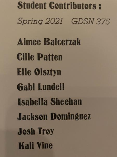
Fancy O’s in this typeface
Hi! I need help identifying this typeface. I scanned it in Whatthefont and it told me Matamoros NF, but this typeface name and design seems to be from the early 2000’s and I’m not sure it would have been made into metal type. Any insights would be much appreciated.

IMG_8484.jpg
The O looks like Inland but nothing else about this font matches.
This is Opaque, a typeface shown in the 1897 and 1900 Barnhart Brothers and Spindler catalogs. If it is 18 point or larger, it likely has a BB&S pinmark on it.
-Bob
A most intriguing thread. I am sure Bob is probably correct.
The thing I find so interesting is that looking up Matamoros NF in Identifont produces a find showing that it was designed by Nick Curtis and a search of Nick Curtis brings up his history. Apparently he has been digitizing old fonts since 2001 and appears to have hundreds.
The intriguing part is that many are 19th Century fonts found in the Library of Congress. This one was not in Mac McGrew’s American Metal Typefaces of the Twentieth Century, probably because it was designed in 1897. Look him up.
-Mike
Was that Dangerous Dan McG? went in for the bastard sizes
9, 13 etc?
Hi Bob,
Thank you for your response! I appreciate it.
Adding to Bob Mullen’s identification, here is the specimen shown in design patent 25,552, issued to Charles E. Heyer on May 26, 1896 and assigned to Barnhart Brothers & Spindler. I’ll also try to attach the patent, but don’t know if it will work.
Opaque.jpg
MaynardNews, do you have advice for searching for type patents? I’m doing some research on a particular wood type series and haven’t mastered Google Patents yet.
bowerbox, this site is a compilation of early 20th-century metal patents. I don’t know if any are wood types, but have a look.