Not Bauer Classic, Not Goudy Oldstyle
Hello experts!
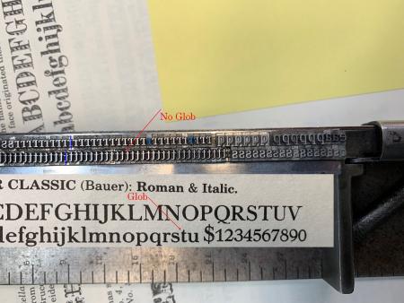
ID of this face is down to the crossbar of the LC ‘t’ type.
In fonting this from an old case I was looking at the tail of the Q which lead me to Goudy Oldstyle or possibly Bauer Classic, all was just fine until I got to the ‘t’
I had to remove a lot of Optima 12’ from this case, which confusingly had exactly the same nick pattern as the serifed unknown that I thought was Goudy OS. When I got to the lower-case t, it became evident that either they were all Optima and I was missing even one t to go with the Goudy OS, or what I was working on was not Goudy OS at all. Specimens of both Goudy OS and Bauer Classic match pretty close to this font but for the glob on one corner of the t-crossbar intersection. So I am puzzled as to this face.
The t’s I have in the case are a match for Optima but they line up with the unknown font, x-height-wise. But I can’t really pass this font on without making sure what it is (and that it actually has some LC t types!)
Any ideas? Thanks for your time!
Note - ignore types marked in blue, different nicks and a different face; these will be removed.
Mike Moore
LetterKraft Press
Independence KY
noglob.jpg
UnknownFont.jpg
After further hunting in my own shop, I think I am going to answer my own question. I think this is Melior Bold.. Or Semi-Bold.
Best
Mike Moore
The LetterKraft Press
Nope, ain’t Melior. Herman Zapf drew most of his capital O’s, G’s, etc. with a kind of squared-off style. Not from the pen of Zapf.
Frank.
you have enough information to use the Fonts by Appearance feature at identifont.com
Fonts by appearance sometimes gets me in the right family, but Imfind most ofmthe fonts it suggests are digital. Still, worth a shot.
Thanks, got it, back to square one.
Mike
Mike, I think you were right when you suggested a Melior variant. We print The Maynard News in 9 point Intertype Melior with Melior Bold (9-pt 8489), and those squared off bowls on both capital and lower-case letters look awfully familiar. Maybe Frank was looking at the specimens you included for comparison, neither of which was printed from the type pictured in your original post.
MaynardNewsMeliorSample.jpg
How about a not very good line-setting version of Bulmer?,
there were two or three.