Type used by “The Flag of the Union” to print Poe’s story
At Lead Graffiti we are in the process of starting work on a printing of Edgar Allan Poe’s “X-ing a Paragrab.” It was published in 1847 in a publication called “The Flag of the Union,” so before Linotype and Monotype.
I’m trying to figure out what the typeface is.
At various times I’ve thought it was Baskerville, Devinne, Scotch and a couple more I cannot remember.
I’d love for any of you that are into letterpress CSI to offer up your suggestions for us to consider.
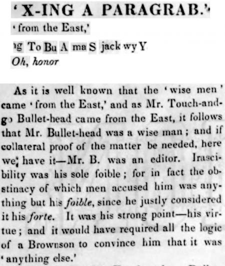
Here is a sample from a photo of the original page.
A few things to consider from the quite enlarged original photograph.
The capital R is distinct.
The “T” is quite wide.
The “A” seems a bit condensed but may be an artifact of the .jpg.
Bowls of the “B” are fairly even on the right side
“S” seems a bit squashed.
“j” is a pretty long descender.
The “k” has a low center of gravity
I through in a few italics that might help.
We appreciate anything anyone can offer.
Ray Nichols | Jill Cypher | Lead Graffiti
x-ing for APA.jpg
It may very well not be a named face that people nowadays are familiar with. In those days each of the foundries cast many roman text faces. If you want to find it, you are probably going to have to go online and search the many old specimen books which have been digitized and placed on the web. Here’s just an example from an 1848 Bruce specimen book on the US Library of Congress’s website. (And don’t count it out just because it is from 1848, a year after your specimen. Foundries showed many earlier fonts in later specimen books, if they were still available). Hope this helps…..Geoff
https://www.loc.gov/resource/gdcmassbookdig.specimensofprint00bruc/?sp=1...
That seriously helped. Looking through the catalog you referenced nicely, I found Pica 1. Close enough to give it a run.
I’ve proofed about 35 typefaces from 10 point to 10 line which I’ve scanned and traced in Adobe Illustrator. I use that digital type taken from printed type to create a photopolymer plate. The process is somewhat strangely similar to the hand-setting of type. You have to pull the type from one file, 1 letter at a time, and place it into another file, arranging the type, spacing, etc.
So, I scanned Pica 1 from the catalog and set the line. The catalog doesn’t give you the lowercase alphabet, so I scanned the sample body copy but couldn’t get all the letters. You’ll notice there is no “k.” Or “w,” which I made from 2 “v”s.
Anyway, here is the first line of Poe’s “X-ing a Paragrab, as accurately as was reasonable.
In the 2 or 3 hours all that took, it occurred to me that I didn’t have to do this for the whole 350 lines. I could get 350 people interested in letterpress to each do one of the lines.
I would put the image up, but I cannot get it to upload and I don’t have spaces symbols in the name.
briarpress-1000.jpg
The image was too big, and I forgot to remove the line that I couldn’t upload it.
We do a similar illustrator process for making quick design proofs before setting type. More recently, I’ve been working with a plugin called fontself (https://www.fontself.com) to output scans as font files, which has definitely sped up that process. It’s fairly straight forward. The font file is definitely not sellable, but works well enough to proof or make plates from.