3 typefaces to identify
Can I get your well trained eyes and amazing type knowledge to help me identify these 3 typefaces (see pictures attached)?
Also, do you know if I can buy more of these?
NOTES:
typefaces 2 and 3 are both in the same case, but 3 doesn’t have numbers or punctuation. I also noticed 3 looks a lot like 1, which made me even more confused.
Thanks!
Karina.
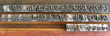
typeface 1 - formed 18pt
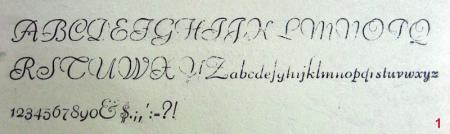
typeface 1 - printed 18pt
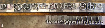
typeface 2 - formed 14pt
typeface 2 - printed 14pt
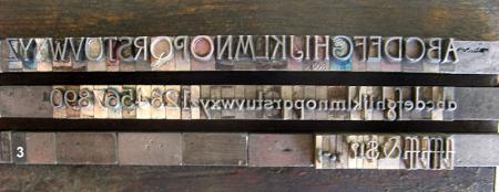
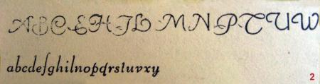
typeface 3 - formed 14pt
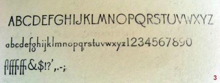
typeface 3 - printed 14pt
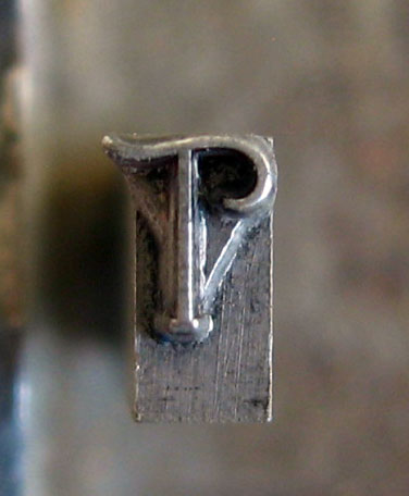
in the same case as 2 and 3, there are several Ts like this. Any hint on what face it might be?
i think numbers 1 is from the Bernhard Schoen family- regular or light, but I can’t tell which- but I do see some slight variances. Coincidentally, I was just using the light version five minutes ago, but on the computer, so I couldn’t tell you where to buy more type.
Sample #3 looks like Canterbury.
# 1 is Liberty, see McGrew p. 200
#2 is Liberty with Canterbury swash caps mixed in. Nicks should be different.
#3 is Canterbury, see McGrew p. 58
#1 Looks like Liberty Script to me. Designed by Willard Sniffin. This is a ATF face. #3 cannot be like #1 since #1 is a script face and #3 is a roman face.
You might find some Liberty Script used.
Wow! This is amazing guys.
John, I had that thought about the swash caps, but wasn’t sure at all. Thanks for confirming.
Sal, Liberty Script looks just like it. Correcting myself: I meant #1 looks a lot like #2 (now I know why).
One more thing: I thought that #2 lowercase was Liberty Script 14pt (which I own too), but it’s slightly different; #2 lowercase sits a millimeter lower and it’s a bit more slanted. Do you think that it could be Canterbury Italic (since it was in the same case)? I will print them up side by side and and post them here tomorrow.
Thank you so much, this mystery was giving me a headache!
Karina.
Karina,
Are you saying that the #2 lower case 14 pt. Liberty does not match another font of 14 pt. Liberty? If so, this is because one of the fonts may have been cast from matrices made by Intertype or Universal rather than from American Type Founders. Look on the counter of the lower case “m” or cap “H” to see if there’s a very small number. (You can see one in your photo of the Canterbury). This is an identifying number from American Type Founders. On ATF Liberty this number should be 511. If there’s no number then the type was not cast by ATF.
There’s no such thing as Canterbury Italic.
You can do yourself a favor by buying a copy of American Metal Typefaces of the Twentieth Century by Mac MaGrew. (Get the second editon.) If you read that book, you’ll know as much about typefaces as the rest of us. Mac spent a lifetime compiling all the information in this book and you would be wise to take advantage of his efforts.
This was helpful to me as well- thank you! The font that I have, Bernhard Schoen, is nearly identical to #1 (the only difference I saw from the picture was the capital “W”), but I’ve been searching for the ‘lighter’ version of it and couldn’t find the name of it. I see now that it is Liberty that I have been looking for- such a huge help!
littlemisspress -
If you have Bernhard Schoen, you have the original design (English translation of the face name is Berhard Cursive) from the Bauer Foundry in Germany. This was designed in 1925 by Lucian Bernhard (born Emil Kahn).
ATF had Wliiard T. Sniffen basically copy this face for them in 1927 and issued it as Liberty. The general look is the same, but you can find sublte differences in some of the characters.
So now you know why there appears to be differences.
Mac McGrew’s book is a “must have” for general type identification. The Encyclopedia of Typefaces is another that cover a lot of European fonts, although its accuracy leaves a little to be desired at times. Another great book (and I’ll probably screw up the title as I am not near my library) is the ATA Type Finder Guide. I’ll have to find that book and post it’s offical title here next week. It doesnopt give the history of each face, but it is extremely helpful in determining the name of faces.
Thank you for the clarification and history on Liberty and also the book recommendations. I am sure they’ll prove very helpful once I get my hands on one or two.
Yikes, I just read my last posting here with a myriade of typos!!!!! I really should have slowed down! The designer of Liberty was Willard T. Sniffen.
I was wrong on the title of the book I was talking about, but have just posted the correct information about it and a few other on the subject thread “books to identify type” in this listing.
Those are all fantastic relatively affordable books.
John, this amazing, about the 2 lowercase looking different due to their matrices. That blew my mind. I did check and saw the “511” on the lowercase m, while other “m”s don’t have it. My McGrew is on its way!
Foolproof546, great info on the history of Liberty! I love these stories, so many surprises.
You guys rock.
One last time for clarification. I think you might have a font of Bernhard Cursive (the original design) in sample #2 as well as a font of the knockoff Liberty in sample #1. I have both faces in my shop. The Bernhard Cursive is decidedly the more elegant of the two. Check the nicks on the faces and you should see that there are probably two distinct positions for the nicks - determining what characters go with which font.
This design was extremely popular in the mid 1920s so ATF made a ‘copy’ of it for the American market to compete with Germany’s Bauer Foundry.