Help with Typeface identity
Can someone tell me more about this font?
I purchased it from the estate of a prominent book printer in Northern California. The case was labeled Versalien 10pt. Google has taught me that Versalien means large caps or all caps in German. The package tag inside the case (see photo) was labeled Lichte Ratro or Ratpo Versalien. I also learned that lichte in German means Light.
Notice the lack of a shoulder on each letter. The face is cast exactly the size of each letter. Since it is caps only, there is no need for a bottom shoulder to accommodate descenders. I have two sizes. The proof is hand inked, my rollers are out for repair. Sorry for the poor quality.
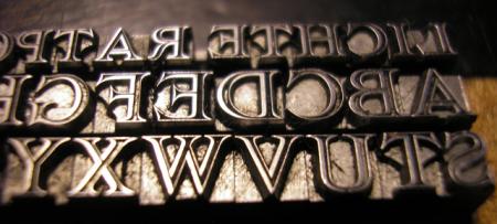
CU1.jpg
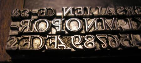
CU2.jpg
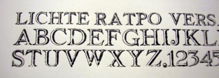
Proof1.jpg
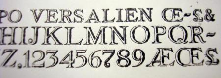
Proof2.jpg
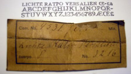
Label.jpg
Lichte Ratio Versalien, or Openr Ratio Titling was issued by the Stempel Foundry, in 1923. Designed by F.W.Kleukens.
Thank you Thomas. Sounds logical to me.