Half justified type
I have a design book somewhere I believed mentioned a technique for justifying type that was called something like half justification. This is from at least 20 years ago and I’ve never been able to find the reference again. As I remember the piece was from England. The idea was that if the length of the text was within some predetermined distance of the maximum possible width the line would be justified. If it fell short of that it would remain ragged right.
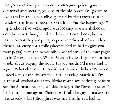
The first example below is 12 point Rialto on a 20 pica measure set flush left / ragged right.
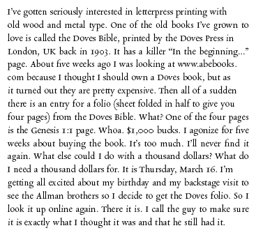
The second example is the same text, but if the text length was 19 picas or more the line was force justified.
I like the way that looks and was thinking about trying it on an upcoming project.
Especially from British readers of this post, does anyone know what this is called or if it is even something compositors actually did? Have an example?

justification-flrr.gif

justification-half-just.gif
This is interesting, Ray. Is the goal of this method to even out the raggedness of the right-hand margin? If so, it would seem that this technique would serve the same purpose as avoiding “rivers of white,” which is to say it would help eliminate happenstances of typesetting that result in something that is visually distracting.
To my eyes, though, it’s the first block that looks less ragged since, in the second block, lines 5 through 8 together make a big “dip” and lines 9 through 12 make a big “bump” (don’t know if there are technical terms here).
I, too, look forward to more on this topic. I’m starting to handset lengthier pieces, and though I love the challenge of full justification, sometimes out of desperation I find myself rewriting the text (only when it’s original, of course). This would be a good middle-ground option.
Barbara
To my eyes the two blocks of text seem to both be ragged right — the several justified lines don’t improve the look in my view. I don’t think full justification is all that much more work, but visually I prefer ragged right anyway since the word spaces tend to be more uniform, making for slightly easier reading. But if you’re interested in the mass of type being even on both sides, half-justified seems not to achieve that.
Bob
I’m not British, but have spent many years working and living in the UK, and I’ve never heard of half-justified. I’ve brought out my copies of Hugh Williamson’s ‘Methods of Bookdesign’ (1956) and ‘Booktypography’ (2005), by Michael Mitchell and Susan Wyman and searched the indexes. To no avail. What I do know, though, is that you can give yourself a minimum and a maximum width to respect when you do your typesetting. You can occasionally take a word or two over, to create a pleasant unjustified or ‘ragged’ effect. Mitchell and Wyman call this ‘massaging’ the text.
I like the flush left example better. The half-justified paragraph looks forced to my eye. As if the composer wasn’t sure which way to go. I like to set left justified but even out the rag with an occasional hyphen or by taking a word over as thomas said.
n/a
I’ve never used a Linotype, but have watched them in use often enough. I can’t help feeling that your problem/technique goes back to metal setting. Putting spacebands between the words would give you the justified setting, putting them at the end of the line would give you the ragged right… Or is there a lever which can disengage spacing, as would be required at the end of a paragraph? The one Lino instruction book I have doesn’t make it at all clear!
circut5, the last lino i ran had a quadder, which had a knob that allowed you to set flush left, flush right or center, or it could be shut off to justify. Without the quadder you would still use spacebands between the words but would put a space or two at the end of the line, there are em, en and thin spaces on the keyboard. Dick G.
Thanks to everyone that offered information about my half-justification question. DickG’s strategy worked great yesterday. So, I’m going to try it on something and see how it works. I’ll post an image after I do it.
Barb,
I think the issue you raise in your note about the raggedness of the half-justified looking even more ragged is what appeals to me. I taught advertising design in the Visual Communications Group at the University of Delaware and one of my favorite art directors of all time was Helmut Krone. He was the art director on the original Volkswagen ads of the 1960s and 70s.
Krone often criticized what he referred to as “#2 grey” blocks of text where the look was too flat and even. He would deliberately cut the type apart on his ads to make the raggedness more ragged. I’ve always preferred fl/rr with no hyphenation because it added more rag.
When I just went back and looked at the two examples I showed above, the half justified just looks more alive than than the fl/rr. Once I notice the evenness of the right side of the fl/rr it just doesn’t feel nice. Seems to lack any personality.
I hear ya, Ray. I’m looking forward to seeing a sample using DickG’s method, though I’m not sure if I understand it. Does it mean that you set each line to a different length — some length that you determine to achieve an overall pleasing appearance — and then adjust the word spacing to “justify” the line to that length? I think that method, combined with Victor Hammer’s idea — of including a full-measure line within the first three, toward the end, and scattered throughout – would help create a block that defines a certain width but also reflects the printer’s own vision and style. Of course you wouldn’t go as far as to hyphenate a word to make your line fit some predetermined length in a ragged-right piece, so to a certain degree you’d still be letting the words themselves determine line length, which is perhaps where the “personality” comes in.
Perhaps it comes down to looking at what you’ve set and adjusting it until it “looks right.” What “looks right” to one printer might not look right to another when it comes to line length, though with something like word spacing there seems to be more of a consensus.
Barbara