British paragraph justification…
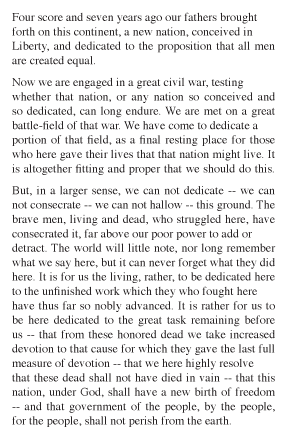
Somewhere in my library of design books I’ve seen an example of a British advertisement which has a form of justification that is a mixture of justified and flush left/ragged right. If a line was fairly close to the maximum measure it would be justified. If it was shorter by some noticeable amount it was left ragged right.
You got the strong sense of the rectangle with a bit more texture. I would also guess that you got much better word spacing overall. You might also notice that there is no hyphenation in the example which I did without any extra work.
Below is an example of what it looked like as well as I can remember.
Anyone know what this was called and were there any specific rules to it?

When I worked at Majestic Composition in Manhattan in the early 1980s, this was known as an “in/out rag” and was considered the mark of an accomplished compositor, graphic designer, or typographer. This sort of rag-right work was seen mostly in short-measure print ads rather than body text. We didn’t intentionally justify lines; instead line breaks were used (and NO hypenation unless absolutely necessary) to achieve the desired effect, which could take several tries. Short line measures should never be justified anyway because of the resulting excessive word space…or at least that’s how it appears to this curmudgeon.
I have a faint memory that Eric Gill had an interest in this sort of justification at one time.
I do certainly recall seeing examples of it in use in the 1950s, and the general view of the composing room I worked with was that it was apalling, with which I entirely agree..
J Stafford-Baker
The Happy Dragons Press
Especially in the example shown it does seem to imply a sense of rhythm that isn’t actually present in the work…
The expectations from rag and justification seem to be that the former is loose (lazy?) and the latter is precise. In actuality, a good rag requires a lot of attention, to keep it consistent but not boring… like a haircut, perhaps? Careful moves, which, if done right, aren’t noticeable.
The style shown above looks at face value to be a bridge between the two aesthetics, but that falls apart rather quickly, betraying laziness in letting a simple system make all of your decisions for you: if it’s convenient to justify, justify it, and otherwise just let it rag.
The fact that it’s three in the morning is perhaps why I’m being so critical. It’s an interesting typographical aside, but, much like the ill conceived attempts to eliminate descenders in text type, its cons seem to outweigh the benefits. The Magic Corporation compositors are free to disagree…