What’s this ‘A’?
Dug this out the other day and ran off a specimen. In the process, I found these alternate squared-off cap As and decided to use one. The typeface itself is a condensed Gothic Light Face. The top is No. 21, the bottom is No. 71, based on Hamilton #14. But the A… was that part of the original face? Or did I manage to get another font mixed in?
Thanks.
(Also, sorry, it’s a cell phone pic…)
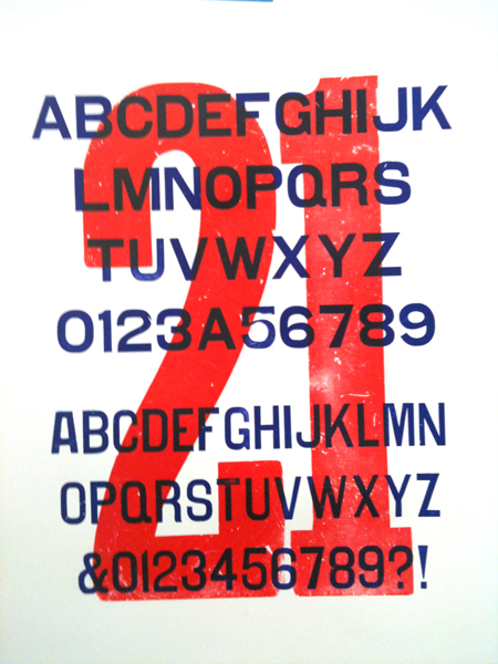
21_sm.jpg
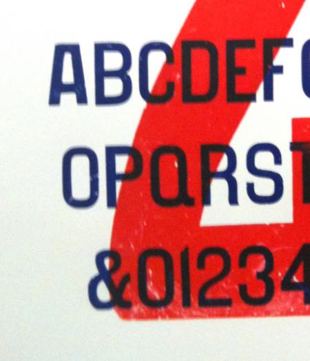
21_close.jpg
Anyone?
I agree with your identifications, but unfortunately I don’t have any specimens that show the A in No. 71. The easiest way to try to tell if this is a bastard letter or actually part of the rest of that font is to simply turn it upside and compare the sawn pattern to the pattern on the bottom of a few of the other characters. Assuming the whole font was cut at the same time, the pattern should be identicle. David Shields has established that different wood type manufacturers had different sawn patterns because they each used different machines. You will be looking for the tightness of the curve, etc. (some are finer than others, etc.)
Hope this helps.
Rick
Interesting thought about the saw patterns. I’ll check it out tomorrow. Maybe I’ll post a picture if it’s legible enough.
That particular A clearly belongs to some typeface, because I have 3 of them. I also have the regular pointed A that belongs with the No. 71 font.
Your identifications are correct.
The condensed does appear to be Hamilton’s No 71 and not Page’s Gothic Light Face Condensed (Hamilton No 4071) which was slightly more condensed, or Morgans & Wilcox’s Gothic Light Face Condensed (Hamilton No 3063) which was slightly heavier, or Wells’s Gothic Light Face No 1 (Hamilton No 5068) which was slightly more rounded.
The “A” in that set doesn’t match the Hamilton cut or any other manufacturers variant of Gothic Light Face. My guess would be that it was likely a hand cut facsimile used to fill in a missing character. The “Z” in that set looks suspiciously heavier than the rest of the characters as well, though hard to say definitively due to the photo blurriness. I think Rick is spot on about examining the blocks themselves to compare the planing patterns on the foot of the block, but by directly examining the block it should also be pretty evident if the “A”s were hand cut or produced with a router/pantograph.
And the easiest way to see the planning pattern legibly is to actually print it. The pattern stands out in greater contrast.
David, I confirmed that my No. 21 is the Hamilton cut, as there’s a stamp on the cap A. The condensed face doesn’t have a stamp. Does that tend to point towards Hamilton as well?
A few more photos of the A’s and Z’s from the condensed No. 71 are attached. The weight on the square A does seem to be different, but I have 3 of them, so clearly it was part of some typeface and not a random cutting by somebody.
The Z’s are interesting. No. 21 has a pointed Z, according to Kelly’s specimen, but I haven’t seen anything about No. 71 anywhere.
The sawing/planing patterns don’t seem to match on any of the letters, but I probably need to ink them to be sure.
ZZ.jpg
AA_2.jpg
AA_1.jpg
Hi Jonathan
From your image (AA_2) it seems pretty clear that the two squarish “A”s on the left of the image are hand cut, they are pretty similar to—though not exact copies of—each other, and are very different from the “A” on the right. Their similarity doesn’t necessarily imply that they came from another set, but does indicate that whoever did the hand cutting was at least skilled enough to craft them similarly to each other (maybe they used the same cardboard template for each?) Printers often would fashion their own replacement letters as needed.
Here is a link to the RRK Collection’s page on Hamilton’s No 21 ( http://bit.ly/gaqzpT ), unfortunately we do not have a sample of No 71.
I’ve looked through what specimens I have access to and could only come up with this lowercase “z” in Page’s 1872 specimen book. The pointed corners on the lowercase may imply that there were pointed corners on the cap “Z” (though that’s a pretty large assumption).
Beyond the version of Hamilton’s No 14 specimen book that is available at Unicorn, Rick has made an excellent facsimile of Hamilton’s No 17 specimen book from 1908. It’s a great addition to anyone’s library.
Hope this info helps.
Page_1872.JPG