European Gothic
Hello all,
We recently purchased this beautiful face.
Imprinted on the A are the words “Caxtonia Leicester.”
Anyone know what it’s called?
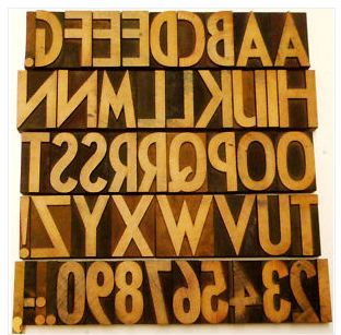
Screen shot 2011-03-23 at 11.15.49 AM.png
ffi |
fl |
5m |
4m |
’ |
k |
e |
1 |
2 |
3 |
4 |
5 |
6 |
7 |
8 |
$ |
@ |
# |
Æ |
Π|
æ |
œ |
|||||
j |
b |
c |
d |
i |
s |
f |
g |
ff |
9 |
A |
B |
C |
D |
E |
F |
G |
||||||||||
? |
fi |
0 |
||||||||||||||||||||||||
H |
I |
K |
L |
M |
N |
O |
||||||||||||||||||||
Hello all,
We recently purchased this beautiful face.
Imprinted on the A are the words “Caxtonia Leicester.”
Anyone know what it’s called?
Screen shot 2011-03-23 at 11.15.49 AM.png
Hi Molly,
I’m surprised that none of our British printers have come forward on this. I only have a few British wood type catalogs and probably only one from the era this design is from. I have a Stephanson Blake catalog from about the right era but this design isn’t in it. The face is stylistically an Art Deco design and my guess is that it probably originated in the 1920s or 1930s.
There is a Caxtonian metal typeface, but it looks nothing like this.
Rick
It is very close to (but still not quite) “Cable” / “Kabel” Bold Condensed (its ‘G’ is distinctive, and much like yours, in this weight (only)). Designed by Rudolf Koch and cut (in metal) by Klingspor, 1927 and after. But the ‘C’ and ‘Q’, especially, of your face differ from it. See Jasper, Berry & Johnson _Encyclopedia of Type Faces_ 4th ed. p. 256. Lanston Monotype also cut their version (see “Sans Serif” in McGrew), but its ‘G’ never looks like this one, in any weight.
Plugging “Caxtonia Leicester” into Google reveals that the firm of Norman Haynes Ltd., printers’ engineers and suppliers, purchased Caxtonia Ltd., formerly of Leicester. So “Caxtonia” would be a company name, not a typeface name.
Regards,
David M.
www.CircuitousRoot.com