type identification
Hey everybody,
Just procured a bunch of type from an old shop. A few oldies I don’t have in any specimen book. Can you help me out.
thanks,
Tom
Here are some notes on the various fonts…
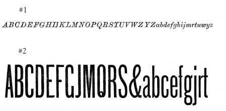
#2 - Q tail is broken off
#4 - I realized after printing that the wrong ‘N’ was in the case.
Cleveland Type Foundry
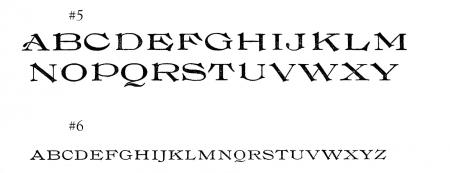
#5 - BTF - (Baltimore?)
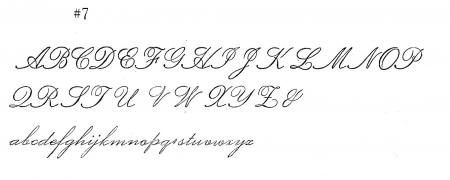
#7 - BB&S
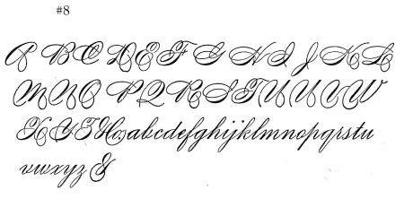
#8 - Boston Type Foundry
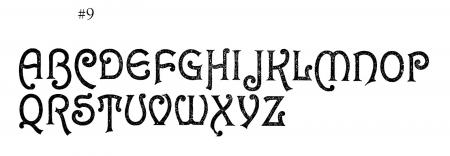
#9 - MS&J

unidentifiable #1.jpg

unidentifiable #2.jpg

unidentifiable #3.jpg

unidentifiable #7.jpg

unidentifiable #6.jpg

unidentifiable #4.jpg
unidentifiable1.jpg
unidentifiable2.jpg
unidentifiable3.jpg
unidentifiable6.jpg
unidentifiable7.jpg
unidentifiabe4.jpg
Are those images coming up?
Nope. Get rid of the spaces and # in the file names. Briar Press’ site doesn’t allow them.
#1 looks like it could be one of the Law Italics.
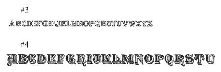
#3 looks like Webb.
#7 looks like Plate Script. These all look like turn of the century or older. Check the cap H and lower case m for numbers. It will speed up identification.
# 4 ~ Astral - (shown in Cleveland 1893 catalog)
# 6 ~ Old Style Extended (? foundry) I have this face (12pt) and it has Large Caps/small caps on the same sized body.
# 9 ~ Johnson - (shown in MS & J. 1892 catalog)
The faces could have been designed a little earlier than the dates, I don’t know.
I doubt that # 5 is from Balto Type. If it’s foundry type it’s not from there.
Could it be from the Bruce Foundry?
[BTF = Boston Type Foundry, according to a document identifying Pin Marks by the late Herb Harnish]
Need more specimen books?
You can find digital scans of the specimens I cited (and many others) here:
http://www.archive.org/search.php?query=type%20specimen
…and from Dr. David M. MacMillan’s site:
http://tinyurl.com/3ebx59l
Some real gems you found here. Lucky you.
Dave
Dave,
Thanks for the info! I figured a lot of these were 19th century if I couldn’t find them in MacGrews. They were all found (with a bunch of other less interesting types) in a tiny work space in southern Maine behind somebodies house. Someone bought the house and wanted to clear this out building with all this press equipment. The stuff had been sitting there easily ten years if not more. The mice had set up penthouses in the typecases. It’s been a year and a half since getting this stuff and I’m still slowly plowing through it.
#1 is not Law Italic, but could be one of several generic late 19th century italics
#2 is Gothic Extra Condensed
#3 is Webb
#4 is Astral
#5 is Coburg
#6 is Old Style Extended
#7 is not Plate Script, it is Grace Script (patented Mar. 19, 1889) from BB&S
#8 is Revere Script
#9 is Johnson
Rick
Thanks Rick…where did you find the Coburg? That and #1 was the only one I haven’t found at this point.
Hi Tom,
I found Coburg in the 1898 ATF catalog. It most likely originated at one of the foundries that merged into ATF. If I have a chance I’ll try to pursue that tonight and see if I can slueth out the foundry of origin. What does the pinmark look like?
#1 is so generic that pretty much all the foundries offered something similar in there text type showings in the front of their catalogs with pretty non-descript names.
One other thing to note is that you have to pay special attention to the wieght of your proof as compared to what is displayed in the old catalogs. Those guys were absolute master printers. Revere Script for instance appears to be much lighter in the catalog than your proof.
Also, something like your Gothic Extra Condensed can be a bit deceiving. If you concentrated on just the “R” you might have swept right by it. When this was made, every size was made from handcut punches, so every size had variations. Some sizes show an R with a plain tail (like your sample) and some sizes have an R with a curl at the end of the tail.
And as a general comment to everyone seeking font identities, the single most useful piece of information that you can provide is the pinmark (or lack thereof). If we have a clue as to the foundry of origin, that makes the search so much easier.
Rick
Coburg originated with the Boston Type Foundry and the patent was pending in 1896.
Rick