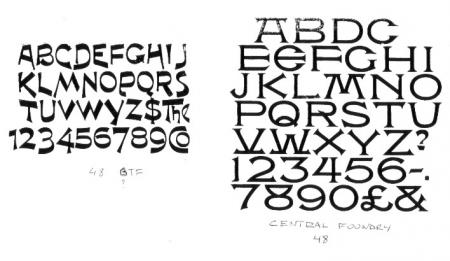
type ID
Hello all,
Can anyone help me with the two typefaces in the image please?
I’ve written in below each font what I think is the pin mark (they are hard to read).
Neither have lower case, except for the unusual contraction with the one on the left.
Many thanks.
Ron
type ID.jpg
The typeface on the left is SAMOA, by Boston T.F., and the one on the right is ATLANTA, by Central Type Foundry.
Dave Greer
Dave is correct. Atlanta should also have an alternate O with a dot in the middle, and an alternate K. The M and W are also interchangeable by simply flipping them upside-down.
Samoa is not only an unusual design but it is one of the few faces that you can flip some of the lowercase characters to create additional sorts if you would need them.
Rick
b and q, d and p, n and u for instance.
Thanks guys,
That’s interesting. I do have the alternate “O” but not the “K”.
The contractions in Samoa are also interesting . Does this mean there was a lower case for this font or are these just quirks?
Ron
Hi Ron,
Yes there is a lowercase for Samoa, as hinted at in the “The” ligature.
Rick
Here is a more complete character set for “Samoa”
Samoa.png
There is, also, an alternate cap T, which is vertical, rather than sloping, as well as a colon (missing in that photo), which slopes in the opposite direction to the semi-colon. The alternate y, shown with the caps, should be with the lower-case.
Dave G.