Mystery type?
I have looked thru Mac McGrew’s book 4 times but have not identified this font…Anyone have an Idea what this is? Thank you in advance for any help. Jon Drew
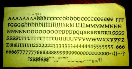
mystery type.jpg
ffi |
fl |
5m |
4m |
’ |
k |
e |
1 |
2 |
3 |
4 |
5 |
6 |
7 |
8 |
$ |
@ |
# |
Æ |
Π|
æ |
œ |
|||||
j |
b |
c |
d |
i |
s |
f |
g |
ff |
9 |
A |
B |
C |
D |
E |
F |
G |
||||||||||
? |
fi |
0 |
||||||||||||||||||||||||
H |
I |
K |
L |
M |
N |
O |
||||||||||||||||||||
I have looked thru Mac McGrew’s book 4 times but have not identified this font…Anyone have an Idea what this is? Thank you in advance for any help. Jon Drew
mystery type.jpg
I believe it is Solemnis. There is a Libra uncial. (I see it labelled as such at the top.) However, this looks more like Solemnis than Libra. Where did you come across it?
Here’s a link to a specimen of both typefaces:
Solemnis:
http://www.daleguild.com/Solemnis.html
Libra
http://www.flickr.com/photos/25411109@N05/2674997587/
Solemnis it is. Neither Solemnis or Libra probably appear in McGrew’s book because they are European faces, not American. They might appear in the appendix on popular European face in the back of McGrew’s book. I am not near my book at the moment.
Rick
Yes Solemnis !
I’ve seen you use that Rick, and I suspect you might have a fairly good run of that.
Jon, I’m curious as to the point size of your font. I believe Solemnis was cast even in 16 pt., as well as other sizes. (I see your link there now, Gabriel).
Very nice. Wish I had some.
The Libra in Gabriel’s other link is mine. I love that as well.
Jon, these types are known as Uncial letters, because there is no distinction between upper and lower case… (but you may have known that).
[edit] Not completely sure if it’s technically correct to call Solemnis an uncial, but it certainly does not have typical caps and lower case.
Both Solemnis and Libra are shown in the appendix of popular European imports in McGrew’s book.
Nice find indeed !
[edit][edit] Solemnis was designed in 1954 by Günter Gerhard Lange for the Berthold Foundry in Berlin.
http://en.wikipedia.org/wiki/Berthold_Type_Foundry
Dave
Dave, I figured that the Libra in that flickr link belonged to a Briar user. It’s lovely. Where did you come across it?
I think that historically it would be accurate to call Solemnis an uncial. Palaeographers distinguish between early medieval insular (Irish and English) uncials such as that of the Vespasian Psalter and half-uncials such as that in the famous Book of Kells.
There would be a further distinction between these Latin uncials and the uncials used in primarily Greek-speaking areas. (I’m sure there’s plenty of historical and geographic variety in Greek uncials, but I don’t know that field.) The utterly anomalous Gothic language Codex Argenteus (written in silver ink on a murex-dyed purple parchment) is a good example of Greek/Coptic uncials.
insular uncial (Vespasian)
http://www.lancs.ac.uk/users/yorkdoom/palweb/week05/vespa3.jpg
insular half uncial (Kells)
http://www.babelstone.co.uk/Blog/Images/BookOfKells_200r.jpg
Greek/Coptic uncial (Argenteus)
http://kulturschnitte.de/Kodikologie/Bilder/silbertinte.jpg
The range of typefaces designated as “uncials” in metal type appear to me to draw on these geographically and chronologically disparate exemplars variously. The Worrell Uncial at Skyline looks much more Greek in its construction, as the history of that typeface would suggest. Libra and Hammer Samson appear to be more like insular half-uncial. Solemnis more insular uncial. Victor Hammer’s American Uncial kind of bridges the historical gap between our typographic conventions and theirs by using uncial letter forms in a system that distinguishes an upper and lower case.
All of them make wonderful typefaces, in my opinion. But I’m perhaps unusually fond of those metal faces that recall manuscript-era bookhands.
Very good information, Gabriel.
Thanks.
Back around 1990, I bought a printer’s hobby press including a Craftsman 5 x 8 press, and the 10, 12, 14 & 48 point Libra was in a set of home made cases. I picked up the 18 and 24 point fonts in the same case sometime thereafter from Dave Churchman.
Since then I’ve augmented the 10, 12, &14 pt. fonts so there is double fonts in 10 & 12 and triple fonts in the 14 pt. so I can set a fairly nice sized page of text. All acquired from different folks at different times, by keeping my eyes open.
Of all the uncial or pseudo-uncial types the ones by Victor Hammer are the closest to pen-drawn characters. Libra is very mannered, and although being a true uncial it is quite modern in construction and feel. They all have a wide set (except for Aurora Uncial which, next to Hammer’s first attempt at designing type, didn’t work as well as expected), and can be difficult to work with for correct spacing and readability. I have quite a bit of Libra, but find myself using American Uncial much more often. One that I wish had been completed at Dale Guild is Goudy’s Friar. It is rather whimsical and irregular, but was cast as a 12pt. type, a nice size with which to work. American Uncial is unfortunately the go-to type for anything Irish or even mildly monastic. I have even seen it adorning toilet signage at a California mission. It is rarely used the way it should be, and how VH intended. When it is used as per his dictates, with narrow spacing and ragged margins, it makes a monumental page.
Paul
vhcassiodorusofscribes_small.jpg
Thank you all very much, great job. Hard to believe that I missed that one.
Gabriel, I don’t really know where I got it. I re-font and clean any interesting faces I come across and identify them later.
David J, I have this in 12 & 24 point. Small fonts like the one I proofed.
Jon Drew/Mpls