Type identification
I need help identifying this font which I couldn’t find it in McGrew, thanks in advance.
Thanks,
Casey
Inky Lips Press
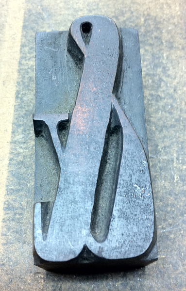
photo2.jpg
photo1.jpg
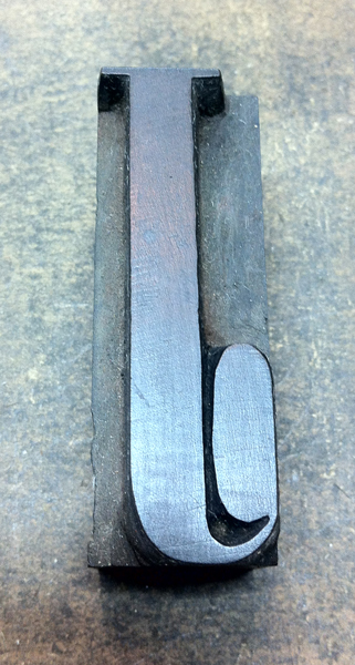
photo3.jpg
ffi |
fl |
5m |
4m |
’ |
k |
e |
1 |
2 |
3 |
4 |
5 |
6 |
7 |
8 |
$ |
@ |
# |
Æ |
Π|
æ |
œ |
|||||
j |
b |
c |
d |
i |
s |
f |
g |
ff |
9 |
A |
B |
C |
D |
E |
F |
G |
||||||||||
? |
fi |
0 |
||||||||||||||||||||||||
H |
I |
K |
L |
M |
N |
O |
||||||||||||||||||||
I need help identifying this font which I couldn’t find it in McGrew, thanks in advance.
Thanks,
Casey
Inky Lips Press
photo2.jpg
photo1.jpg
photo3.jpg
Hi Casey,
You won’t find it in McGrew. It is a Roman XX Condensed, probably from around 1840 or so. Look at the sides of the capital A and see if there is a maker’s mark there. If there is and you can tell us what it says/looks like, we might be able to give the actual original name.
McGrew deals with 20th century metal faces.
Rick
Rick,
I did look at the A and there wasn’t a mark. The ball terminal is very condensed and I haven’t found any anatomy of type elements that come close.
Thanks for the reply.
Casey
Casey,
Given your location, I am sure you are aware of the Rob Roy collactioin at U of Austin. Here is a link to the online. You might find it here.
http://www.utexas.edu/cofa/rrk/index.php
-Mike
Mike,
I was just in San Marcos this past weekend and didn’t have time to see the collection. Next time I’m in Austin I’ll be sure to spend some time there.
Hi Casey,
The closest thing I can find is shown on page 234 of Kelly’s book. It displays a Roman X Condensed from Nesbitt c. 1838. Your font seems to be a more condensed cutting of of this. I do note that a lot of hand-cutting was done (vs. pantograph cutting) - see the hand-finishing to define the ball terminal on your J.
If this particular font wasn’t by Nesbitt, it would still be classified as a Roman XX Condensed. This style of Roman was very popular in the mid-19th-century and was probably cut by more than one maker.
Rick
Rick,
The anatomy is spot on, thanks for the lead to Kelly’s book. I read some of the Nesbitt and Allen story which was interesting. Did Nesbitt stamp the wood type he cut? I didn’t see an example in Kelly’s book. Thanks again.
Casey
Inky Lips Press
I learned something here yesterday: look at the side of the capital A on wood type for some identification.
Last night I looked at the capital A’s for the 3 wood fonts we have. Only one had a mark. It said Thompson etc, in the other circle, but in the middle it said “Two River.” (Might have said Two Rivers - I can’t remember which)
So, my question is: what is Two River? A font or ???
thanks to anyone who might educate me.
Two Rivers, Wisconsin, home of Hamilton Wood Type
How does it compare to Condensed Aldine from Palmer and Rey?
Pg 86-87
http://books.google.com/books?id=78cDAAAAIAAJ&printsec=frontcover#v=onep...
Michael -
I just had to look up your “Aldine” reference in the Palmer & Rey catalog. Truly bizarre. There are a lot of ‘Aldine’ named faces from other manufacturers and NONE of them look anything like this so I don’t have a clue how P&R came up with that name. The Aldines that I am familiar with (and have several of) are somewhat “Clarendon” in overall style but have distinct fairly heavy serifs.
Also note the unusual cap O in the P&R Aldine specimen. If anything, Casey’s font more resembles Extra Condensed No. 3 on page 78 or Extra Condensed No. 4 on page 79. And, once again, I am at a loss as to why these fonts don’t have “Roman” in their names.
Palmer & Rey were is existence for a fairly brief period of around ten years.
Rick
While i think of it as basically criminal to break up fonts of wood type i reckon the majority of you wood officionados must just love it when you need an odd couple of letters to fill out a font . until i read some of these posts i didnt really consider just how old a lot of it really is although the cost of some of the more complete fonts on e bay is almost scary when i think of what i saw happen to many hundreds of cases of it in the change from letterpress to litho .!
I think it’s criminal to to break up any complete set. Consider switching what your main set it.
Casey -
Don’t know if Nesbitt had a stamp on their type. Kelly is pretty much my source of ID on the various stamps known.
CarolinaPrinter -
Hamilton Wood Type used a few different styles for their stamp. Your circular stamp with TWO RIVERS in thre middle inidcates that your font was cut between 1889 and 1891.
Rick
Thanks Rick, I don’t have Kelly’s Book. I know it was common for different houses to release essentially the same font under different names. Those O s are quite different. I was looking for a Q to compare but didn’t see one in the P&R catalogue. The body weights seemed quite similar though.
Thanks guys, the UC “J” ball terminal is very condensed and oblong shape, (not round at all) it doesn’t appear to be the Condensed Aldine. I’ll keep looking and let ya’ll know what I find.
Casey
Inky Lips Press
Hi Casey,
I’ll return again to my original comment that this face is Roman Extra Condensed (or Roman XX Condensed) depending on the maker. This was a fairly common design in the late nineteenth century and probably cut by several different makers. The Nesbitt cutting shown in Rob Roy Kelly’s book of Roman X Condensed appears to be ever so slightly wider than your type. When I look at William H. Page’s 1888 specimen, your font appears very close to their Roman Extra Condensed and their Roman Double Extra Condensed appears more condensed than yours. I hope that you will someday be able to nail-down who specifically cut your font, but I have no doubt that it is a Roman X (or XX) Condensed.
Are you going to be able to make it to Phoenix in June for the Wayzgoose?.
Rick