FONT Identification!!!!
Hey everyone,
I have a client that needs a specific font. They sent me a photo to go off of and it’s an old Sheraton hotel sign… Google is not helping at all.
Can anyone identify the font in this photo today!!??
Thanks for all your help.
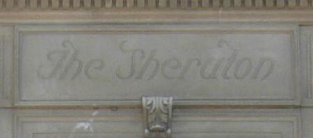
sheraton.jpg
Just found out the building in the photo was build in 1923 if that helps!
All I can recommend is to get a higher resolution version of the image, isolate the text, make it black, make sure none of the characters are touching, and upload that image to www.WhatTheFont.com. It will analyze each character and try to match it to the fonts in their database. No guarantees, but worth a try. Another option would be to call the Sheraton company and see of they have some kind of archive that may show what that font is?
My guess: It’s a stone-carver’s design and probably sort-of-based on some italic font or other, with added flourishes. Some of the proportions are a bit “different”, which makes me think “freehanded”. The Sheraton may have provided a letterform sample, but good luck finding that now, 90 years later!
Bob
@trbloco, I tried www.whatthefont.com with no such luck.
@AdLibPress, I am starting to look into finding out who created the sign. On the plus side, I am learning a lot of interesting information about this building!
Thanks for the help!
As Bob suggests, I would guess that this is not a “font” or typeface at all, but rather hand lettering. As such, an exact match to a typeface is probably not possible. But there was a substantial body of literature devoted to hand lettering, and it may be that the artist was working from a published design for an alphabet.
One place to start would be
https://archive.org/
where you might search on “lettering” or “show card”. You’ll find some volumes on lettering for technical drawings (which won’t be of much help to you), but also a number of beautiful books on commercial lettering.
Regards,
David M.
www.CircuitousRoot.com
Just a shot in the dark, silly even, But as the time frame etc puts New York (and your original Sheraton Hotels) well within the scope of the Hey day of Transatlantic Liners etc, (can not check until Mid Year when the Museum in Ditchling in Sussex U.K. Reopens) is it just possible that Eric Gill!!! Cruised in and whipped them up a design, in exchange for Bed and Brekkie, and then utilised it for one of his sculptures. Have you got in the U.S.A. anywhere, archive material of His??? Tenuous maybe but worth a little check, perhaps!!!
re Sheraton
There was the point made on a discussion about type faces that all true italics had the shape of a as in the sans serif font (fount) in which I am typing this, and also the face
with serifs which is used for the display of messages also used the preferred a. I have told of the astonishment of the proofreader when we gave him text with the two styles of a in it, a Mergenthaler Metrolite, and the name Saab.
I am not an expert on typefaces, leave that to those who handled many different faces, only repeating what has already been published here.
It is noticeable that many people who have signs made for their business prefer an italic fount.
Alan.
All originally handlettered. Note the two “h”s are not even the same. As David said - more resembling the fonts shown in Showcard and Lettering manuals of that era and not really a typeface.
Rick
Thank you all! I think I am going to do as the original artist did and simply re-create this typeface but for a new word.