Emancipation Letterpress US Stamp
I was at the Post Office the other day and noticed a poster for an Emancipation Proclamation Stamp. Investigating further, I found that the original broadsheet that the stamp was based on was printed at none other than Hatch Show Print in Nashville, TN.
The stamp commemorates the 150th anniversary of the proclamation and the post office is selling the stamps and also 16x23” letterpress posters (limited quantities—some signed and some unsigned).
Really sharp looking piece. Here is a link for more info:
http://blog-stampofapproval.com/2013/01/08/letterpress-emancipation-proc...
From here you can also get to the USPS site to buy the stamps, posters or several versions of the first day covers. It was issued at the first of the year but I guess we don’t go to the post office that much anymore. Glad to see letterpress represented and representing such a significant anniversary.
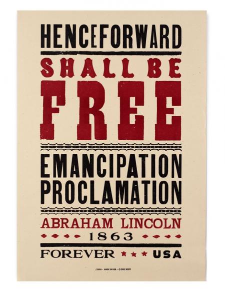
emancipation poster.jpg
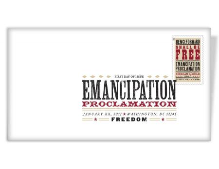
First Day color postmark.jpg
Too bad the gothics have differently weighted letters. It makes it look stupid.
Hatch does that a lot with their poster designs…mixing letter weights, etc.
Yes, and it looks terrible.
Paul,
I pretty much print what is given to me.
Do you have a suggestion on a traditional “best practices” reference in terms of typography? Probably a very broad answer to this, but a reference book or two that can by sourced today would be helpful if something like that is available.
ron
Hi Ron, I just posted a list in response to a similar question. Someone mentioned on another post as to what a bane designers are to the printing process. I have found that to be the biggest problem in the business, especially since the advent of the computer. I always loved how the designers get the big paycheck, but the printers do all of the work.
Paul
Found it. Thanks!
Yes, I have a press guy that does the bulk of our production work due to other work commitments I have. However, I certainly understand what you mean and get frustrated with the lack of understanding that design often has for production.
Are you still in Santa Cruz?
I used to come there way back when SCO (Santa Cruz Operations) a UNIX company was headquartered there. Was a nice diversion from the traditional Cali IT environment.
to Devils Tail Press
bain or bane ? Yes, there is a usage for the word bain as in bain marie or (perhaps) bainmarie. In Australia, we often read of “with baited breath” where I think it should be “with bated breath”.
I did a few years of proof-reading.
Alan.
@alan. Thanks for the heads-up on the typo, my wife who is a walking dictionary is not here this evening, she certainly would not have let that one pass.
@ron. I’m across the bay in Marina (the city without one), I have found it to be the most ideal environment in which I have ever lived, pretty much between 50 and 70 degrees all year long. It’s a nice marine climate which keeps paper nice and supple, but is a bit hard on lead type. And since I invented type locks for my type stands I worry less about earthquakes. We even get to visit the sun once and a while.
Paul
Later: I looked up bain marie, found it is sometime spelt bain-marie (with hyphen) with the plural bains-marie.
Could it be that, re different weights of characters in the large size gothic typefaces, the printer had only a few characters (down to only the 26 of the alphabet) in early days. During my apprenticeship, I pointed out to a friend who was running a press that the wording on a poster was BACON NUCKLES and the response was that they had only the alphabet and would put the posters through again to print the (missing) K.
When we produced newspaper posters on a proofing press, we had to advise journalists of a limited supply of some letters, but I added to the number of cap D by proofing the cap D we had and cutting a copied character from kitchen-bench plastic Laminex or Formica or similar) and eased the task of the journalists slightly.
Alan.
@paul you mean there is a better climate than Houston, TX? :) I moved here for a consulting gig at NASA from Golden, CO. It was supposed to be a two year move… going on 18 years now. Still planning to big move…
I saw your locks on your Flickr stream very cool and practical idea. There was a funny post earlier today about a move gone bad and a type sorting party….
Thanks again for your help.
I once printed ‘The Owl and the Pussycat’ in booklet form form for a wedding invitation. I used a beautiful Victorian script type for the text, and interspersed appropriate little foundry cuts with each one (2 to 3 per page) printed in a different color; I even engraved on wood a tiny runcible spoon. [Funny, spell check is telling me that runcible is not a word] I had printed the outer pages, and as I was resetting what little type I had discovered that I had run out of a letter about three-quarters of the way through the center spread. I was forced to run what I had, then distribute and re-set the rest of that page and the next. Some time after I finished the job (good thing I didn’t beforehand), I counted the number of runs through the press for just that four page spread. Ten times! Ten times through my C&P just for that little poem. Luckily I had a very appreciative client, which really makes it all worthwhile anyway.
Paul
@ron. I never want to be within reach of the Gulf of Mexico again. I lived most of my life within reach of it, and was never comfortable in the summer until we moved out here. Now I actually have to work at it to break a sweat. I think I will always wish to keep at least one mountain range between me and the gulf.
Paul