Type ID
Can anyone tell what these are?
You can also see them here:
http://smashletterpress.info/id/photo 1.JPG
http://smashletterpress.info/id/photo 2.JPG
thanks,
patrick
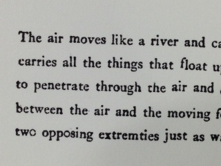
image.jpg
ffi |
fl |
5m |
4m |
’ |
k |
e |
1 |
2 |
3 |
4 |
5 |
6 |
7 |
8 |
$ |
@ |
# |
Æ |
Π|
æ |
œ |
|||||
j |
b |
c |
d |
i |
s |
f |
g |
ff |
9 |
A |
B |
C |
D |
E |
F |
G |
||||||||||
? |
fi |
0 |
||||||||||||||||||||||||
H |
I |
K |
L |
M |
N |
O |
||||||||||||||||||||
Can anyone tell what these are?
You can also see them here:
http://smashletterpress.info/id/photo 1.JPG
http://smashletterpress.info/id/photo 2.JPG
thanks,
patrick
image.jpg
Sorry. Try here:
http://smashletterpress.info/id/photo2.jpg
http://smashletterpress.info/id/photo1.jpg
thanks,
patrick
photo.JPG
The high cross in the lowercase ‘e’, and the low bowl of the lowercase ‘a’ make me think Garamond, but it is so heavily inked that it is difficult to tell which version it might be. The first example looks like a different type than the second, but again, the distortion of the type through over-inking makes it difficult to identify.
Paul
We can at least be sure the first example is not photopolymer (or slug), and probably printed from not just a used and poorly distributed case of one of the Garamond faces, but maybe even a case of mixed sources, considering the overall misalignment. Then see how, without using the ligature, the kern of the “f” has forced the character higher than the “l” following (as well as the general misalignment of characters) in the word “float”.
I’d hate to have my juvinalia put to this level of scrutiny. The work above may have lead to better things. Nobody goes into printing poetry without putting personal motivation above renumeration.
All correct I’m not unhappy to say. A beginning letterpress class, 20 young people, old type, hand inking, first time they ever handled it. Everyone has (or had) to start somewhere, no?
Thanks for the replies, as always. Your expertise is most appreciated.
p
Here’s how I’d approach that typecase: just start settting lines from each box methodically, and arrange them on a galley. Proof if you can. Next to each other, a sharp eye will see a zero next to a lower case o, a cap I next to a lc l or a figure 1. and when things start to stand out, you may see other features that say a particular stick of type is a wrong font; maybe casting details will indicate if something is from a different foundry. You could have two different castings of the same face that don’t align correctly in the same case (either cast at differnent foundries or just different alignments from the same place).
There might be more versions of the general Garamond style than anything other roman face, so there’s a serious possibility of past mixing.