Spotty Ink Issues
I am a letterpress novice and recently purchased a Kelsey Excelsior 6x10.
I have been trying to print and am running into some issues so I was wondering if anyone might have some ideas. I’m using Lettra paper 110# and Van Son rubber base plus ink in PMS 7531 straight out of the can. For some reason the ink is looking very spotty, almost like it needs to be thinned out? And it’s coming out very very dark, almost black. It should be more of a taupe color like this: http://media-cache-ak0.pinimg.com/736x/a6/d2/40/a6d24018b811290e84502334...
Am I just using way too much ink? I tried using just a regular piece of cardstock instead of the Lettra and got a pretty even print so I don’t know if it’s the paper or the ink or both. Also I was trying to adjust my packing and/or the screws on the back of the platen to figure out how to get a deeper impression. Is it better to pack more or adjust the screws? I’ve been trying to do research on what to use as packing in case that’s my issue. I’ve been using tympan, red pressboard, and a few sheets of newsprint at the back.
I’ve attached a few photos for you to see what I’m running into. I was only able to get the color remotely correct once - Photo 3 which might be hard to tell because of the lighting in the picture.
Thank you in advance!!
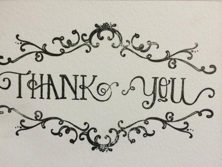
photo1.jpg
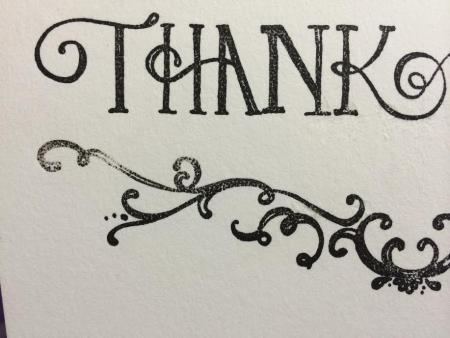
photo2.jpg
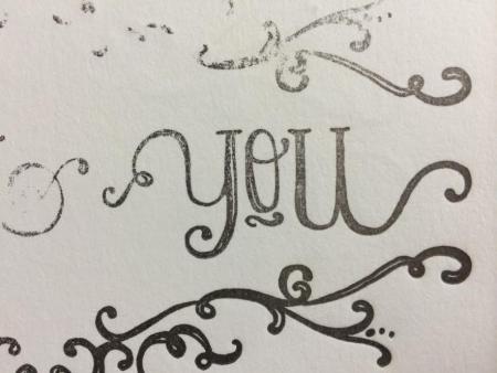
photo3.jpg
1. Letterpress uses a much thicker coat of ink then offset, so Pantones will always look a few shades darker than they do in the books.
2. You should set the impression screws for a level pressure, and abstain from mucking with them any further, concentrating instead on packing and makeready.
3. You won’t get a very deep impression on a tabletop Kelsey, with anything but the smallest of forms.
4. I would start with checking if the rollers give an even inking, proceed to makeready (a form like this, on my Kelsey would require a minimum of 3-5 layers), experiment with double or triple inking between impressions, and finally try adding more ink.
I would add: I’d ensure the plate is clean, dry, and free of oils (hand oils too). I’d use a dry, lint-free rag - maybe with a touch of presswash.
Sounds like the issue I’ve been having myself. I have an old (1884) Golding Official and was having trouble with uneven impression and ink-slurring. I finally figured out the majority of my problem was that my platen wasn’t tight! Once I tightened it that cleared up the slurred letters, but I am still having issues with not enough ink - I’ve put so much packing in that it can’t be the right way to adjust for this, but I can’t bring the platen any closer to the form because the screws tighten it down too soon - I think they are not original to the press and maybe aren’t long enough?
Anyway, I didn’t mean to hijack your thread emily, but let us know if you figure it out!
~Marina.
I had a problem with an Adana 8 x 5 I noticed the ink was not being transferred to the block correctly so I lowered the rollers by turning the nylon wheels round and it inked and printed wonderfully. I have a pantone formula guide and it has helped my colour matching no end
To check your ink color, do a finger test. Dab a small amount on your fingertip and then dab your finger on a sheet of paper a bunch of times. The color should lighten up enough to give you a sense of the true color. Your photo looks much too dark in comparison to the chip you linked to. I wouldn’t expect it to go that dark, even if you double or triple inked. It’s hard to tell from the photo but it doesn’t look like you have too much ink on your rollers.
The spottiness looks to me like there’s some solvent residue on your plate. You have to let the plate dry for a bit for you ink up, depending on your solvent. California Wash is slower to evaporate than coleman fuel. If you ink up too quickly, you can get that kind of spotty look.