Help with type identification
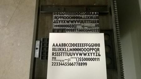
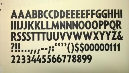
Hey, could anyone identify this typeface? There isn’t a nick or pin mark of any kind. The stems (end of the stems?) don’t sit square with the baseline, they’re angled. Thanks!
Adam

TypeOne.jpg

TypeTwo.jpg
ffi |
fl |
5m |
4m |
’ |
k |
e |
1 |
2 |
3 |
4 |
5 |
6 |
7 |
8 |
$ |
@ |
# |
Æ |
Π|
æ |
œ |
|||||
j |
b |
c |
d |
i |
s |
f |
g |
ff |
9 |
A |
B |
C |
D |
E |
F |
G |
||||||||||
? |
fi |
0 |
||||||||||||||||||||||||
H |
I |
K |
L |
M |
N |
O |
||||||||||||||||||||
Hey, could anyone identify this typeface? There isn’t a nick or pin mark of any kind. The stems (end of the stems?) don’t sit square with the baseline, they’re angled. Thanks!
Adam

TypeOne.jpg

TypeTwo.jpg
I believe it may be M&H’s Sans Serif Extrabold Condensed No. 333J http://www.arionpress.com/mandh/docs/MHcatalogue.pdf
Not sure if anyone has a full specimen of that particular typeface to confirm.
The M&H type is simply their casting of Lanston Monotype series 333, Sans Serif Extrabold Condensed (which does look as if it might be your type). I’ll attach a small-scale image of the showing of it from a 1940s Lanston specimen book.
If the URL below survives transit, it should point to a PDF of the 4-page section from the same specimen showing series 332 (S. S. Extrabold), 3321 (S. S. E. Italic), 333, and the related 84 Point Sans Serif Cap Fonts. (If the URL doesn’t survive transit you can probably piece it back together - there are no spaces in it.)
http://www.galleyrack.com/images/artifice/letters/press/comptype/monotyp...
The Cap Fonts are all “72H4”, which indicates that they’re actually 72 point bodies with a caps-only face appropriate for 84 point cast full on the body.
The ‘J’ suffix to the series number is just a helpful reminder that it is Boldface Roman in style; it isn’t really a part of the series number itself.
McGrew (American Metal Typefaces of the Twentieth Century - which you need if you don’t have it) identifies Lanston Monotype’s “Sans Serif” as a copy of Rudolf Koch’s Kable.
Regards,
David M.
www.CircuitousRoot.com
lanston-333.jpg
Thanks for the type identification and book recommendation, David. I’ll have to pick up a copy when I get a chance.
Adam