Designing Plates with Adobe
Hello—
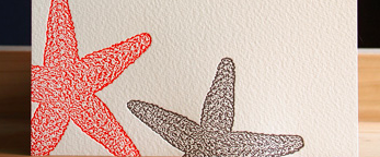
A few months ago, I purchased a C&P 8x12 Platen Press. I have been taking courses to learn the mechanics of the press, while attempting to teach myself Adobe Illustrator. I am somewhat clueless here—on the countless amount of invitations and stationery that I see, are images such like these downloaded vector files? Or how are these done? Literally every letterpress I look at, I can not understand how the images are made. I have attached one very generic / basic image to illustrate my point—it can be much simpler or much more complicated than the below starfish. I am fully capable of drawing such things by hand, but when placed in Adobe Illustrator, the image trace and expand functions alter the images.
Basically, I need an understanding simply of how the files / banners / fonts are designed!
Any help would be most appreciated—
Thank you!
Screen Shot 2014-08-17 at 8.03.53 PM.png
Many of these things are drawn by hand (or were at one time) and then scanned into the computer and converted to vector graphics using Illustrator. The image trace function of illustrator is complicated and can take much trial and error to get the results you are after. Every type of image requires tweaks to the image trace settings—the presets are only starting points for the best results.
I hope this helps.
Brad.
Hi Brad—
That helps a lot, thank you. I am just having so much difficulty figuring out the best way to design a plate. I then found the vector and font downloads, but was worried about the licensing for such things. I purchased many fonts and plan to use them for text, and suppose it sounds like hand drawing and importing is the way to go? Something as simple as a silhouette of an animal or an anchor, to something more complicated like a flourish—I just can’t seem to wrap my head around!
Feeling overwhelmed with all I need to learn to carry a design from start to pressed finish!
Screen Shot 2014-08-17 at 8.26.36 PM.png
Screen Shot 2014-08-17 at 8.26.10 PM.png
I’m a professional graphic designer who lives in the Adobe Suite as well as a hobby letterpress printer, so hopefully I can give you some useful information. Fundamentally, what you want is what’s called line-art. Basically, everything is either solid, 100% color or solid, 100% white. You don’t want anti-aliased edges or graduated tones because these can’t be truly rendered on the plate. If you really want any form of gradation it must be rendered into a halftone (little solid-color dots) to make the plate.
If you’re starting from something hand-drawn a pen-and-ink drawing would be best to get good contrast between the paper and the art. After scanning at at least 300 DPI (though I personally prefer much higher-1200 or so), it can be processed to “Bitmap” color mode in Photoshop. Note that this is not the same as the file format on Windows computers that’s also called bitmap. A Photoshop file in bitmap mode can be saved as a TIFF, EPS, or PS file.
This may actually be the best point to stop as the resulting graphic can be placed as a high-resolution linked file in Illustrator. Once placed, spot colors can be applied to it if you want multi-color artwork.
If you’re wanting to convert it to vectors using Illustrator’s trace tool, bitmap files are still a good starting point. Trace’s settings gives you a great degree of tweakability to get the vectors very close to the raw art but the end result still needs to be line-art to make the plate properly. Also, what trace produces will never exactly match the original. Trace doesn’t “know” what the art is, it can only look at the pixels input and try to approximate them mathematically using bézier curves. You’ll always get a few flaws from the process. Starting from a high-res bitmap will both minimize the flaws and will do a better job of producing proper line-art.
Hopefully some of this helps.
—
Michael Hurley
Titivilus Press
Memphis, TN
Also, just a note that in printing, “press” is not a verb. Ever! It is always a noun. The verb is “print.” Just as you never intaglio or offset or laser, you never letterpress. you always print, whether that be letterpress printed, intaglio printed, laser printed or offset printed, the act itself is still “printing.” “Letterpressing” is a trendy neologic bit of slang found among crafty-types, but people in the printing world will take you more seriously if you use the terminology correctly.
—
Michael Hurley
Titivilus Press
Memphis, TN
Hi Michael—
Thank you for the input, you are literally my ideal blend of professional. I aspire to be you!
Can you tell me, fundamentally, what you think the best method for designing is? I am signed up for Lynda.com classes and hoping to navigate my way from there. I have literally been goggling letterpress projects and trying to recreate them in Illustrator to teach myself. A few major questions:
—Can you recommend a course (either in person or on something like Lynda) that is best for letterpress design? I am having trouble specifying tutorials for what exactly it is I need to do.
—As far as font and vector downloads go, do you use these? Am I authorized to use them? I am finding that the vector packages run the gamut from simple drawings to more complex designs—even by hand, I feel as though it would be hard for me to come up with an exact / crisp line drawing of, say, a baby carriage. I do not necessarily want it to have a freehand look, I am just trying to figure out how most letterpress designers are doing this.
I am sorry, I probably sound SO ignorant and undereducated here, but I am doing my best to learn. Just a LOT on the plate at the moment.
Thank you again!
Julia
I’m afraid I’ve mostly learned by doing. I took two- and three-dimensional design (back when that meant drawing, painting & sculpture, not computers!) and film photography in college. I fell into graphic design for print and learned as I went. Oh, and I don’t get to do letterpress work for a living! I run the design department for a conventional, modern printing company and mostly design and pre-flight for laser and offset printing. I dabble in letterpress as a hobby.
To my knowledge, there aren’t any Lynda-type courses specifically for letterpress design and most graphic design college programs seem to be oriented toward web and application design these days rather than any form of print design. Not that I can blame them. It’s where the money is. You do have an advantage, though in that you’re located in an excellent area for letterpress. The New York region seems to have quite a few active studios. You might try putting out local feelers to see what you can find. You might try asking at the local colleges’ art departments, too.
Really, any design-for-print knowledge will help. You’ll ultimately need at least a basic understanding of line-art and how it works, designing for spot-color printing, halftoning, spread, trap, overprinting, and many other concepts that apply to general printing as well as letterpress.
Downloadable clipart and fonts are perfectly useable, assuming the licensing allows for it and the quality is good. The licensing is usually pretty easy to figure out. Understanding quality is just something you have to learn by doing. I use whatever works. Sometimes I start from a sketch, sometimes I just start throwing elements around on screen, sometimes I find something I can download.
I’m afraid there isn’t a quick answer. Your best bet is to keep trying and keep learning. As the old saying goes, experience is the best teacher. You are at least willing to ask questions, and that’s a good place to start. Good luck!
—
Michael Hurley
Titivilus Press
Memphis, TN
as you are good drawing by hand this might be your best option ,because it vectorices your drawings.
you have many different options and brands ive seen very nice work done with these.
it is compatible with adobe illustrator and more
http://www.astutegraphics.com/blog/using-a-wacom-graphics-tablet-with-ve...
good luck
If you are interested in hand-drawing to digital conversion, lynda.com has a great series about this by Von Glitschka. You should definitely check it out.
As a printer by trade, I have abetter understanding of the major problem designer are facing these days. Back before the computer, took over the world, a designer, a person with a major in art drew line art in black and white for printing. And if was to be in color made overlay black and white sheets for each color.
From this line artwork, the camera or litho department in a print shop took the artwork and made litho negatives. If it was to be printed Letterpress engraving from the Litho film was made, if it was to be printed Offset plates were made.
Back in pre-computer days, there was skilled people in art design, litho camera work and skilled press people.
Now, artist are trying to learn four jobs by using a computer. It takes many hours of training to understand how art on a page or on the computer monitor gets printed.
The best way to learn is DRAW a line drawing on poor white drawing paper, have someone teach you how to scan it or send the line art drawing to a company have makes Letterpress printing plates. Have a engraving made and lock it up on your press and learn how the image on the plate takes ink and places it on the printed page.
You have to learn the basic printing of type, images and types of paper before understanding Letterpress.