Updated: Typeface Identification Help
Here is a list of unidentified type at Mills College. I am trying to put a name to them. Any help would be appreciated.
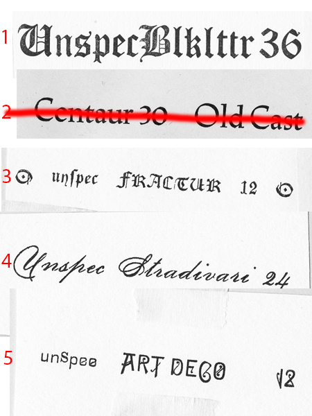
type1.jpg
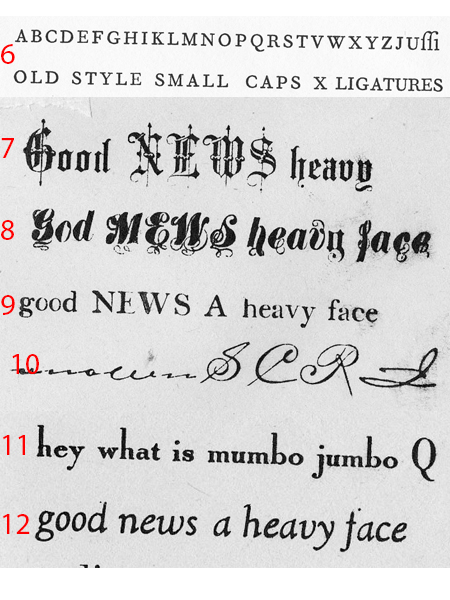
type2.jpg
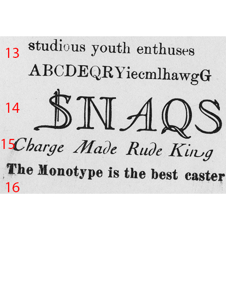
type3.jpg
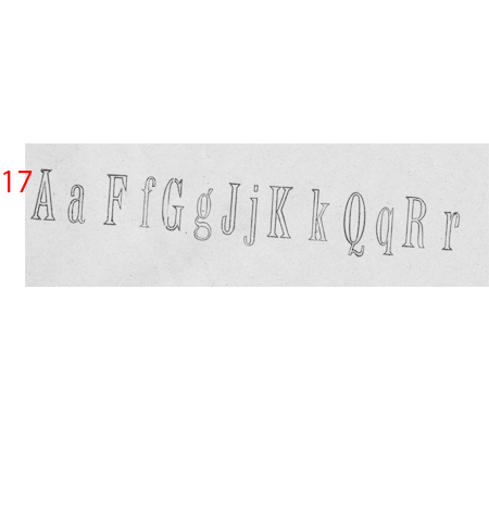
type4.jpg
ffi |
fl |
5m |
4m |
’ |
k |
e |
1 |
2 |
3 |
4 |
5 |
6 |
7 |
8 |
$ |
@ |
# |
Æ |
Π|
æ |
œ |
|||||
j |
b |
c |
d |
i |
s |
f |
g |
ff |
9 |
A |
B |
C |
D |
E |
F |
G |
||||||||||
? |
fi |
0 |
||||||||||||||||||||||||
H |
I |
K |
L |
M |
N |
O |
||||||||||||||||||||
Here is a list of unidentified type at Mills College. I am trying to put a name to them. Any help would be appreciated.
type1.jpg
type2.jpg
type3.jpg
type4.jpg
Hi, Mark — a larger proof would make it easier, or at least a larger image of that proof. No. 2 looks like Weiss Initials, Series 1. A few more characters of No. 1 would help — it looks like a slightly condensed and slightly bolder version of Centaur. Beyond that my ATA Type Comparison Book doesn’t go without a clearer image.
(EDIT) I think #1 is close to Engravers Old English — it’s slightly different from the specimen and the cap U is quite different. Maybe European?
#11 looks like Typo Roman
#12 looks a lot like Kennerley Italic
#13 looks a lot like an ancestor or alternate of Century Expanded with longer descenders.
Are all of these foundry? and if so are there any pinmarks or other identifying characteristics? Do any have milled feet (indicating Didot height machined down)?
Have you checked to be sure there aren’t any wrong fonts in your specimens? There seem to be some characters that don’t match the style of the others.
Bob
1. Cloister Black, designed by Joseph Phinney, introduced in 1904 by ATF
4. similar to Boston Script, but not exactly it, 1880s
5. Elite, designed by Charles Heyer for BB&S, 1884 (wrong font s”)
7. Fancy Text, MacKellar, Smiths & Jordon, 1870
8. Treasury, designed by Herman Ihlenburg for Mackellar, 1874
That’s all I can do for now. Thanks for having printed samples and for enlarging the images. To repeat Bob O.’s questions: does the type have a pinmark? Is it all foundry type? Also, it is very helpful to have printed specimens, such has you have provided, but a more complete alphabet is helpful. Unfortunately, these samples were heavily over-inked, making the typefaces appear much heavier than they really are. It threw me off, and I missed identifying a couple of faces until I realized this. Good luck on the rest—my eyes are tired from staring at type specimens for the last hour and a half.
No.14 is Naudin Champleve, a Deberny & Peignot face.
Rick
I should have mentioned that No. 14 was imported to the US by Continental Typefounders and is also called Sylvan.
No. 17 is Contour No. 7, shown in the 1898 ATF catalog.
Rick
Hey Mark,
6 is Fournier small caps; 15 is Cochin (not Nicolas Cochin) italic; 13 might be Scotch Roman; 10 might be Carpenter Script. Good luck.
Pat
Thanks for the help guys!
10. is Carpenter Script
11. is Typo Roman or Typo Roman Shaded
Michael
www.Nickel-Plate-Press.com